KPI dashboards: Track metrics and drive results
Everything in business moves fast. In the time it takes to open a spreadsheet, your metrics may have already shifted. KPI dashboards provide a live view of your most important data points, from project status to campaign performance and company revenue, so you can respond as things change.
Instead of sorting through static trackers or waiting for weekly updates, teams can see where they stand in real time. With Tempo’s Jira-native tools like Timesheets and Structure PPM, you can build dashboards right inside the systems you already use without needing any extra software.
In this guide, we’ll explain what KPI dashboards are, share examples from different industries, and show you how to build one that works for your team.
What’s a KPI dashboard?
A KPI dashboard, or key performance indicator dashboard, is a central view in a software platform or an app that pulls key metrics from multiple data sources into one place. Dashboards usually display these metrics as charts, graphs, and tables that are easier to interpret than raw data. Users can quickly spot trends, monitor performance, and respond to changes in real time (or close to it).
The type of data that KPI dashboards show depends on the context. For example, a sales team might track monthly revenue, while a customer support team might focus on average response time or ticket resolution rates. The scope can be broad, like a company-wide business intelligence view, or highly targeted, like a marketing KPI dashboard that tracks campaign engagement and conversions.
No matter the focus, the purpose of KPI dashboards is the same: to give teams the clarity and context they need to make informed, timely decisions that drive better outcomes.
KPI dashboard examples
KPI dashboards vary based on the department, goals, and stakeholders involved. Below are some common KPI dashboard examples and how they’re used in practice.
Project management dashboards
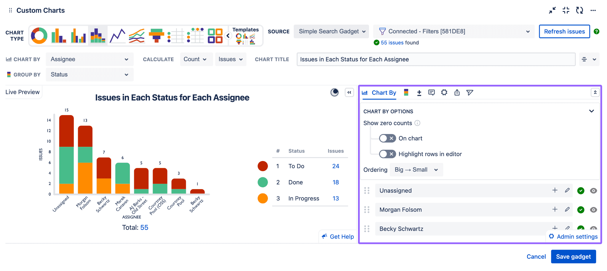
Project management dashboards track progress against plans, budgets, and deadlines using metrics such as milestones, task completion, and resource allocation. When powered by tools like Structure PPM, they reflect real-time data from Jira – for example, a software development team might follow sprint progress, story points completed, and deployment status across multiple epics.
Marketing dashboards
Marketing dashboards show metrics like campaign performance, lead generation, and engagement. They show how marketing contributes to pipeline and revenue, helping teams see what’s working and what they need to adjust. Campaign-level dashboards can also compare performance across channels or time periods. For instance, a B2B marketing team might use a dashboard to monitor Marketing Qualified Leads (MQLs) by source, email open rates, and cost per lead across campaigns.
Financial dashboards
Finance teams use these dashboards to analyze revenue, expenses, cash flow, and profitability. These insights allow them to plan better and ensure financial KPIs align with broader business goals. Financial dashboards can be tailored for leadership, department heads, or operational managers based on reporting needs. A SaaS company, for example, could visualize monthly recurring revenue (MRR), churn rate, and runway based on real-time accounting data.
Sales dashboards
Sales dashboards show stats like quota attainment, deal velocity, and customer acquisition cost, helping managers identify top performers and adjust strategy accordingly. In one case, a regional windows and doors sales team might compare open opportunities by rep and conversion rates through each pipeline stage.
Operations dashboards
Operations dashboards are common in industries where efficiency, logistics, and service delivery are critical. They allow IT service management teams (ITSM) to observe supply chain activity and production volume. Operations dashboards can also include quality control measures and service-level agreements (SLAs). Some, like those used by manufacturing firms, monitor incident metrics through integrations with tools like ServiceNow and Power BI.
6 steps for creating a KPI dashboard
Building an effective dashboard involves more than plugging in data. Here’s how to ensure your KPI dashboard is actionable, relevant, and easy to interpret:
1. Identify your goals
Start by defining what you want to measure and why. Connecting your goals directly to broader business objectives will guide the KPIs you choose and how you configure the dashboard to present them.
2. Select relevant KPIs
Focus on a small set of metrics that provide a balanced view of performance. These could be outcome-based (like revenue growth) or process-based (like cycle time). Avoid including too many KPIs, which can overwhelm the dashboard and dilute focus.
3. Choose a dashboard tool
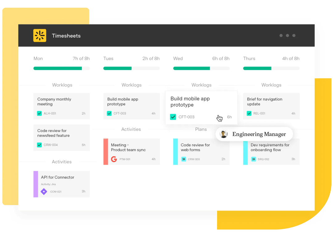
Select a tool that integrates with your data sources and matches your team’s technical comfort level. Tempo’s Timesheets, for example, uses data you already track in Jira, which eliminates the need for separate reporting tools.
4. Connect data sources
Link your dashboard to live data such as your project management system, CRM, marketing automation tool, or financial software. Automated updates reduce manual reporting and build trust in the data.
5. Design for clarity
When designing your dashboard, always keep your audience in mind. Use clear visualizations, group related KPIs together, and place the most important metrics first. Structuring Jira dashboard content this way allows teams to access insights without interrupting other workflows.
6. Share and review regularly
Make the dashboard accessible and review it frequently with your team. Discuss what the data means and agree on next steps. Regular reviews keep the dashboard relevant, which is key to the team making informed choices.
Benefits of KPI dashboards
A well-designed KPI dashboard delivers a range of operational and strategic advantages. Here are some primary reasons organizations rely on them:
Real-time visibility into performance: Live data allows teams to see progress and spot issues early. This visibility supports faster reaction times and more proactive planning.
Better alignment across teams and stakeholders: A shared set of metrics keeps everyone on the same page about priorities and success criteria.
Simplified decision-making: Instead of wasting time digging through complex reports, KPI dashboards enable teams to see top-line performance metrics at a glance, which supports faster, smarter strategic and tactical choices.
Time savings through automation: Automated updates eliminate the need for repetitive data entry and manual reporting, freeing up time for higher-value work.
Increased accountability and performance: With metrics in plain view and easily accessible in KPI dashboards, individuals and teams are more likely to stay focused and deliver on their commitments.
Improving KPI visibility and reporting with Tempo
Tempo’s suite of Jira-native tools makes it easy to build and manage KPI dashboards without leaving your core work environment. Because they pull real-time data from the tools you already use, your dashboards always reflect the most current information.
Timesheets captures detailed time tracking across teams, projects, and tasks. Dashboards show this data to compare actuals to estimates or measure effort toward key initiatives. Structure PPM adds project- and portfolio-level visibility, with Gantt chart and roadmap views that layer in milestones and dependency targets.
Together, these solutions allow you to create dashboards that highlight the right metrics to ensure visibility across teams and drive performance improvements at scale.