The ultimate Jira dashboard guide
Tempo Team
Reporting is essential for any team trying to improve, because reports tell you what needs improving. Without them, you’re shooting in the dark.
For teams working in Jira, the Jira dashboard is the single best reporting tool you have. And with the help of our dashboard add-on, Custom Charts for Jira, you can make them tell truly captivating data stories that will galvanize your teams into action.
This guide offers tips and tricks to get the best out of Jira dashboards, so that you and your team will know, at a glance, exactly what’s going well and what’s not, without having to go looking.
Jira dashboard basics
There are two quite different ways of making reports in Jira.
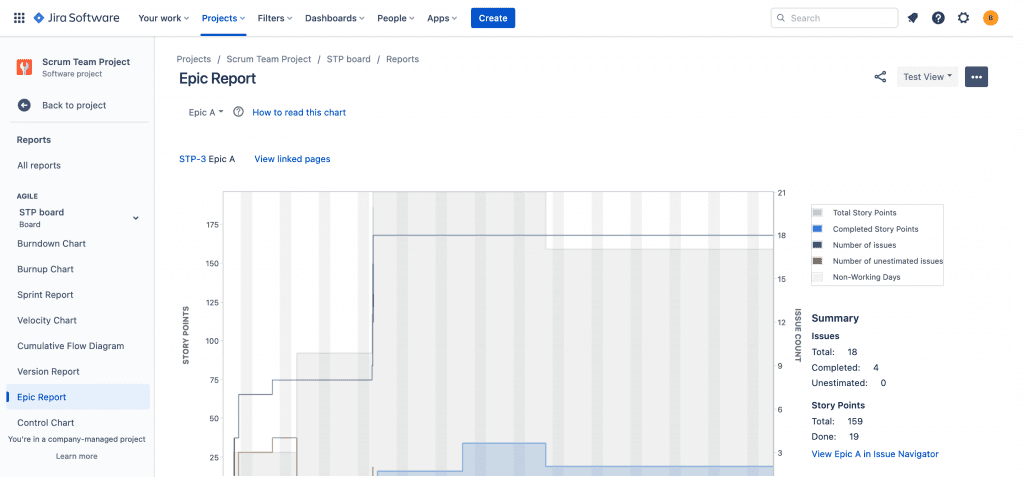
The first is project reporting, where you go into an individual project, navigate to a board, click on Reports, and generate the report you want from the list.
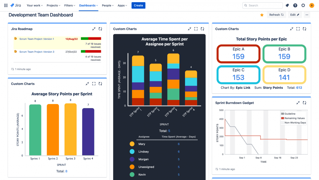
The other is dashboard reporting, where you can add multiple reports spanning multiple projects to a single screen, giving a more expansive overview of everything you’re working on. The reports you stick on a Jira dashboard are called ‘gadgets’.
Once you’ve created a Jira dashboard, you don’t have to do anything else. Every time you reload the dashboard, all the reports will update automatically with the latest data. You can also configure them to refresh at regular intervals. This makes dashboard reporting a much faster way of reporting. With project reports, you have to generate them one-by-one in separate screens, and the data is fixed at the time you run them. In effect, project reports offer a snapshot of your data, whereas dashboards offer a dynamic, near-real-time view.
Find out more about the difference between reports and gadgets in Jira, and why we think gadgets are better.
Jira dashboard gadgets and how to use them
A Jira dashboard gadget is a chart, graph, table, or diagram that displays Jira data and is accessed and configured directly on a Jira dashboard. All the different ‘windows’ that appear on the dashboard screen are gadgets.
Jira comes with a certain number of gadgets out of the box. However, while these gadgets are really easy to use, they’re super-limited in what data they will display, and in how they can display it. Custom Charts for Jira is a dashboard reporting add-on that lets you make much more customizable charts and graphs directly on the dashboard, the key thing being that it’s just as easy to use as the native gadgets. It means that you can replace your native gadgets with Custom Charts versions, and have much more power over your data.
Many of the project reports have gadget versions. For example, you can go into a project and generate a Created vs Resolved Issues Report, or you can add a Created vs Resolved Issue Gadget to your dashboard. This is why we recommend using dashboard reporting instead of project reporting wherever possible, because dashboards are better and you just don’t need project reports most of the time.
Plus, you can use Custom Charts on a dashboard. So, if you wanted, you could replace the native Created vs Resolved Issues Gadget – which comes as a line chart only – with a Created vs Resolved Issues Bar Chart using Custom Charts.
Custom Charts is a gadget too. Once installed, you add it just like any other gadget (by clicking Add a Gadget).
How to make a bad Jira dashboard
When you make a Jira dashboard to present to your team, you’re in effect writing a story with charts. Like all stories, they need to be told well if you want your audience to react a certain way.
Here are some ways you can end up with a bad dashboard and bad data storytelling.
Too many gadgets
Stories can be hard to follow or even nonsensical if you add too many characters or your plot is overly complex. And if your Jira dashboard has too many gadgets, your audience won’t understand the message you’re trying to get across.
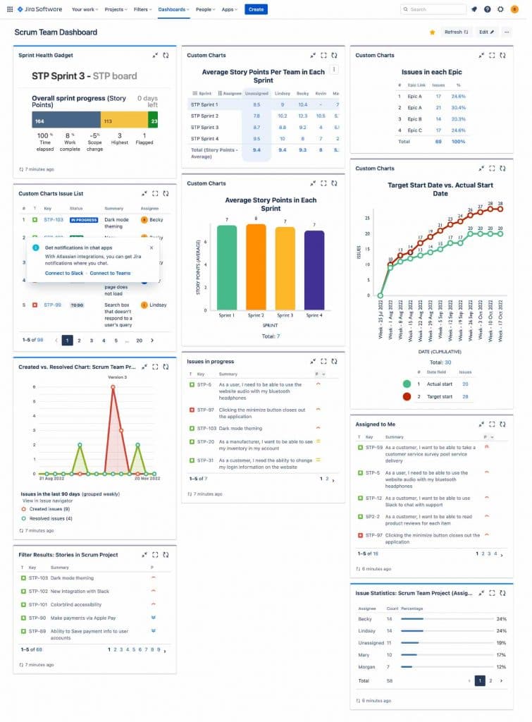
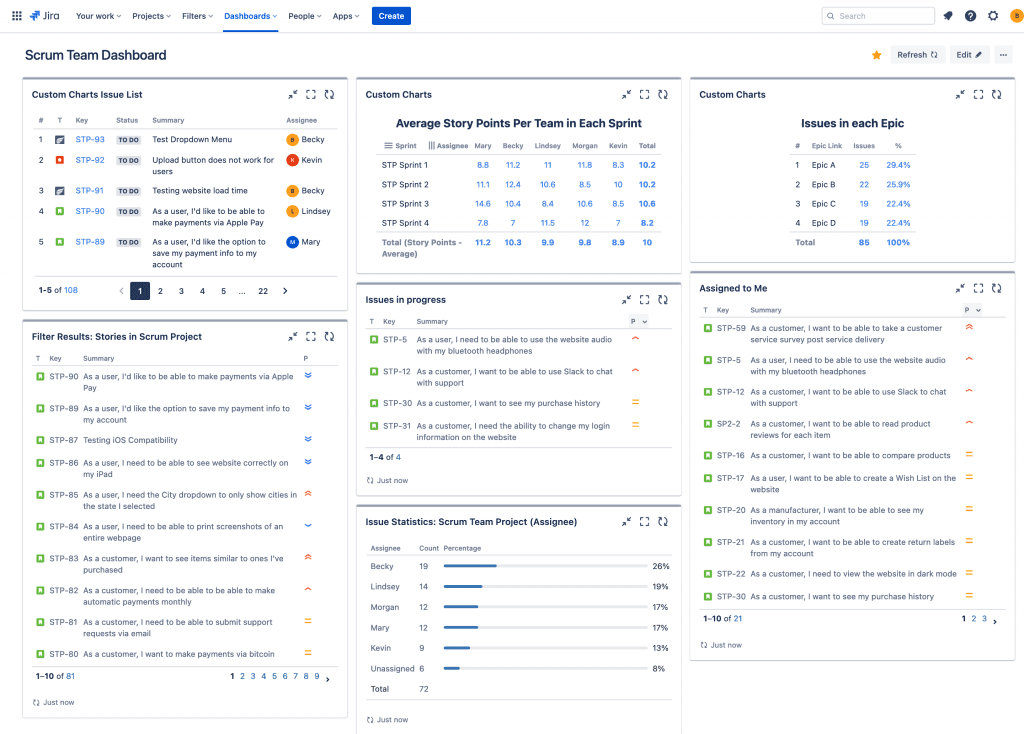
We recommend no more than 6 gadgets/charts per Jira dashboard. If you need to show more data, make another dashboard. It’s better to have multiple smaller dashboards for particular use cases than a giant dashboard attempting to show everything. In order for a dashboard to effectively convey information at a glance, it’s best to keep it simple.
Too much text
A Jira dashboard that’s cluttered with text is no good to anyone. Sure, you might want a list of Jira issues on your dashboard. It’s useful for showing a variety of information about your issues in one spot. But at most, have 1 issue list per dashboard. Good dashboards are about visualizing your data, and lists are hardly visual. They require the audience to interpret the data to get to the point of the story. And you’re not telling a good, clear data story if you’re asking viewers to tell it for you.
Irrelevant charts/dashboards
Avoid charts that have data points your audience doesn’t care about. If, for example, you use loads of different issue statuses, don’t show all of them. Just show the ones relevant to what you’re trying to say. Likewise, don’t make charts with lots of assignees if you’re only aiming convey information about the core team.
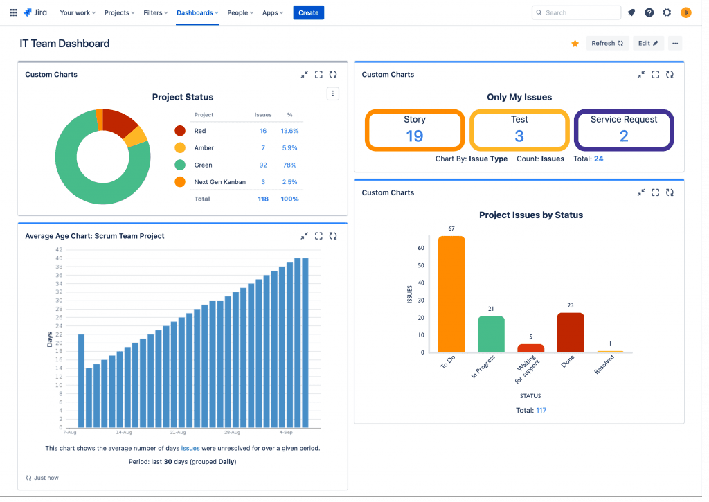
A bad dashboard might also have the wrong combination of charts on it. Charts that are useful on their own, but when combined, make the whole dashboard irrelevant. Consider the dashboard below. This has an Only My Issues Tile Chart, a Project Status Pie Chart, an All Project Issues by Status Bar Chart and an Average Age of Issues Bar Chart. All of these reports are great, but who cares about all of these things at the same time? This dashboard is a story that consists of four excellent chapters, all from different books.
Bad charts
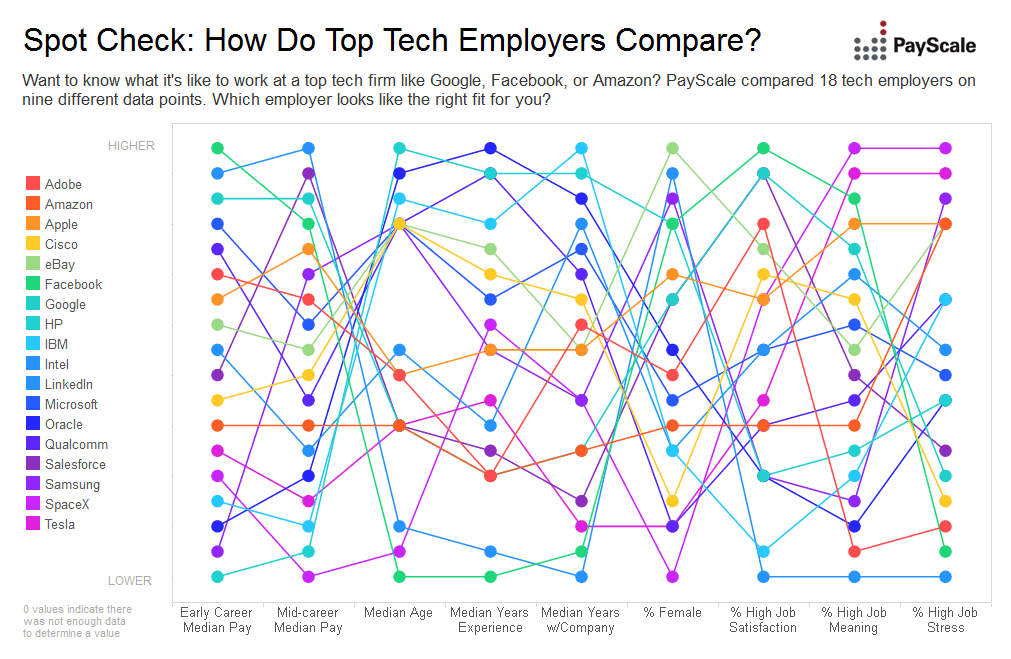
Then of course there are just straight-up bad charts. Charts that totally baffle the audience when they’re supposed to do the opposite and make your message clearer.
Like, you know, what the hell is this crap…
A bad chart may also arise from choosing from the wrong type of chart for your data points. For example, we love pie charts here:
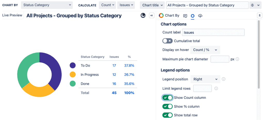
It’s super-difficult to see which segment is biggest. However, if we try a bar chart…
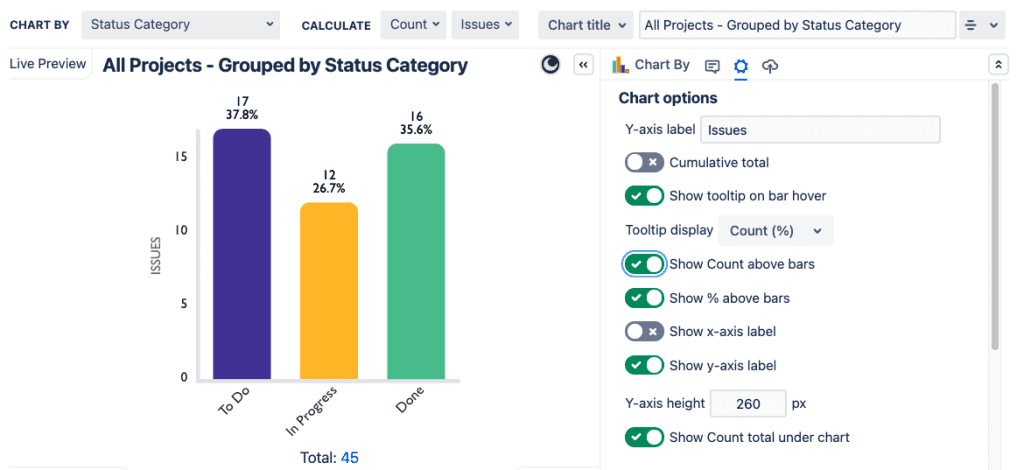
Ahhh, much better.
Of course, some bad charts arise from bad data. Frankly, if the story you’re trying to tell is faulty… don’t tell it.
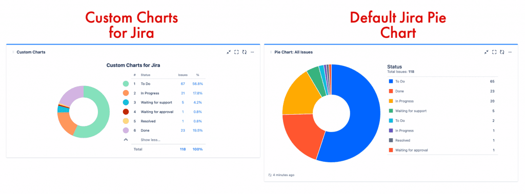
And sometimes, the data isn’t bad per se, but then your platform turns it bad. For example, native Jira has this nasty habit of duplicating values when you create Next-Gen projects, e.g. multiple “to do” and “done” statuses. As a result, you end up with a pie chart that looks like the one below on the right. Pretty darn confusing. Custom Charts for Jira automatically combines duplicate fields and statuses so that you can have a clearer chart like the one below on the left.
See more examples of good and bad data visualization, or find out more about improving how you visualize Jira data.
How to make a GOOD Jira dashboard
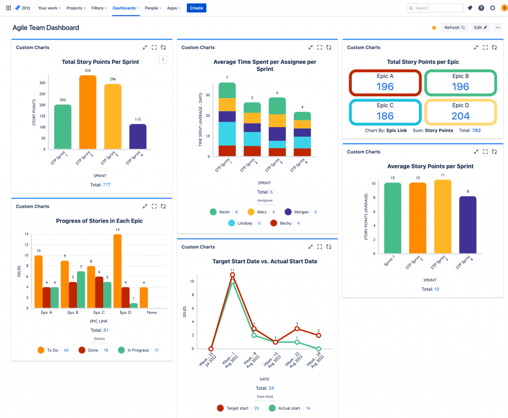
Here are the 4 things you need to do to make a good Jira dashboard that tells a solid and engaging data story.
Define your audience
Is the dashboard for your entire team? Is it for an individual member of the team? Is it for a supervisor or some other stakeholder? Even though there may be crossovers, narrowing down your audience will make it easier to know the sort of story you’re going to tell.
Craft a story, the right one
You don’t want your Jira dashboard to be the visual equivalent of a list of facts. You want it to engage your audience, move them, spur them to action. Facts don’t do this. Stories do.
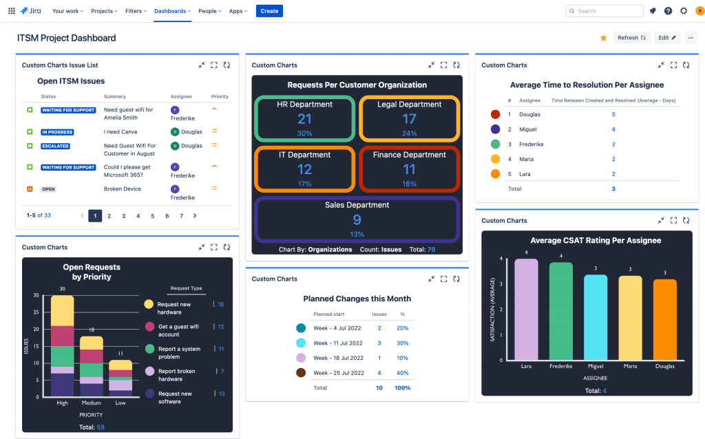
Your story could be about the fact that some assignees are taking much longer to resolve customer requests than others and their customer satisfaction is suffering. To craft a story about that, start at the beginning. Give some context in terms of all assignees’ workloads. Lead up to your main point by talking about the average time to resolution and customer satisfaction (CSAT) ratings per assignee. Then comes your main point: some assignees are performing better than others and you need to look at why that is. Finally, produce the kinds of charts that will enable you to tell this story in a succinct way.
Effective data storytelling prompts the discussions you need to be having about how to improve. Here, the team will be asking whether the workload is not properly balanced, or whether certain assignees need more help/training.
Find out more about how to tell a compelling data story.
Make your charts comprehensible
To get your story across, you want charts that are easy to understand. So, avoid all the pitfalls of the bad charts discussed above, and make sure you choose the right type of chart for your data points.
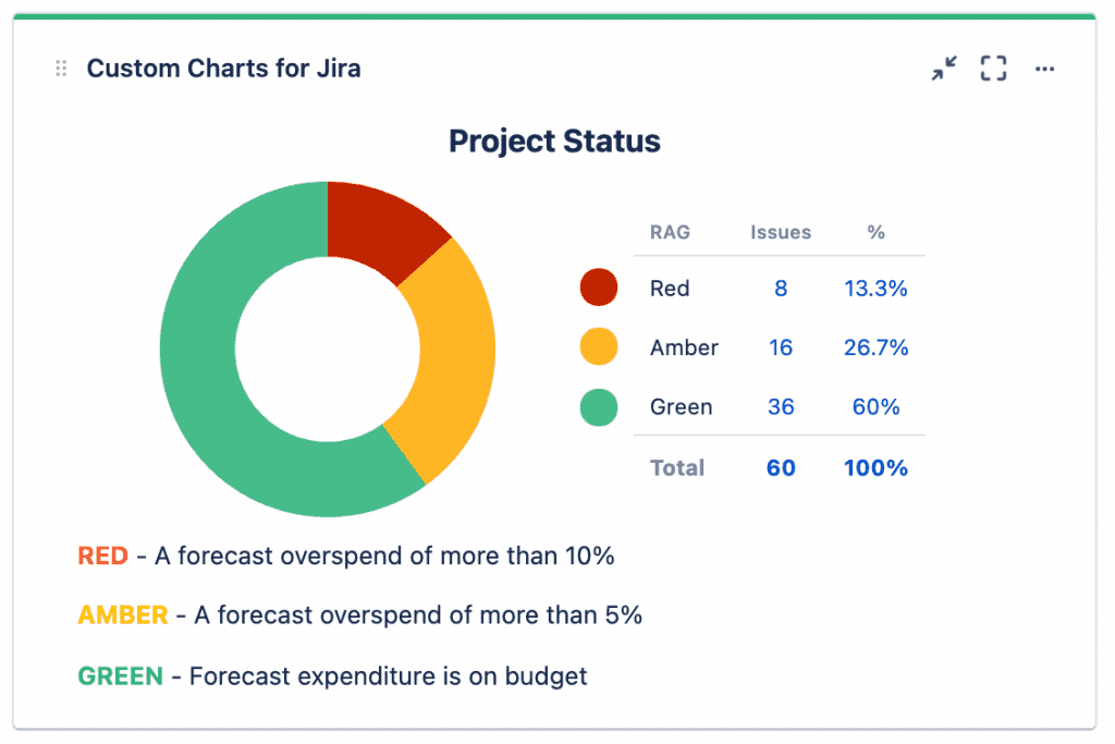
To aid understanding, add labels and descriptions to your charts. Show percentages. Tell the audience what the colors mean. Embed links to Confluence pages where they would provide context and define metrics.
It’s particularly important to choose the right colors. It would be weird to have a RAG (red-amber-green) chart if you couldn’t actually have RAG colors. As it happens, in native Jira, you can’t. Blue is green, amber is orange, and red is yellow. And you can’t change that nonsense because there’s no color customization out of the box. However, if you use Custom Charts for Jira, you can make RAG charts that are actually RAG. Like so:
Make your charts maintainable
If your reports and dashboards take a lot of time and effort to maintain, you’ll end up not maintaining them properly. In time they’ll start to show inaccurate data.
Some ways of making your dashboards easier to maintain are:
Instead of labels, report on established data points like custom fields and components.
We know adding labels to Jira issues is really popular, but over time you start to get slightly different versions of the same label due to typos, abbreviations, etc. And then you have to go in and do a load of manual cleanup. As your reporting becomes more formal, we recommend that you reduce your reliance on labels.
Create and use templates.
Custom Charts for Jira allows you to build Jira chart templates for common use cases, which is great for making future dashboards quickly. And with the Simple Search gadget, you can use tabs to create different chart combinations for different audiences without having to generate a whole new dashboard for each one.
Avoid hard-coding dates. In Custom Charts for Jira you can use dynamic dates, which are much more flexible and make dashboards easier to update.
Different types of Jira dashboards you can make
Our Quick and Easy Jira Reporting Cookbook has a great selection of dashboards that you can make using native Jira gadgets and Custom Charts for Jira. For more experienced Jira users, there are dashboards you can make using Adaptavist’s Scriptrunner and the business intelligence platform EazyBI.
The ‘recipes’ include a dashboard for your daily standups, a dashboard for sprint retrospectives, and a dashboard that tracks time, story points, and cumulative totals instead of simply counting issues.
For support teams using Jira Service Management (JSM), there is also a really insightful dashboard for monitoring customer satisfaction. (In addition to the cookbook, JSM teams might want to have a look at our articles about charts you can create for monitoring your IT service management (ITSM), and specifically, for measuring performance against service-level agreements (SLAs)).
The cookbook also explains how you can bring Jira dashboard reporting into Confluence, courtesy of the Jira Charts macro or the mirror-image sister app to Custom Charts for Jira, Custom Jira Charts for Confluence. With Custom Jira Charts for Confluence, you can make charts, graphs, and whole dashboards out of Jira data from directly inside a Confluence page.
How to share a Jira dashboard
Sharing Jira dashboards internally
You can share a Jira dashboard with an internal user simply by copying and pasting the link to it, as long as the internal user has permission to view it. This is usually where problems happen. Replies like “I can’t access that” or “All the gadgets are empty” are common responses after sharing a Jira dashboard internally.
To avoid access issues, make sure the permissions are set up properly before you share anything.
There are a number of options when choosing who to share Jira dashboards and filters with:
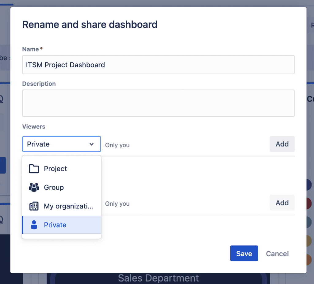
Private (default option)
Only accessible by the dashboard owner
Group
Accessible to anyone in the selected group
On Jira Cloud you can only share dashboards and filters with groups you are a member of
Public
Anyone on the internet can view the dashboard or filter
This only allows anonymous users to see the underlying issues if the projects containing the issues also have Public set on the browse projects and issue permission schemes
My organization (Cloud only)
Organizations are a site-level management system created by Atlassian specifically for Cloud
The documentation can be found here
Any logged-in user (Server and Data Center only)
Any user that is able to log in to the Jira instance can access the dashboards or filters
This only allows logged-in users to see the underlying issues if the projects containing the issues also have “Any logged-in user” set on the browse projects and issue permission schemes.
Making your dashboards easy to find
A dashboard that no one’s looking at isn’t useful. Sharing dashboards is one thing, but you also want them to be easy to find when your users need them. So, link to them with shortcuts wherever your team does their work, e.g. the project sidebar, the Confluence sidebar, Confluence landing pages, etc. Also, make them easy for teams to find when they go to View all dashboards in the Dashboards dropdown, by giving them clear and descriptive names that tell you what those dashboards show.
Sharing Jira dashboards externally is the hard bit. But there are a few options…
Exporting a Jira dashboard
Better PDF Exporter for Jira allows you to export your dashboard as a PDF document. You can then email it, print it, or share it with whoever you want. You can even customize the way the dashboard looks by changing the layout, adding your company branding, and showing/hiding certain gadgets.
Sharing live Jira dashboards externally
The problem with a PDF export option is that you’re sharing a static view of the dashboard. You’d have to export again (and again) to keep sharing updated data. Ideally what you want is to be able to share a live Jira dashboard outside your instance.
Native Jira offers only one way to share a live dashboard outside your instance and that’s by making your dashboard (and the underlying projects) public. However, this means the dashboard and all the issues featured on it are visible to and searchable by anyone on the internet.
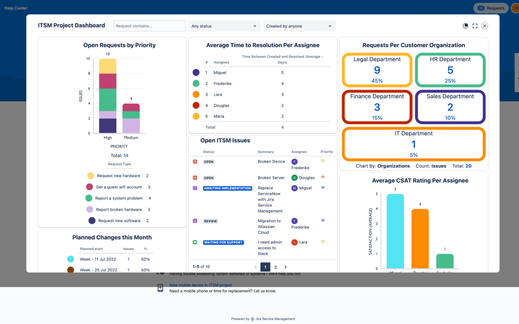
As an alternative, Custom Charts comes with a Shared Dashboards feature that lets you share dashboards with customers in the Jira Service Management portal. In time, the Shared Dashboards feature will allow you to share dashboards with anyone using public links, without making your project public.
Recreating live Jira dashboards in Confluence
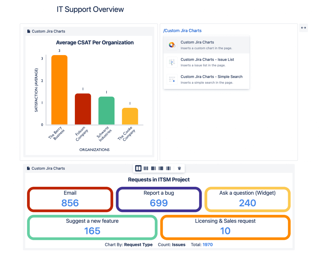
If you’re a Confluence user, a way of sharing Jira dashboards with people who may be on your Confluence, but not on your Jira, is to use our app, Custom Jira Charts for Confluence. This app allows you to build a Jira dashboard from inside a Confluence page, i.e. you can make exactly the same charts and arrange them exactly as you would on the dashboard. Executives, customers, and other teams who have permission to view your Confluence pages will then be able to see and interact with your charts.
In summary…
There are 2 types of reporting in Jira: project reporting and dashboard reporting. Traditionally dashboards were for higher-level insights, but now you can replace most of your board reports with dashboard gadgets and have them in one place. You can also use Custom Charts for Jira to replace even more of your project reports with dashboard versions.
A bad Jira dashboard is one that is messy, with too many gadgets or too much text. Alternatively, it could have lots of bad charts which are bad because the data is bad, the chart isn’t customized enough to show what you want it to show, or you chose the wrong type of chart for those data points.
A good Jira dashboard is one where you have narrowed down your audience, decided what story you want to tell with the data, and produced the most appropriate charts to tell it. It’s also one that’s easy to understand and maintain.
If you want people to take notice of your dashboards, share them! And make them easy to find too, by adding links to them in the right places. However, make sure that your users can see them by ensuring permissions are properly set.
Sharing a Jira dashboard externally is trickier, but the Atlassian Marketplace has options. You can either export to PDF using something like Better PDF Exporter for Jira, or if you want to share a live dashboard with always-up-to-date data, try Custom Charts. Custom Charts for Jira has a Shared Dashboard feature that lets you share entire dashboards with customers in the Jira Service Management portal. And its sister app, Custom Jira Charts for Confluence, lets you build and share charts and dashboards on Confluence pages.
Sign up for a demo
Request Demo

