10 project dashboard examples for visibility and control
Tempo Team
If there’s one thing project management teams never run short on, it’s data: budget, timelines, hours worked, and other core metrics that PMs track to ensure everything’s on course.
The challenge is making sense of it all. With so many figures and status updates, presenting information in a way that’s clear and engaging for both teams and stakeholders can be difficult, even for seasoned pros.
Project management dashboards consolidate the most important figures into charts, graphs, and other visuals. They give teams a shared view of progress across the project lifecycle and make it easier to align priorities and address potential issues early.
In this guide, we’ll highlight project dashboard examples to help you turn all that data into actionable insight, whether you’re stepping into your first PM role or fine-tuning a mature reporting process.
What’s a project dashboard, and how is it used?
A project dashboard is a standard feature in most project management tools that compiles key details like budgets, timelines, and milestones into charts, graphs, and tables. It turns raw project data into a clear, at-a-glance view that’s simple for teams to interpret.
Many project tracking dashboards are customizable so that the most relevant metrics are always front and center for both the team and stakeholders. This is especially helpful for teams in project management offices (PMOs) that design their own layouts or start with specific templates tailored to their work.
Here are some of the main benefits project dashboards provide.
Build visibility
Dashboards pull live project data into one view that shows what’s on track and what might need attention. Managers can drill into KPIs, milestones, and task status to spot potential bottlenecks before they slow progress.
Keep everyone aligned
Whether your team works across time zones or in the same office, a project dashboard gives everyone access to the same information in real time. Automatic updates replace the need for constant check-ins, so everyone’s on the same page regarding priorities and deadlines without constant meetings and emails.
Gain early access to Public Shared Dashboards and shape the future of external reporting in Custom Charts.
Request to Join the EAPTrack performance
Project status dashboards monitor more than project progress. They also show productivity trends, time usage, and spending patterns – insights managers use to fine-tune workflows and address performance concerns before they escalate.
Inform decision-making
With the context that dashboards provide, project managers can make faster, evidence-based decisions, which helps them plan better and lower the chance of missteps.
Manage resources
By mapping workloads, deadlines, and milestones in a single view, project dashboards help teams shift assignments, balance workloads, and respond to changes like staff absences without derailing the schedule.
Reduce reporting workload
Dashboards turn live project data into visual summaries that replace manual reports. They save managers time and give stakeholders the updates they expect with minimal prep work.
10 project dashboard elements to consider
Most project management tools include a default dashboard with a broad overview of tasks, deadlines, and progress. But you get more value by tailoring them to fit your project’s specific needs. Here are 10 examples of panels and views you can add to make your dashboards more insightful and useful.
1. Gantt chart view
A Gantt chart lays out the entire project timeline with start and end dates to show how long each task should take. It also indicates where dependencies exist and when milestones fall. A Gantt chart in your dashboard gives the team a shared picture of progress – and a sense of satisfaction when things move to “complete.”
2. Budget panel
The project budget is one of the most important KPIs for any PMO. Adding a budget panel to your dashboard allows you to track real-time spending against estimates and assess whether the project is on course to meet its financial goals. Budget panels also usually display the percentage of hours worked that are billable and compare the value earned against the actual costs.
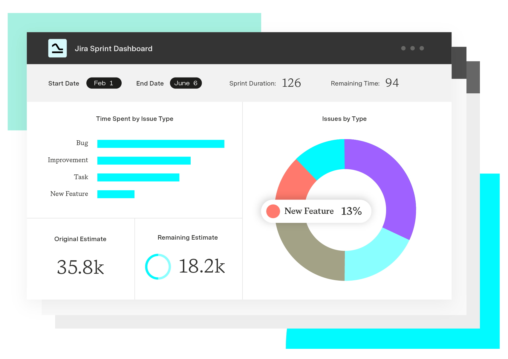
3. Agile sprint tracker
Agile teams work in short, fast-moving cycles, so they need a dashboard view that includes sprint progress. A sprint tracker shows how quickly your team is moving through tasks, tracks what you’ve completed, and measures how long work takes from start to finish. This view in the dashboard allows teams to focus on their current sprint and adjust quickly if things fall behind.
4. Executive summary panel
An executive summary panel gives upper management a concise, high-level view of the project’s status. It highlights the KPIs leadership uses to spot trends, set priorities, and make informed decisions fast – without needing to comb through every detail of the project plan.
5. Resource allocation panel
Too often, a few team members carry the bulk of the workload while others wait for direction. A resource allocation dashboard shows each team member’s capacity and whether the team is using its resources as efficiently as possible. If anyone’s workload is too heavy or too light, managers can redistribute tasks quickly to keep momentum steady.
6. Risk management view
Risks often build quietly and go unnoticed for too long. A risk management dashboard identifies potential threats like compliance gaps, financial exposure, and incident delays and highlights those most likely to occur. It also rates severity and response urgency so teams can act early and remedy small issues before they become major setbacks.
7. Project health snapshot
This view answers the big question: “How are we doing overall?” A project health snapshot sums up the team’s performance and project status – budget, timeline, quality, resourcing, and risk. It doesn’t go deep into threats like a risk dashboard, but it lets you spot early signs of trouble and easily share status updates with anyone who needs them.
8. Marketing campaign dashboard
Marketing campaigns shift quickly – performance can spike or nosedive at any time. A campaign dashboard captures how initiatives perform across metrics like site traffic, conversion rates, lead volume, and social media engagement – all in real time. Seeing these numbers as they happen enables teams to make mid-course corrections instead of waiting for end-of-week reports to see what’s working and what’s not.
9. IT service dashboard
For projects that depend on IT infrastructure, even a brief outage can knock everything off course. Using an IT service dashboard, teams are tuned into system uptime, server performance, security events, and application behavior. This is especially useful for fast-moving technical sprints where every second counts. Otherwise, issues can go undetected until they snowball into major problems.
10. Portfolio overview dashboard
Some projects don’t run into issues on their own, but they run into each other. PMOs use portfolio overview dashboards to prevent that from happening. A portfolio overview dashboard pools data from multiple initiatives to show shared resources and cross-project dependencies. This top-down view shows how work connects across your organization – and where it might be pulling in opposite directions.
Enhancing project dashboards with Tempo
Spreadsheets and disconnected widgets can only take a project so far, and stitching together reports from different tools wastes valuable time. Tempo brings all your data into one place. Powered by Custom Charts and Power BI Connectors, Tempo’s project dashboards integrate directly with Jira and Confluence to chart progress, time, status, and other details central to your project’s success – all from a single view.
And because Tempo is fully customizable, PMOs can focus on the metrics that matter most and steer projects to the finish line with confidence.