Top 10 Jira Service Management charts for ITSM dashboards
Tempo Team
Why you need powerful Jira Service Management reporting
Sometimes customer satisfaction depends more on the IT service management (ITSM) team than any other. Effective ITSM is about making sure they’re supported by robust processes and tools to deliver what customers need and expect from their IT services.
For ITSM teams working in Jira Service Management (JSM), dashboards are the best way of monitoring and continuously improving service quality.
To help you, here’s a list of the best JSM charts to include in your ITSM dashboards for powerful and game-changing reporting. All these charts span multiple projects, allowing teams and managers to see what’s happening across whole programs and portfolios.
The following charts are available in the Atlassian Marketplace reporting app, Custom Charts for Jira, and its sister app for Confluence, Custom Jira Charts for Confluence, and can be added to your Jira dashboards and Confluence pages.
The best IT service management reports for Jira dashboards
Created vs Resolved Requests
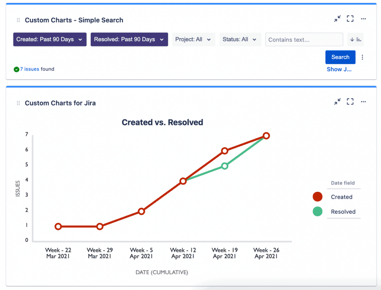
Are your IT team able to handle all the requests they’re receiving? A Created versus Resolved Requests chart tells you yes or no, by letting you track the number of requests created and resolved over a set period of time. If the team are receiving more requests than they’re resolving, you can take action to avoid delays, service-level agreement (SLA) breaches, and bad reviews by reallocating resources to help them.
There is a basic Created vs Resolved chart in out-of-the-box Jira Service Management, but you can’t customize it, stopping you from getting your message across in the way you deem fit. The Custom Charts for Jira and Confluence version lets you change colors and labels, add a description, change the chart type, show/hide data, customize the legend, and more.
You can also link your Created vs Resolved chart to a Simple Search gadget to dynamically filter the dates and decide what you want to see at any moment, e.g. requests in a particular service desk queue.
Time to First Response
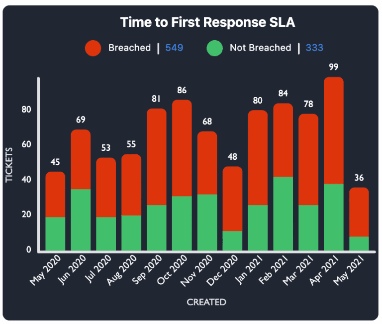
Making sure you are sticking to the time for responding to customers stipulated in your SLAs is probably the main concern all customers have. They want to know that their requests and problems are being addressed, which makes time to first response one of the most important ITSM metrics to monitor.
In Custom Charts, you can visualize time to first response in many different ways; the 2D stacked bar chart above is only an example. It focuses on whether you’re adhering to your SLA, but you might also want a chart that shows how long you’re taking to respond, like the one below.
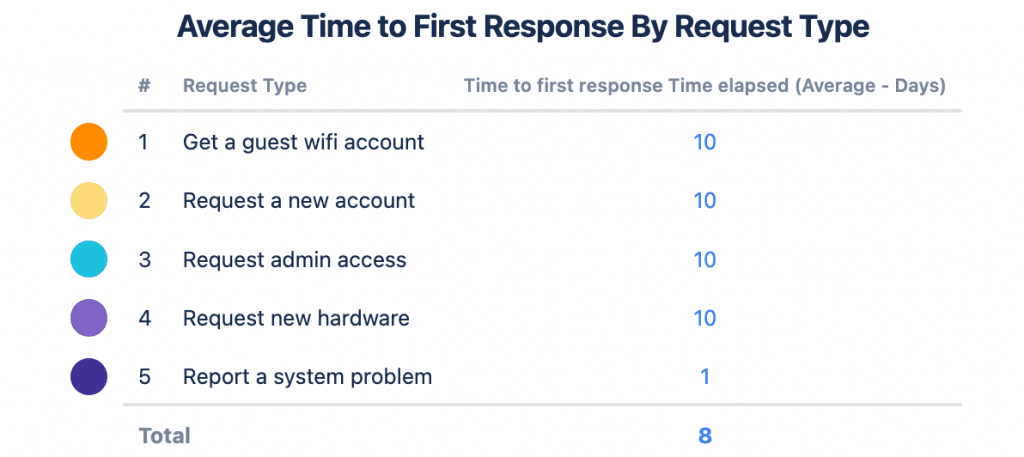
This tracks the time per request type and lets you see how well you’re serving your customers and which requests are taking the most time. Taking 10 days to respond to customers on average isn’t going to result in much happiness!
Time to Resolution
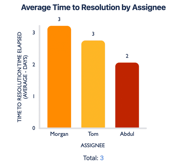
Time to resolution is another critical SLA metric and shows how long the ITSM team is taking to resolve requests from when they are first logged in the service desk. In Custom Charts, you can break down this data by request type, priority, or – like we have – by assignee.
Segmenting time to resolution data by assignee provides valuable information about team efficiency and productivity. For example, if it’s taking one assignee way longer to resolve requests than another, then it could mean that the workload is not balanced or more training is required.
SLA Success by Project
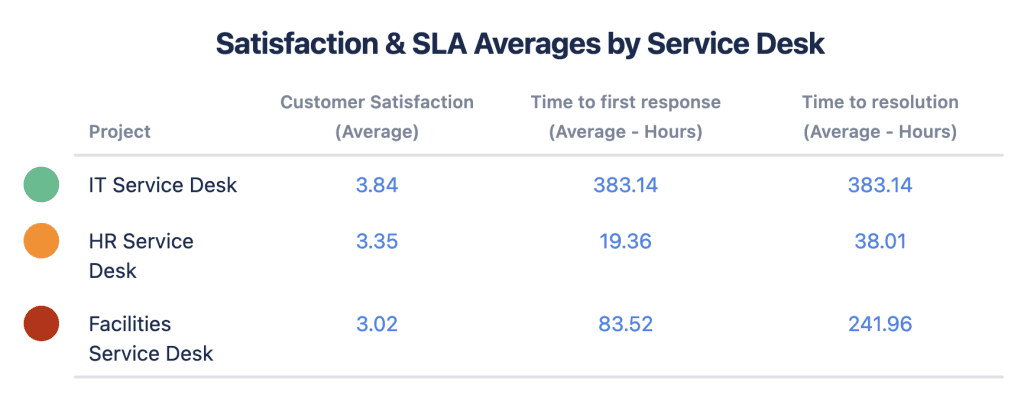
Taking a broad look at how your ITSM team are performing next to other teams is great for triggering conversations and inspiring deeper investigation into why something is happening. The 2D table chart above offers a broad overview of your SLA success and customer satisfaction and compares it to other Jira projects.
You can see that although the IT team’s customer satisfaction is higher than that of the HR and facilities teams, they’re taking much longer to respond to and resolve requests. This could indicate that they have too much on their plate and need some help.
Service Desk Queues
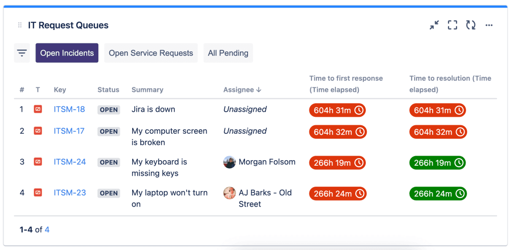
Jira Service Management has a filter that lets you organize requests into queues and view, triage, and assign them as they come in. You can display vital information about the requests in different queues using Issue List, keeping teams alive to what’s going on.
Issue List is a separate gadget that comes with Custom Charts and allows you to have specific issue details, e.g. summary, status, and assignee, on your Jira dashboard. It comes with quick filters that let you divide the issues into different service desk queues as shown above. Also shown is a feature that lets you see whether your SLAs have been breached; if they have been, they go red, but if not, they’re green.
Agents’ Workloads
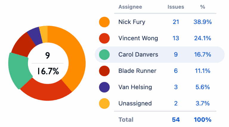
For your service desk to be successful, your ITSM team need to be able to stay on top of their workload. It’s important to monitor this as a way of making sure work is distributed evenly and fairly and no one has too much on their plate.
For example, the pie chart above shows that Nick Fury has more than double the amount of ITSM issues to deal with than some of the others. We all know that Nick Fury really shouldn’t be trying to do everything himself. Armed with this data, you can do what Fury should’ve and get the Avengers to help him.
This pie chart is showing workload based on issue count, but you could also view the same report based on the original or remaining estimate, or time spent on the issues.
Requests Per Organization
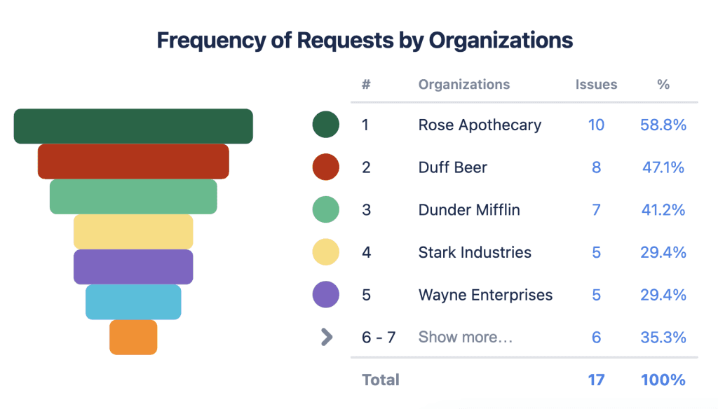
In Jira Service Management, service desk customers can be grouped into Organizations. The funnel chart above is a great way of visualizing where your requests are coming from, so you can see which of your customers are submitting the most/least.
You could even add a second variable to offer the audience more detail around different customers’ requests, e.g. their status. Displaying both issue count and status per organization in the 2D stacked bar chart below offers a valuable insight into which customers may be at risk. As you can see, Rose Apothecary and the Bluth Corporation have barely any issues resolved, plus several escalations. This means there’s a chance they may not be satisfied with the IT team’s customer service.
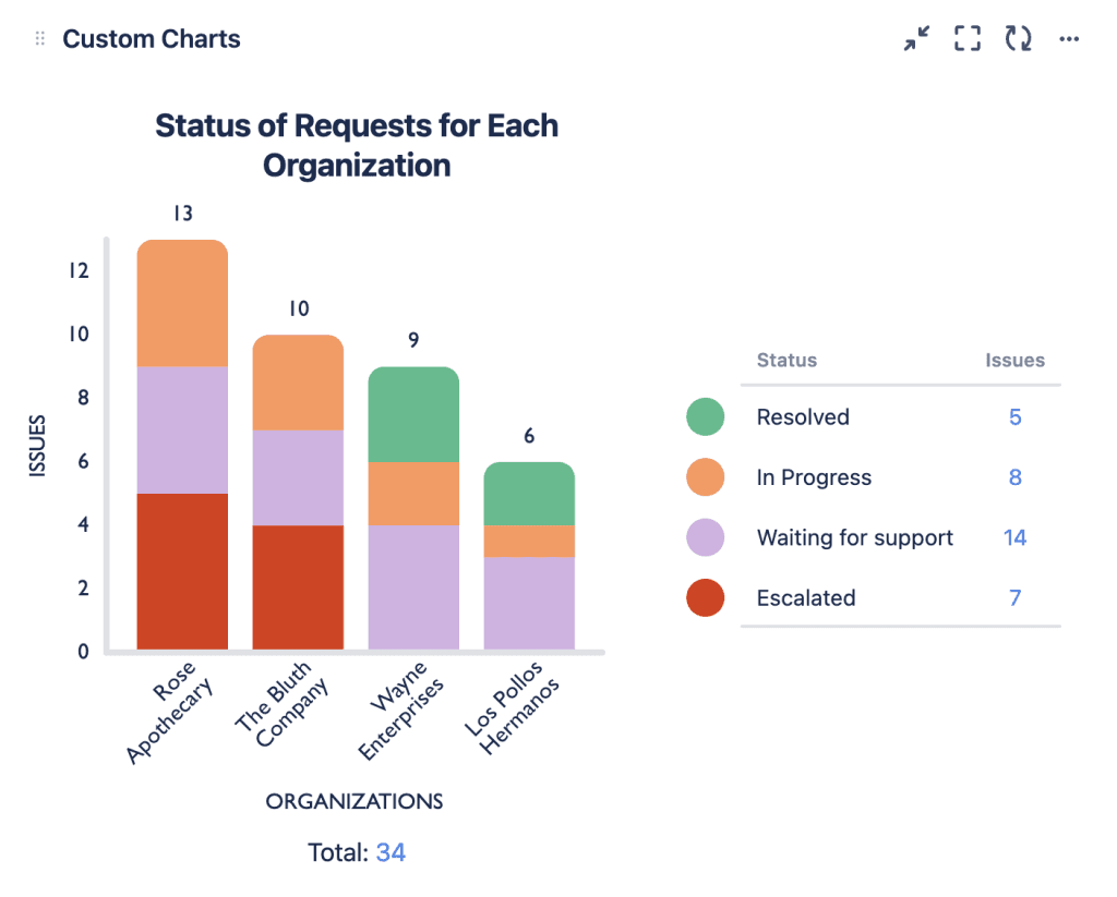
Most native JSM reports don’t let you chart by Organization, but Custom Charts lets you use it just like any other field in your instance.
Changes Planned for the Month
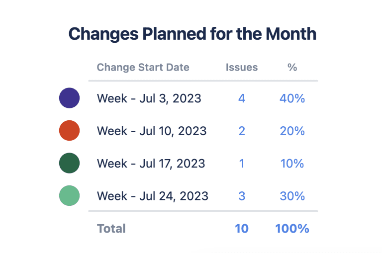
Change management is an important ITSM process that involves making changes to critical systems and services whilst minimizing risks and disruptions. It’s important for ITSM teams to track change metrics and find out about the impact of changes and whether they’re being realized in a timely and effective manner.
Your team would likely benefit from a dedicated Jira dashboard especially for this purpose, but on your main ITSM dashboard, a useful insight for the team would be simply what changes are about to happen. That way, everyone knows what’s going on and can stay aligned. The table chart above serves this purpose with a simple count of how many issues/changes are due in each week.
Customer Satisfaction
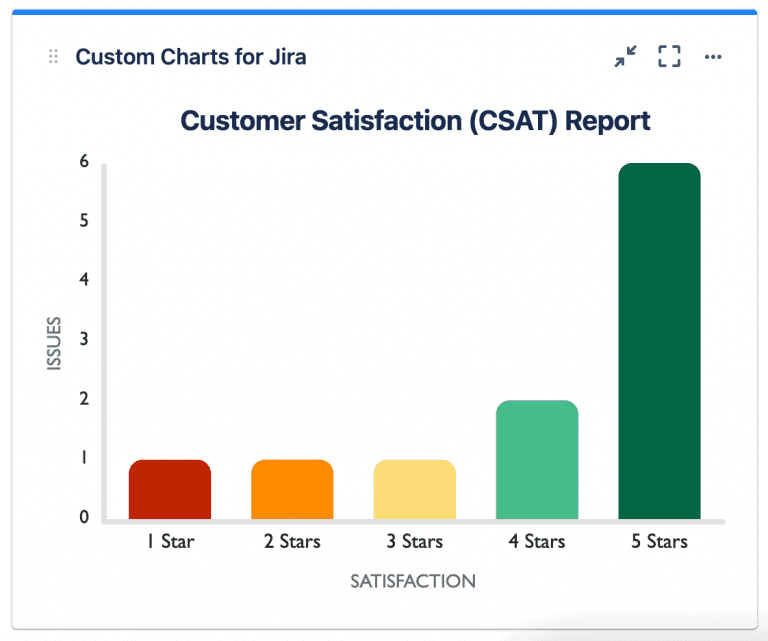
If you’re wondering what the most important metric is to have on your ITSM dashboard, you’ve found it. Satisfying customers is what IT services are all about, so making sure you track how customers are responding to the service experience is the highest priority.
There’s only one customer satisfaction (CSAT) report that ships with Jira Service Management and it’s very limited. In Custom Charts, you can visualize CSAT however you want, like the bar chart above. You can also display average CSAT ratings per assignee (or any other custom field) to work out where to focus your attention for improvement. For example, if one service desk agent has a low CSAT rating compared to others, it could mean that they require additional training.
Requests by Component
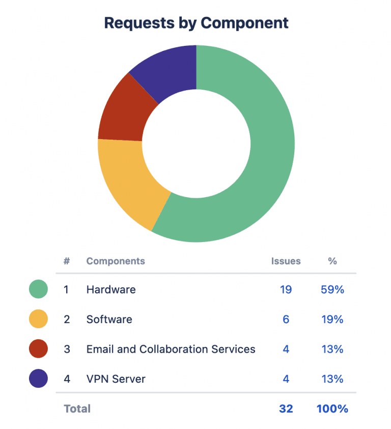
All Jira projects come with Components, which allow customers to categorize their requests from customers for better organization, e.g. a Hardware component which then gets automatically assigned to all requests that relate to IT equipment.
The pie chart above shows the different types of requests coming in. As 59% revolve around hardware, this can trigger a discussion about whether the customers’ computers, phones, printers etc. are aging and need replacing.
Conclusion
Incorporating these charts into your JSM dashboards will help IT teams manage and improve the quality of service they’re delivering. Together these charts offer an excellent overview of customer satisfaction, request patterns and trends, workload, and SLA compliance. They provide triggers for conversations and deeper investigations into why things are happening.
Some of the charts in this article are available in out-of-the-box Jira. However, they’re not customizable and you won’t be able to change colors, show/hide data, chart by estimates, chart in 2D, dynamically filter your charts, customize the legend, or change the chart type. You can’t chart by Organization or create SLA reports directly on the dashboard, and you’re stuck with a simple table for a CSAT report.
With Custom Charts for Jira, you can make all the charts in this article, but you can also change them how you see fit. If you don’t want a pie chart (many aren’t fans of pies! We are, though), then you can change it to a bar chart. If you want a particular color scheme, then Custom Charts has a full color picker with every chart (and you can also set default colors for new charts). And with Simple Search, you can filter data down on all Custom Charts and Issue Lists to show only what you need to see.
Want to see how a Custom Charts dashboard can power up your ITSM?
Sign up for a demo
Request Demo

