How reporting with Jira visualizations builds a more engaged audience
Tempo Team
There’s no doubt Jira generates valuable insights into the status and efficacy of project and ITSM teams. The question is how to best use this data to communicate progress and drive success. If you present this information as a list of numerical values, you’ll quickly notice a sea of crossed eyes and nodding heads.
The fact is, human beings don’t process written or spoken information as quickly as visual info. Your brain can identify images 60,000 times faster than text – faster than the blink of an eye. Whether you’re working with Jira service management, issue management, or project management, you must help your audience visualize data if you want them to remember and engage with it.
Creating visuals from your Jira reports may seem a tall order, but Atlassian makes reporting with Jira visualization easy. Within minutes, you can transform complex data from Jira work management software into digestible and actionable information for stakeholder analysis.
What is Jira visualization?
Jira visualization is the built-in functionality that creates graphical representations of information in the Jira software database. Instead of copying dry numbers from a spreadsheet, you can use creative visuals, such as charts, graphs, and maps, to help your audience comprehend data related to issues, sprints, and epics.
Graphics allow stakeholders to grasp info in a fraction of the time it would take to crunch the raw data. They will spot trends or anomalies they would otherwise miss. Anytime you need a fast, evidence-based decision, Jira visualizations will help you make an informed choice.
Despite their utility, visualizations aren’t a one-size-fits-all solution. You must choose the right type of graph or chart to represent your data accurately. A poorly constructed visual leaves readers confused or – worse – misleads them entirely.
The importance of report visualization in project management
Visualizing your project reports significantly benefits you, your team, and your stakeholders. Here are the most significant advantages:
Enhanced reporting and analysis
Jira visualizations allow you to populate project updates with valuable insights like status, task completion rates, resource allocation, and more. With visually compelling reports and concise, meaningful project data, stakeholders can make informed decisions that improve productivity and client satisfaction.
Real-time progress tracking
Project execution is a dynamic process. As the project manager, you must track every development and deviation from the project plan. Jira visualizations deliver real-time updates to your dashboard, including:
Project status
Team performance
Issue connections
Task progress updates
Resolved issues
Using this comprehensive overview of team activities, you can swiftly identify bottlenecks or resource shortages. Timely insights help you formulate an action plan and keep projects on track before these issues impact your schedule and outcomes.
Improved communication and collaboration
Stakeholders don’t have time to wade through reams of data to arrive at a conclusion. Jira facilitates communication by providing basic visualization options for project data that are easy to understand and interpret. They’re invaluable to distributed teams and stakeholders with different backgrounds.
Graphical information acts as a common language, helping team members collaborate and establish shared goals regardless of technical expertise or discipline. Here are just a few of the graphics that can help your team optimize processes, mitigate risk, and drive overall success:
Pie charts
Burnup and Burndown charts
Bar graphs
Cumulative flow diagrams
Reporting in Jira: Visualization tools
No matter your framework, Jira has a variety of visualization tools to illustrate any aspect of your project management practice.
Agile boards
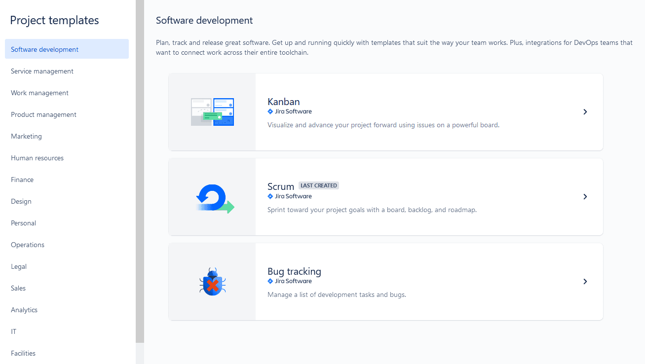
Agile boards are an essential part of agile project management. Jira offers a visual depiction of either a Scrum board to organize sprints or a Kanban board to manage project team workload and progress.
(Source: Reliex)
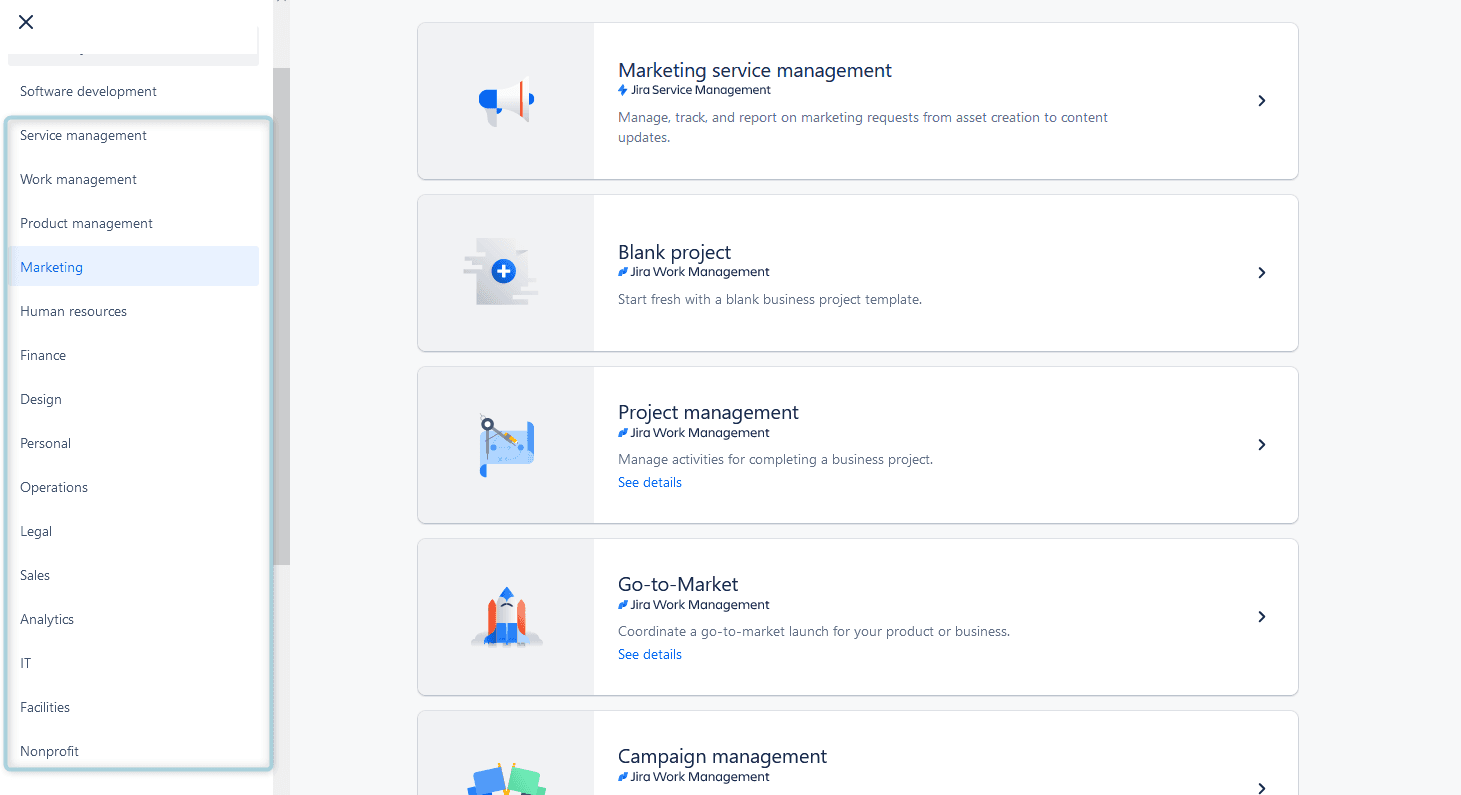
If you operate using a non-agile project management framework, Jira has project templates to help you visualize projects, too.
(Source: Reliex)
Charts
Jira lets you illustrate the details of an initiative’s progress using pie and Gantt charts. Gantt charts illustrate your project’s timeline by mapping out tasks and dependencies, allowing teams to monitor productivity and meet their deadlines.
Pie charts help to visualize task distribution by assignee, issue type, and project component, giving teams a quick overview of the project’s status.
Jira Reports
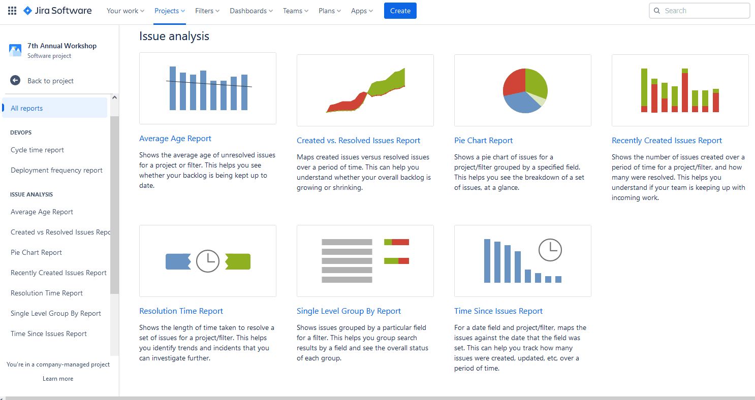
Jira reporting tools are a great way to view your team’s activities. You can quickly visualize project data related to task execution, resource workloads, progress, and results in a single, convenient location.
(Source: Reliex)
Dashboards
Imagine visualizing all your project’s vital metrics from a single, customizable, user-friendly page. That’s the power of Jira Dashboards. By selecting the information you want to visualize and track, your project dashboard becomes the data center for all your activities. Information related to project progress, KPIs, and other essential measures is updated in real time, so you can always see your work’s immediate status.
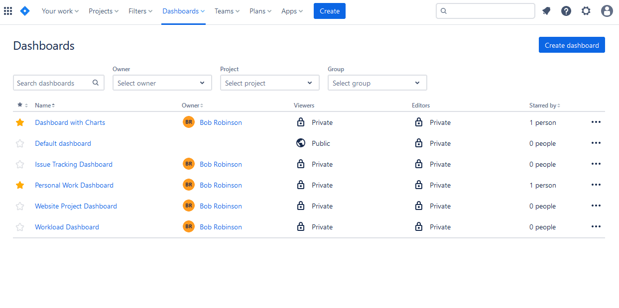
(Source: Reliex)
You can create a private dashboard or share it with your team and other essential stakeholders.
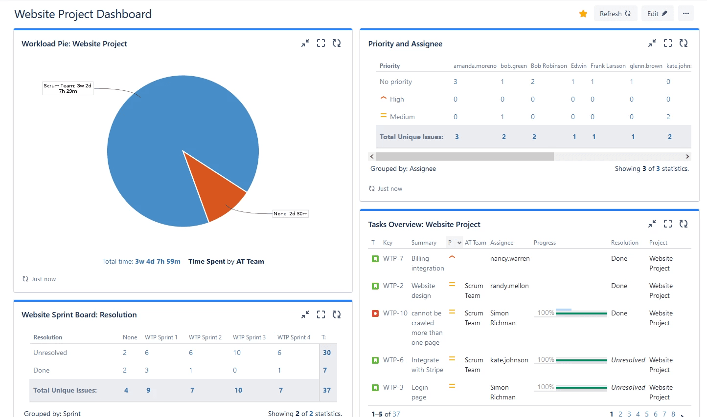
(Source: Reliex)
Best practices for visualizing Jira reports
Want to ensure you’re generating understandable and actionable insights into your team’s performance? Jira reporting tools are intuitive, but you’ll get even more out of them with these tips:
Define clear objectives
To create relevant and meaningful visualizations, clearly outline each graphic’s purpose. Once you understand the objective, identify which metric, KPI, or project element you can use to deliver the desired result.
Download add-ons
You can improve Jira’s visualization and monitoring power by downloading additional dashboard gadgets and third-party plug-ins from the Atlassian Marketplace. They can help you display:
Burndown and burnup charts
Pie charts
Issue statistics
Activity
These enhancements give your team more control to personalize their own visually engaging and informative dashboards, timesheets, and reports. With so many choices, including Jira cloud and server options, you’ll have no problem finding an add-on to suit your project’s objectives and visualization requirements.
Consider the data
When adding a graph to a report or presentation, the goal is to visualize data that is either too complex or too numerous to explain in words. Not to mention, it should take up less space. If your chart is too convoluted or confusing, like this one, you would probably be better off without it:
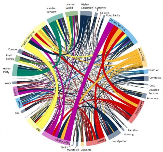
(Source: Old Street Solutions)
Know your audience
Before creating graphs and charts, familiarize yourself with the requirements and preferences of your target audience. Determine the most helpful way to facilitate their understanding of critical insights. Finally, gauge their familiarity with the data and adapt your visualizations to match.
Choose the proper visualization method
Not all charts are created equal. There are good visualizations, and then there are bad ones. Take pie charts, for example. They do a fantastic job of showing how parts relate to the whole, but they struggle to illustrate subtle differences in data. Can you identify the second-largest slice in the following pie graph?
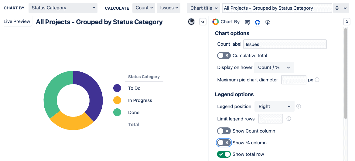
(Source: Old Street Solutions)
Not so easy. Now, try it with the same data in a bar chart:
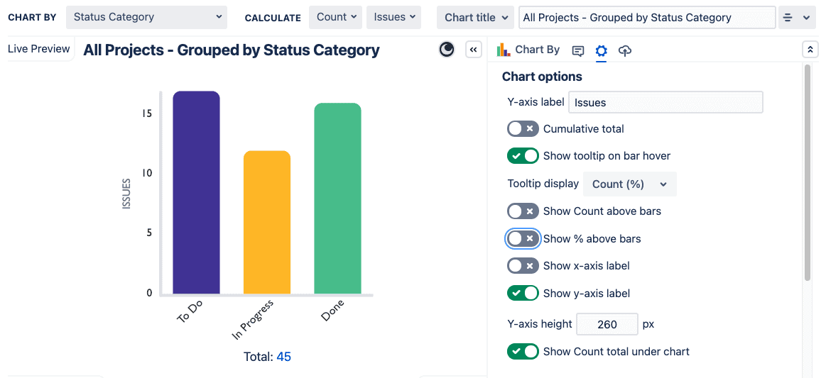
(Source: Old Street Solutions)
Much easier! Humans are better at judging differences in length than in angles or area, making a bar chart the best visualization choice for this info.
To ensure clear visualization of your Jira data, assess whether the information is chart-worthy. Is creating a graph of just two data points worth the time and space in your report? Sometimes, you’re better off using a table layout.
If your chart is genuinely helpful, consider the pros and cons of different visualization options and choose one that best fits your needs.
Bar charts are great for showing differences in values
Line charts are appropriate to represent continuous data that changes over time
Scatter plots and histograms illustrate sample size and data distribution, helping you identify anomalies and outliers
(Source: Old Street Solutions)
Additional tips
After choosing the correct chart, there’s more you can do to clearly convey your message. Here are a few more items to consider when adding visualizations.
Colors: When a graph relies on visual differentiation, use a contrasting color scheme. Also, consider what message you’re sending with your choice. For example, people tend to associate red with stop and green with go. Your palette could unintentionally build perceptual bias into the graphic.
Quantity: Consider using multiple charts for the same data set. If your data drives a lot of insight, two simple charts may be better than one complex visualization.
Legibility: Ensure your chart is easy to read by avoiding confusing background images and distracting colors. Format your legend and additional text to prioritize visibility.
Clarity: You want your audience to be impressed with your data, not your design skills, so don’t waste your time on fancy styling. Focus on communicating vital information.
Necessity: Don’t add charts simply because you think it’s expected. Often, a table of raw data is all you need, especially when dealing with a small sample size.
Power up your Jira visualization reporting with Tempo
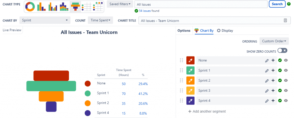
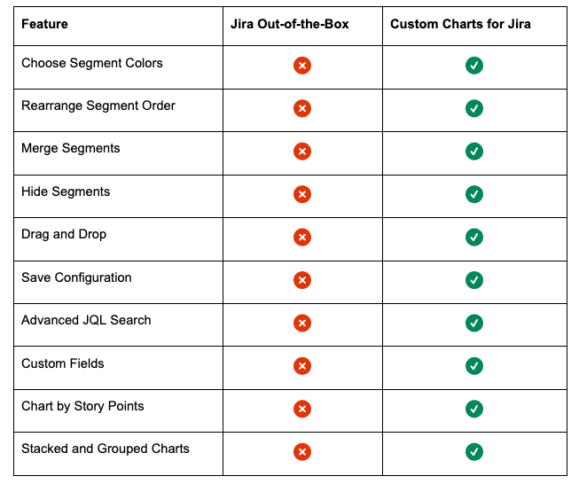
The visualization function for Jira dashboards and reports is highly effective, but Tempo’s Custom Charts for Jira adds even more controls and features. The platform lets you quickly switch between various chart types, customize colors, filter data using JQL queries, and more.
Compare standard Jira reporting with Custom Charts to see how it can help you level up your data visualizations.
And you aren’t limited to data housed within Jira. Custom Charts also integrates with Tempo Timesheets and Structure to report on time tracking and epic completion. It also works with various third-party apps to visualize every facet of your project.
You can share your dashboards outside Jira, configuring read-only charts to communicate with customers via the Jira Service Management portal. You can also add reports to a Jira Confluence page to improve collaboration between IT, development, and business team members.
Whatever your data visualization goals, Tempo’s Custom Charts for Jira can help you achieve them.
Sign up for a demo
Request Demo

