5 tips for enhancing your reporting in Jira and Confluence
Tempo Team
How long do your standup meetings take on average? In most cases, people spend between 30 minutes and 2 hours per week. The biggest reason for the dragged-out process? People don’t convey their message in a succinct or engaging way.
Data is a powerful tool when used correctly
Interesting, insightful, and even playful data captures imaginations and drives behavior. If your data isn’t driving a change in behavior, it isn’t being used properly. And using it properly means visualizing it. Data visualization is the essential final step of data analysis. It’s the bit that ensures that the information gets translated into something that firstly, goes in, and secondly, gets interpreted the intended way.
For example, imagine sitting in a Scrum meeting, discussing an update, and providing your team with the following table:
January | February | March | April | |
Completed Issues | 15% | 15% | 25% | 25% |
In-Progress Issues | 35% | 40% | 40% | 45% |
Unresolved Issues | 50% | 45% | 35% | 30% |
The spreadsheet lovers in the room might be paying attention, but most are probably staring out the window, wondering what they’re going to have for dinner, or browsing Facebook. And even those who are paying attention – how many of them are going to remember the point you’re making with those numbers?
So maybe don’t say it with numbers. Say it with pictures. Like so:
A chart or graph is capable of conveying a clear message in a way that a simple list of numbers can’t. There’s a reason kids are encouraged to read picture books as they’re learning and it’s because visuals help them understand what they’re reading. If children are struggling with the words, illustrations help them figure out the narrative, thereby increasing their comprehension.
The same is true for adults trying to understand data. If we’re struggling with the numbers, visuals such as pie charts, line graphs, heat maps, or some other infographic can help us understand those numbers and figure out the narrative – the data story – that’s being told.
For example, in the bar chart above, you’re able to see clear levels of improvement instantly. Just one glance and the entire team knows what’s going on. There’s a reason “a picture paints a thousand words” is such a cliché – it’s true. Complex or multiple ideas are often better conveyed with a single image than with a profusion of words or numbers.
So, how do you go about creating charts in Jira and Confluence that paint a thousand numbers? Here are 5 tips for getting started.
Tip 1: Get onboard with Jira dashboards
There are two main reporting options in Jira: board reporting and dashboard reporting. Board reports are accessed and generated one at a time from individual boards and are a snapshot of your data. Dashboard reports are called gadgets. Gadgets are dynamic reports that can be loaded in multiple onto a dashboard screen, offering a cross-team, cross-project view of what’s going on in near-real-time.
Dashboard reports are much more versatile than board reports and you don’t need to go looking for them; they’re right there in the dashboard. Importantly, though, using Jira dashboards means you can swap out the built-in Jira gadgets for more customizable and visually appealing versions using the Custom Charts for Jira add-on (which isn’t available for board reports).
There’s sadly no built-in dashboard reporting in native Confluence. In fact, your reporting options in Confluence are extremely limited, with only a few standard Jira board reports capable of being generated on a Confluence page. Anything else you’d have to build from scratch. That’s unless you have our Custom Jira Charts for Confluence add-on, which has the exact same functionality as Custom Charts for Jira and allows you to have dashboard reporting (beautiful and fully customized dashboard reporting) on your Confluence pages.
Find out more about why Jira dashboards are so useful.
Tip 2: Make charts that are well-structured and easy to read
In other words, avoid many of these downright dreadful data visualization practices. But more than that, make charts that clearly convey your intended message. Don’t include unnecessary variables that water down what you want to get across. Conform to people’s color assumptions. Lay out the text so that your audience doesn’t have to tilt their heads to read it. Avoid confusing background images, distracting colors, and 3D. And importantly, make sure you’re using the right kind of chart. For example, bar charts are better than pie charts when it comes to displaying small differences in values, as illustrated below.
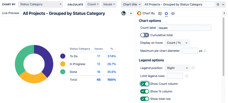
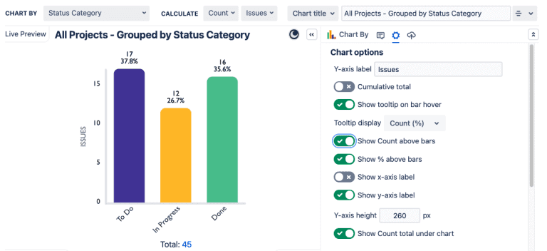
Sometimes making better charts will involve investing in better tools. Out-of-the-box Jira will only let you go so far, which is why an add-on like Custom Charts can be enormously helpful.
Tip 3: Use colors to tell a story
Colors are important storytellers because of the psychological associations that come with them. For example, warm colors are considered “active” or “advancing” and cool colors are “receding”, which is why a warm-to-cool color scale is normally used in heat maps.
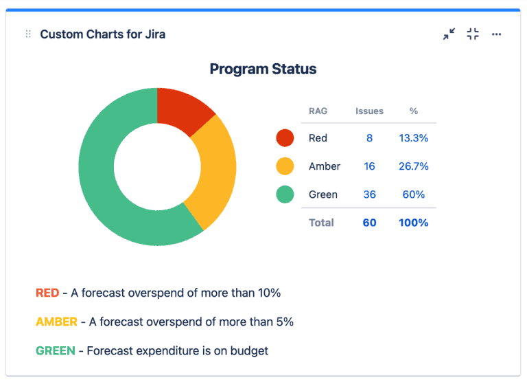
Then there’s red, amber, and green (RAG) coloring, one of the most commonly used tools in project management. This is because it’s already used in so many other fields to indicate health and risk levels. Not just traffic movements but airport departures, bed occupancy in hospitals, factory production lines, and even the healthiness of pre-packaged food.
Because of this ubiquity, everyone knows that red is bad, and green is good. This is why RAG coloring is a great tool for making charts where you want the status and health of your projects to be immediately obvious to the team.
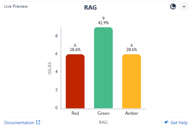
That said, RAG coloring isn’t actually available in native Jira. In fact, there’s no color customization in native Jira reporting, despite its importance. To customize colors in your charts, you need an add-on like Custom Charts for Jira or Custom Jira Charts for Confluence, which come with a simple and user-friendly color selector. Then you’ll be able to create pie charts like this. Pretty, eh?
Tip 4: Create lovely charts and stick with them
Don’t you just love it when you learn where everything is in your local supermarket, then the next time you go in, they’ve moved it all around and you have to re-learn where the eggs, and sugar, and hair products are? 🙄
One of the main goals of enhanced reporting is shortening your meetings. If you’re constantly changing the color or structure of your charts, then each meeting requires time to unpack the new design. Once you’ve decided on a color scheme, and which types and formats of charts you’re going to use to show certain things, don’t change them for funzies. Only make alterations if/when you have to.
In Custom Charts for Jira and Confluence, you have the option of updating your already-made charts with new data without changing any colors, labels, or formats. And we will shortly be introducing a customized templates feature that will make reusing and repurposing charts even easier. You’ll be able to create frameworks for charts that will sit in a designated templates area for ease of access by any user who wants them.
Tip 5: Make charts only when you need charts
Before you attempt to make any kind of chart, be sure that what you want to present is actually worth creating a chart for at all. While you can build a bar chart for two or three units of data, it might actually be easier and more informative to present it in a table. Remember, data visualization is used to aid understanding. If it’s obvious that your audience will understand the data without visualization, then making a chart or graphic might be the thing that waters down or distracts from the point. Only use data visualization when the data is numerous or complex and it would therefore be easier to present it graphically.
Find out more about visualization in Jira and common data visualization mistakes.
Sign up for a demo
Request Demo

