Pie chart mastery: Using data visualization effectively
Tempo Team
If you’ve read any business or statistical report, you’ve likely come across a pie chart. These diagrams are a simple and effective means to illustrate and compare data for non-experts. But not everyone appreciates the humble pie graph.
In 2013, Pulitzer Prize-winning author and data expert Walt Hickey penned an article for Business Insider entitled “The Worst Chart in The World,” which opened with this:
“The pie chart is easily the worst way to convey information ever developed in the history of data visualization.”
And Hickey isn’t alone. He’s echoing sentiments from data visualization pioneer Edward Tufte and information technology innovator and consultant Stephen Few.
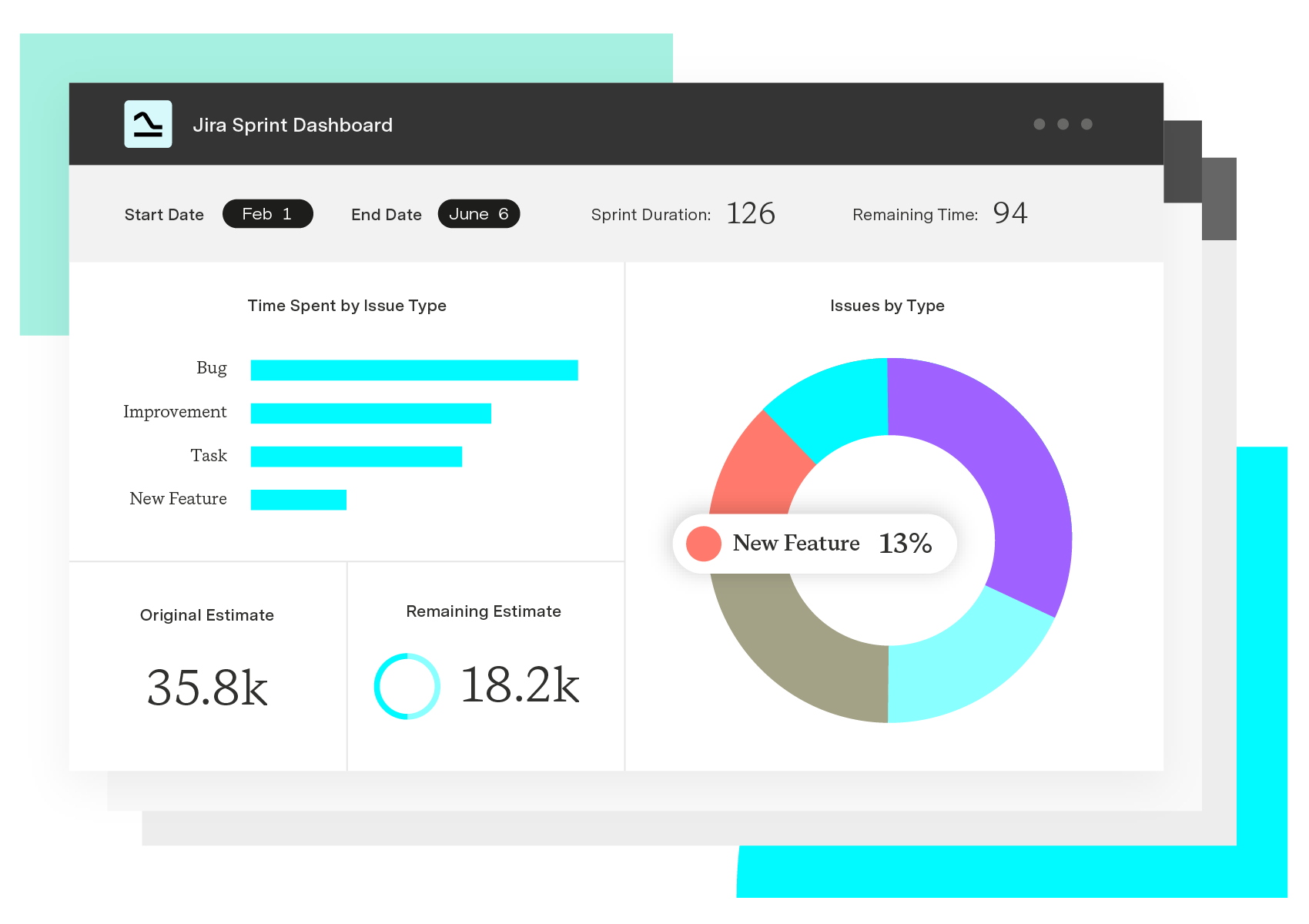
But despite the pushback, pie graphs remain popular. They’re used in stock reports, news sources, and corporate dashboards. In fact, they’re one of the most popular visuals used in Custom Charts for Jira.
So what’s the verdict?
Everything has a time and place – even the much-maligned graphic pie. A circle chart can be a powerful visual tool to convey information, but only if you play to its strengths and leverage it appropriately. It’s simple to build and easy for audiences to understand.
If you’re committed to creating pie charts for articles and reports in Confluence or other Jira platforms, we have the secret to unlocking the diagram’s potential as a communication tool.
What is a pie chart?
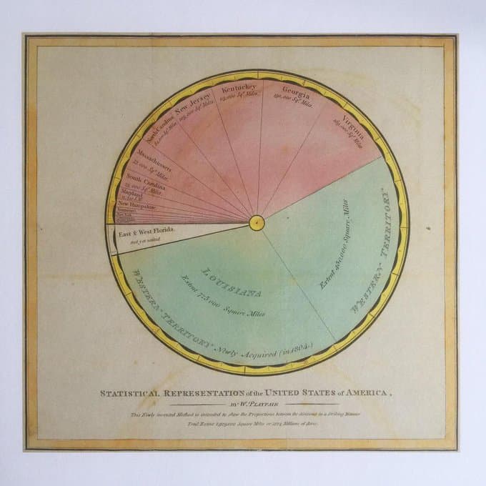
Historians attribute the invention of the pie graph to William Playfair, who published the first known circle diagram in his 1801 book, “Statistical Breviary.”
(Source: Research Gate)
A pie chart is a circular graphical chart divided into slices that represent a fraction or proportional amount of the whole. Each pie slice equates to a data point, usually a percentage. The piece’s central angle, area, and arc length at the outside edge correlate to the quantity it represents.
(Source: Third Space Learning)
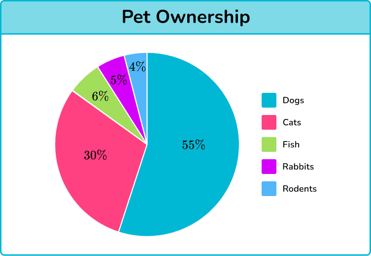
If you measure the central angle of each pie slice and then compare the number of degrees against the total number in a circle – 360 degrees – you’ll see that it’s the same percentage as is represented in the chart.
For example, the above chart suggests cats represent 30% of pet ownership. The angle making up the slice is 108 degrees, which is 30% of 360.
Central angle = 360° ✕ percent value
Central angle = 360° ✕ 0.30
Central angle = 108°
By representing data in a pictorial form, the pie chart helps its audience visualize and understand proportions and the relation of each statistic to the whole.
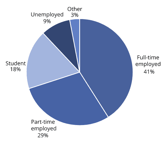
Types of pie charts
There are several ways to plot a pie chart to make the information more visually attractive for your audience.
Donut chart
Donut charts remove the center portion of the pie graph, creating a ring or donut. If necessary, you can plot another related data set and add it to the graph as a new ring.
(Source: Rosane Rech)
Exploded pie chart
In this variant, the creator pulls one or more slices away from the center for emphasis. This treatment affects the readability of the pie chart, making it hard to compare slices, so it’s best to use it sparingly.

(Source: Stack Overflow)
3D pie chart
A 3D variation is often used to improve the chart’s aesthetics, but it comes at the cost of readability. The chart may look cool, but the skewed perspective makes interpretation more challenging than a 2D version of the same data.
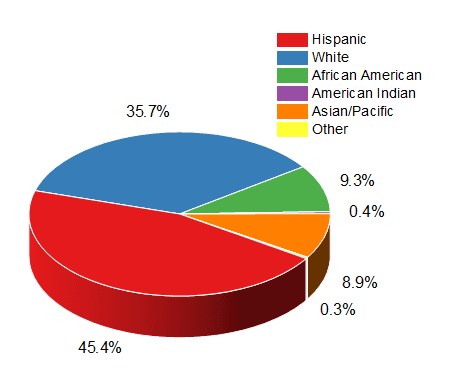
(Source: Origin Lab)
When should you use a pie chart?
Pie charts have a limited capacity to communicate information. They are only helpful when correlating the value of parts within a whole.
Some common pie chart examples include the following:
Illustrating market trends and consumer behaviors relative to total sales
Identifying the contributions of individual social media channels to total user engagement
Comparing the impact of related projects, tools, strategies, or individuals
Visualizing sales data by category
Profiling online user behavior
If the data you’re trying to illustrate meets this criteria, a pie graph is the way to go. If not, consider another chart type, like a line or bar graph.
Best practices to create your pie charts
If you’ve decided a pie chart is the best method to visualize your data, we have six ways to level up your circle diagrams. Follow these to ensure your audience understands what you’re trying to say in your next Confluence Jira Report:
1. Use different colors
Sure, a monochromatic effect looks dramatic, but it makes your pie chart hard to scan and interpret quickly.
(Source: Old Street Solutions)
Instead, use diverse chart colors so each data point stands out.
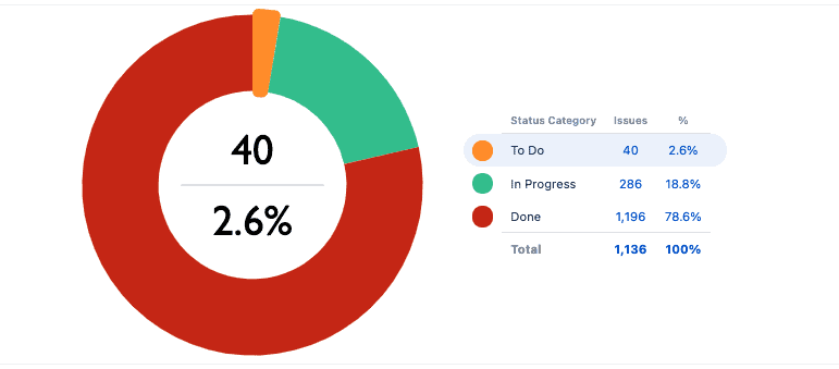
2. Use meaningful colors
Speaking of colors, relate them to the information you’re discussing. For example, if you’re creating a pie chart depicting Jira statuses, you could use the platform’s color scheme: blue for “To do,” yellow for “In progress,” and green for “Done.” These thoughtful touches make the chart meaningful and readable without additional explanation.
(Source: ApexCharts)
3. Eat the middle
By switching from pie to donut, you make your chart slightly more readable by prompting your audience to focus on the length of the arcs at the edge of the graph rather than the area or the angles in the middle. It’s still not as straightforward as a bar chart, but it’s an improvement.
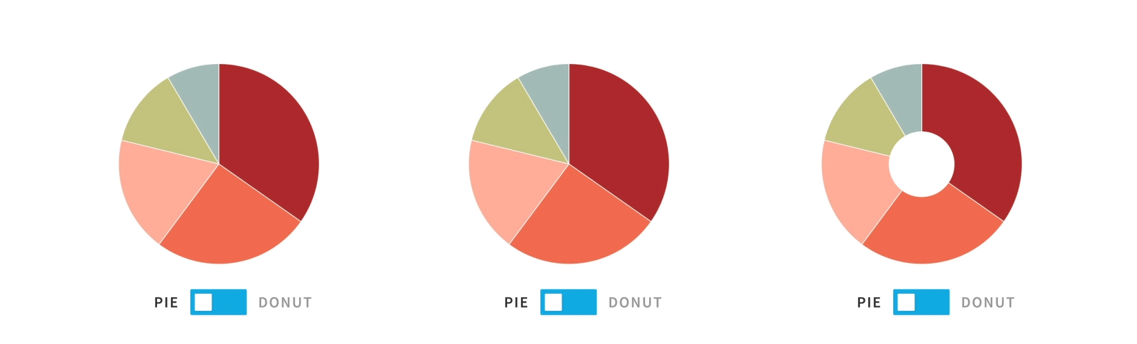
(Source: Old Street Solutions)
Also, you don’t have to leave the donut’s center empty. Adding some contextual information can make the open chart area more functional.
(Source: Old Street Solutions)
4. Sort your values
Order your slices from largest to smallest, or vice versa, to make interpretation more intuitive. Otherwise, the graph looks clumsy, and comparing each slice is difficult.
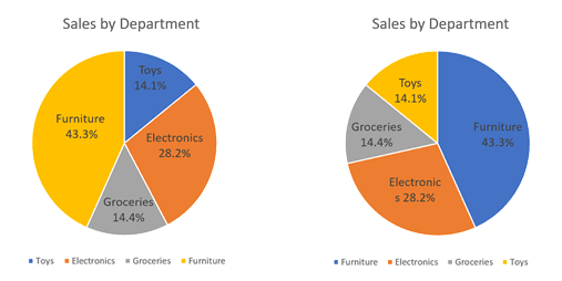
(Source: Spotfire)
5. Include annotations
Judging the proportion of each pie slice can be challenging, even when there are significant differences between data points. Make interpretation easier by adding annotations, data labels, or a legend. Remember, you’re using visuals to turn dry facts into a compelling story; that can’t happen without context.
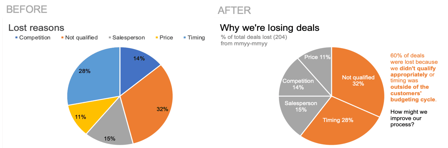
(Source: Storytelling with Data)
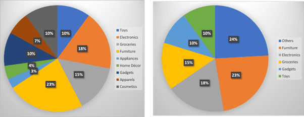
6. Merge smaller categories
If you’re dealing with more than five data categories or have some tiny pie slices, consider combining the smaller categories to improve informational representation.
(Source: Spotfire)
Common mistakes when using pie charts
Circle diagrams’ awful reputation results from mistakes in their use. Here are four of the most common errors and how to avoid them:
1. A pie chart isn’t the appropriate graphic
Step back and think about the data you’re trying to illustrate. If you’re handling percentages or contributions to a whole, circle graphs are the way to go – provided the numbers add up to 100%.
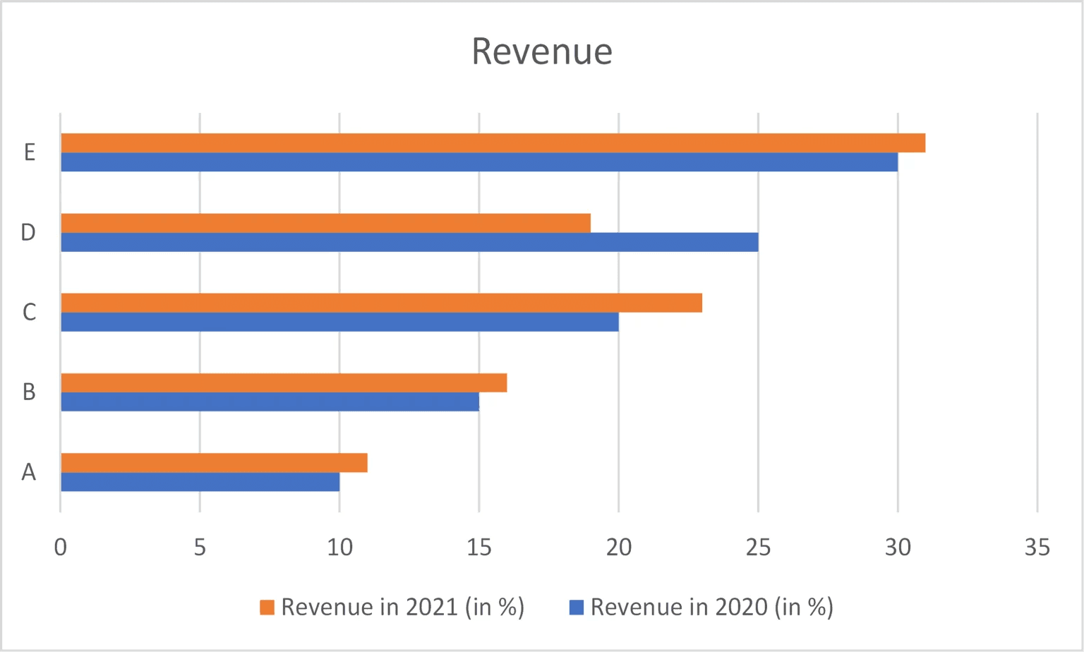
However, if you’re trying to convey the change in data over time, you’re better off using a line graph. And if the values you’re comparing aren’t pieces of a whole, try a bar chart. Consider these two pie charts showing categories of a company’s revenue for 2020 and 2021.
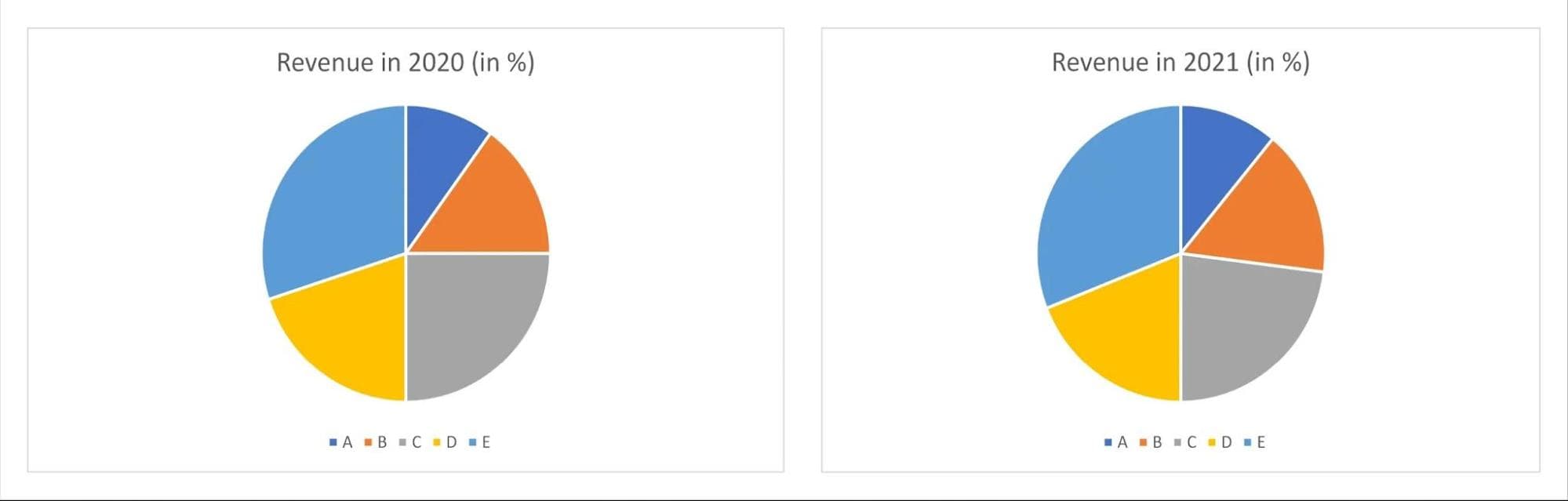
(Source: Info River)
There isn’t much of a difference between the two visuals. However, plotting the same information into a bar chart lets you clearly see how each revenue stream changed in a year.
(Source: Info River)
2. Too many slices in the pie chart
The beauty of a well-crafted pie graph lies in its simplicity. The audience should understand the information you’re trying to convey at a glance. With too many data points, the chart becomes convoluted, and your audience loses interest.
(Source: Old Street Solutions)
Too many skinny pie slices can make the chart hard to read. Instead, limit your pie to no more than five slices, although three is best.
3. Similar values
When the values in your pie graph are similar, your audience may struggle to differentiate between the slices. For example, can you choose the biggest slice in each graph?
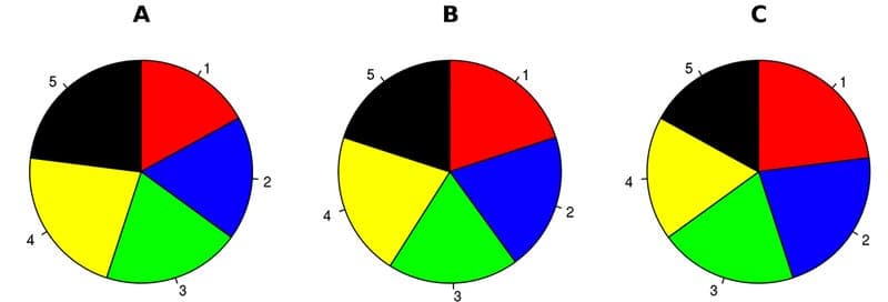
(Source: Old Street Solutions)
Not likely. Humans aren’t adept at comparing the sizes of circle segments. You need a legend or raw data to make sense of the information.
However, people are much better at visually comparing the lengths of rectangular columns. In this case, a bar chart would be the appropriate visualization method.
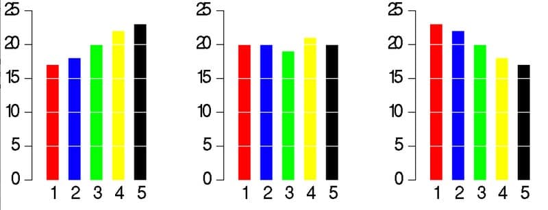
(Source: Old Street Solutions)
4. Skewed perspective
Some people get fancy with their pie charts and use a 3D effect. This format provides visual interest, but you could inadvertently deceive your audience.
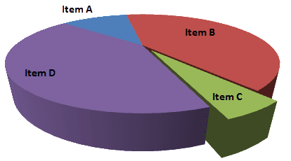
(Source: Old Street Solutions)
Because of the perspective, the area at the back of the graph looks smaller, whereas the sections at the front are bigger. Looking at the above graph, you would assume items C and D were more significant than items A and B.
When you look at the same graph in two dimensions, you can see the 3D version is misleading.
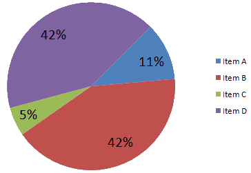
(Source: Old Street Solutions)
Items B and D are precisely the same, and Item A is larger than Item C.
If you still want to use the 3D version, it’s best to add another visual point of reference to help people compare pie slices – adding height, for example, to make the bigger pieces stand out. Carefully orient the diagram to avoid creating bias.
(Source: Shutterstock)
Wrap-up
Pie charts are a valuable tool for illustrating many metrics vital to project reporting. That’s why Atlassian includes graph creation functionality in its Custom Charts for Jira Reports and Custom Jira Charts for Confluence platforms. You can easily add pie graphs with custom chart colors to your Jira dashboard and reports.
And don’t worry if you don’t know how to make a pie chart in Jira. The online Atlassian community can help with tutorials and advice. So, pull up a chair and cut yourself a slice of the pie.
Sign up for a demo
Request Demo