When data visualization really isn’t useful (and when it is)
Tempo Team
Introduction
We know there are spreadsheet lovers out there. Good for them. But plenty of us get the ‘spreadsheet sweats’ when we’re expected to look at countless rows of numbers and make sense of them. After all, we’re not all numbers people.
This is why those who analyze and present data to an audience use data visualization. Data visualization is the representation of data in a graph, chart or other visual format. Stick a load of numbers in a table and your manager might not understand what the numbers mean to the business. But visualize those same numbers in the form of a bar chart, pie chart, heat map, line graph or some other infographic and they’ll come through loud and clear.
The chief benefit of data visualization is the ability to communicate data to a wider audience. It’s much easier to understand and care about what’s going on when you can see it. That, in turn, leads more stakeholders to make data-driven decisions.
Data visualization isn’t just for data scientists and analysts though. Whether you work in finance, marketing, tech, design or frankly anything, you need to be able visualize data to present findings to your audience. Fortunately, a proliferation of type: entry-hyperlink id: 5UWsJEqaQpEBbzSbQHsMIc in recent years has made it easier for professionals without any background in data to create charts and graphics.
Here at Old Street Solutions, we’re all about giving more employees the ability to do more things without having to revert to an ‘expert’. That said, just because somebody can create a chart doesn’t mean they’re going to do it well. There’s even a website out there called WTF Visualizations, dedicated to terrible charts, graphs and infographics. Visuals that do the opposite of what visuals should do.
This article explores some of the worst and best visualizations out there, and looks at some data visualization mistakes to avoid.
If you’re a Jira user who’s ready to start using Jira reports and dashboards to visualize their data and need some pointers, have a look at our guide to making useful visualizations in Jira.
How to confuse the hell out of your teams with dreadful visuals
Charles M. Blow said that using charts to confuse instead of clarify was the same as when a “drunken man uses lampposts – for support rather than for illumination”.
For example, there is such a thing as too many segments in a pie chart. Instead of hundreds, try 3. And certainly no more than 6.
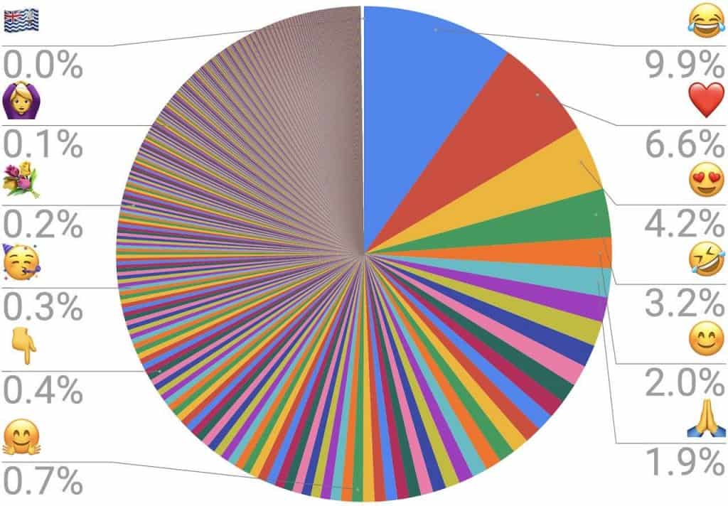
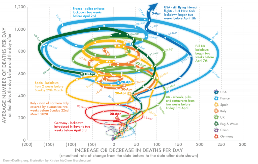
In the chart world, the following is what’s known as a ‘clusterf**k’. Don’t try this at home.
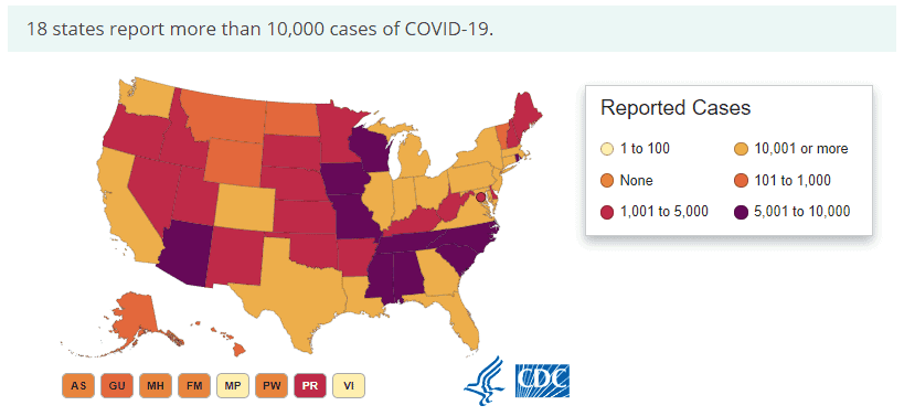
Now let’s look at heat maps. These use variations in color to give (hopefully) obvious visual cues about how a phenomenon is clustered or varies over space.
Not like this one. This one’s the anti-heat map. We’re wired to see the darkest or strongest color as having the highest amount of something, the lightest color as having the least. The following graphic goes against this assumption; the highest number of Covid-19 cases, “10,001 or more”, is represented by a lighter color than the lowest number, “None”. There’s literally no logic to the rest of the colors either. Fail.
Erm, who thought of this? Just no.
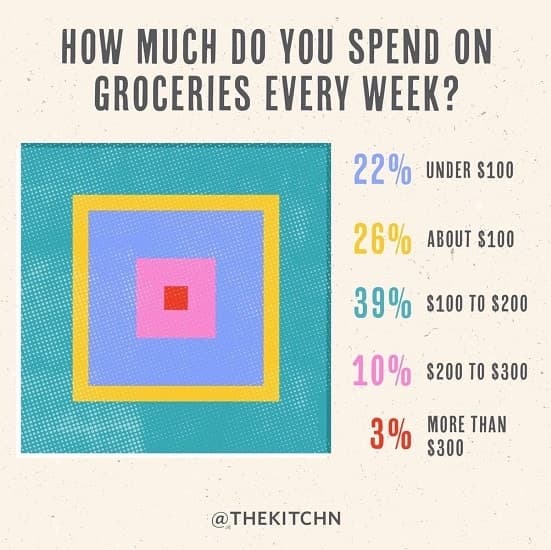
Here we have Fifty Shades of Red. Are we really supposed to distinguish all these?
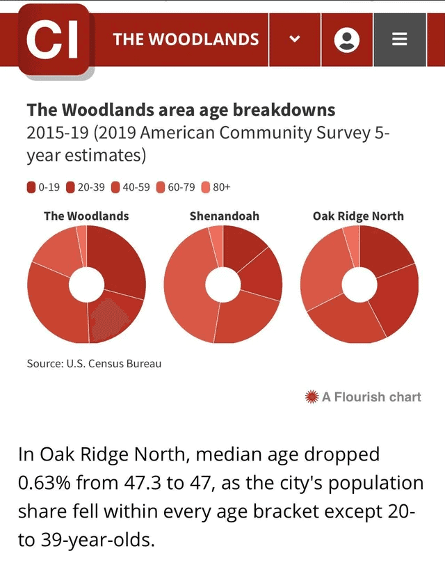
Next, statistician Nathan Yau said that if you see a 3D chart that’s 3D for no reason, like this one, then you should question the data, the chart, the maker, and everything based on the chart.
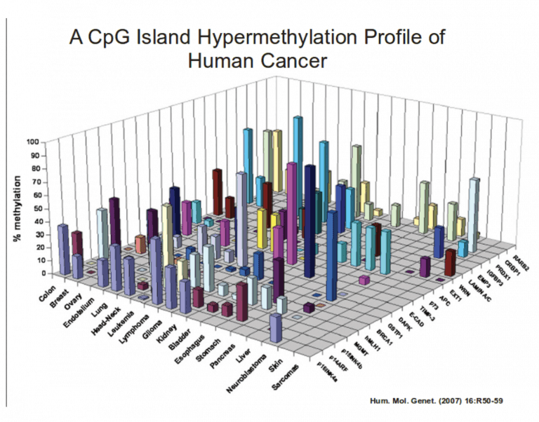
Talking of questioning charts and their makers…
Sometimes charts lie (or rather the people behind them do)
Sometimes a poorly made graph or chart is just an honest mistake. Other times it’s entirely deliberate and designed to mislead the audience as to the data. Nathan Yau over at Flowingdata.com explored the use of charts to spread misinformation in his article, “How to Spot Visualization Lies”.
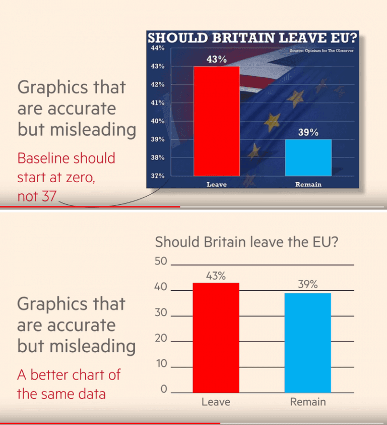
One of Yau’s examples is where the value axis is truncated in a bar chart. As bar charts use length as their visual cue, truncating the axis will over-dramatize the differences. It means that someone wants to show a bigger change than there really is.
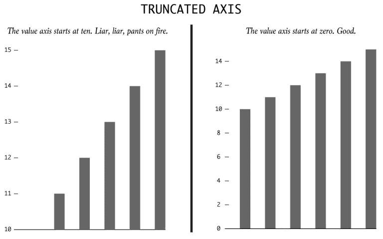
And here’s another example of how truncating the y axis can give a dramatically different impression of the data.
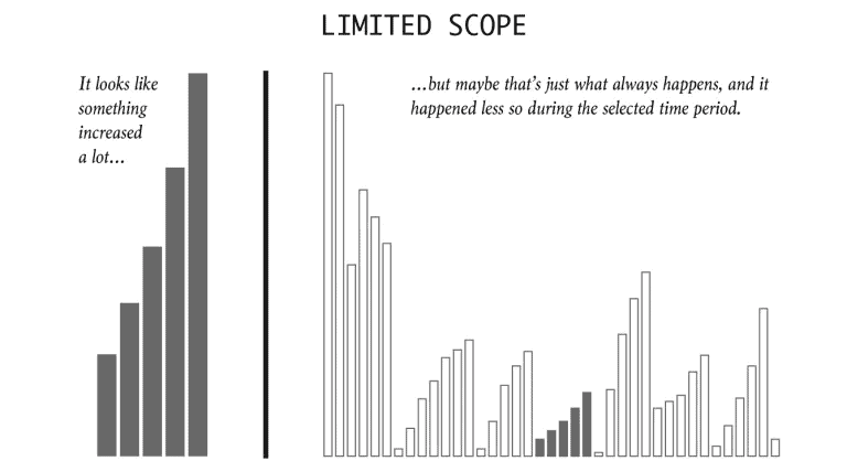
Yau also points out how easy it is to cherry-pick dates and timeframes to fit a particular narrative and again give the impression of a much more drastic change than is actually the case.
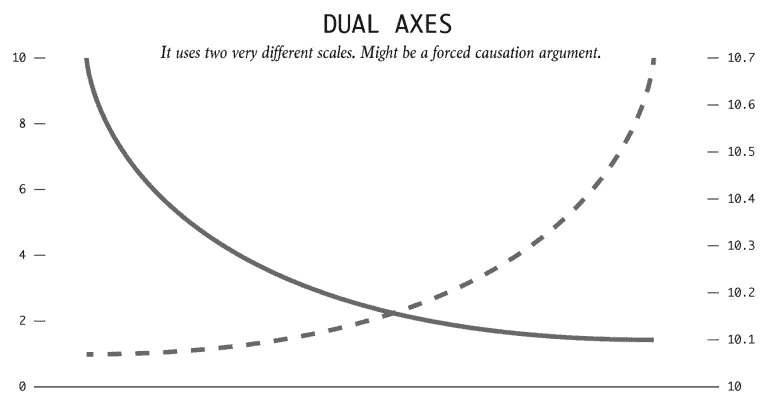
Then there’s dual axes. While many charts use dual axes quite legitimately (including Jira’s own Epic report), they’re sometimes used to imply correlation or even causation, i.e. “because of this, this other thing happened”. Tyler Vigen wrote a program to find random things that correlate as part of his spurious correlations project. He found, for example, that the divorce rate in Maine correlates with the per capita consumption of margarine. Steer clear of butter if you want a happy marriage, folks.
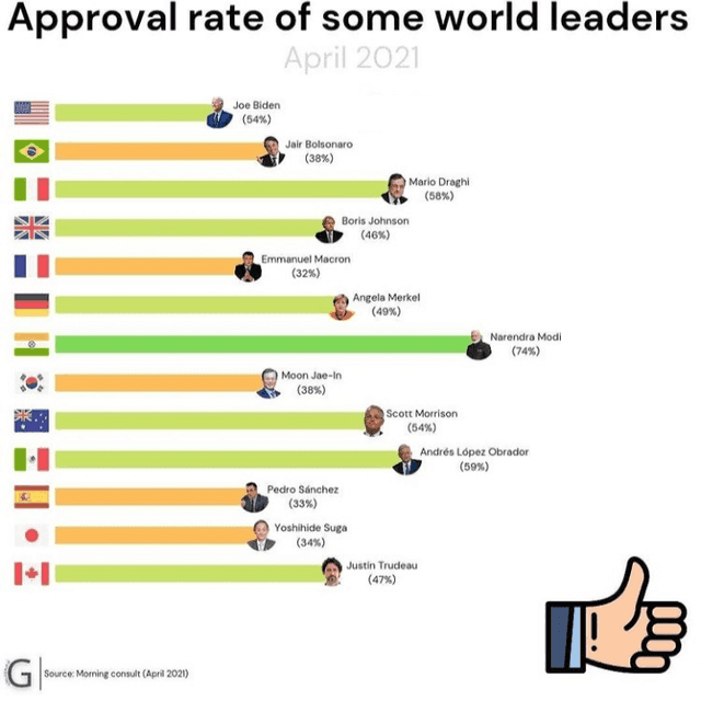
And of course there’s political agendas to consider. Whoever made this chart is clearly not a Joe Biden fan and really wants you to think that he has the lowest approval rating, even though most of the leaders in this graphic have a lower one.
And sometimes they’re the product of severe brain fartage
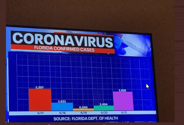
Like this one. Literally don’t know where to begin.
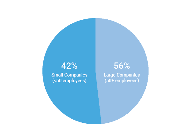
And this one made us chuckle. The smallest slice is 56%. And, er, 56% and 42% add up to 98%.
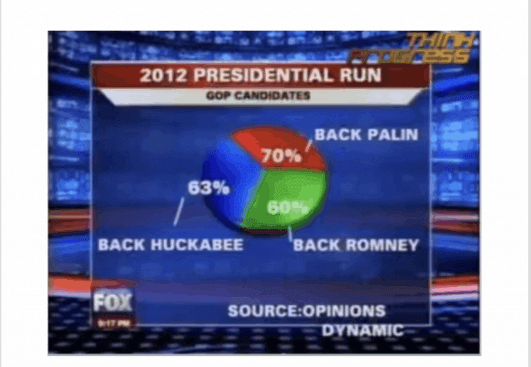
And finally, this one did the rounds on a few bad visualization sites. Again someone can’t count. The 3 slices in this pie chart add up to 193%.
But other times they’re totally stupendous
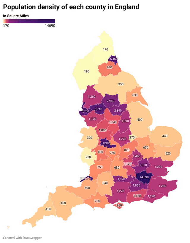
Here is a lovely heat map made in exactly the way heat maps should be. The denser the population, the darker the color. The fewer people per square mile, the lighter the color. And the change in hue is more gradual as well, unlike that useless heat map of US Covid cases above.
The fact that they’ve included the numbers in the county as well, so you don’t have to guess purely based on the color shade, makes it even easier to visualize the population density across the UK.
In this rather marvelous bar chart, there are only two colors and both are distinctly different. All the James Bond movies are named along the x axis, the color key’s explicit and obvious, and the white horizontal lines help us see where the bars sit in relation to the numbers. This clearly and attractively demonstrates that Spectre and You Only Live Twice were bloodbaths and Pierce Brosnan was not to be messed with.
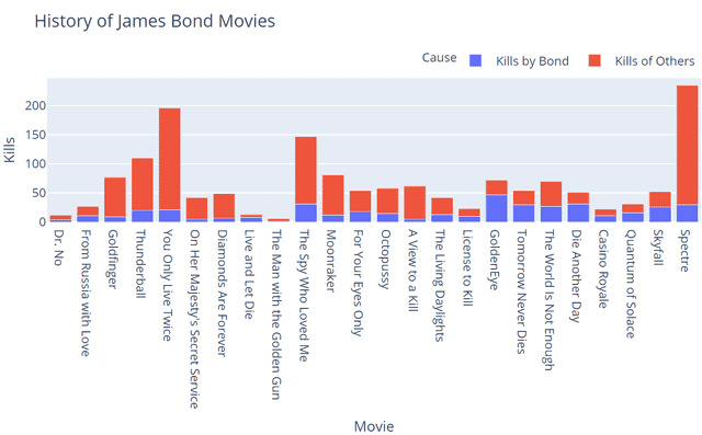
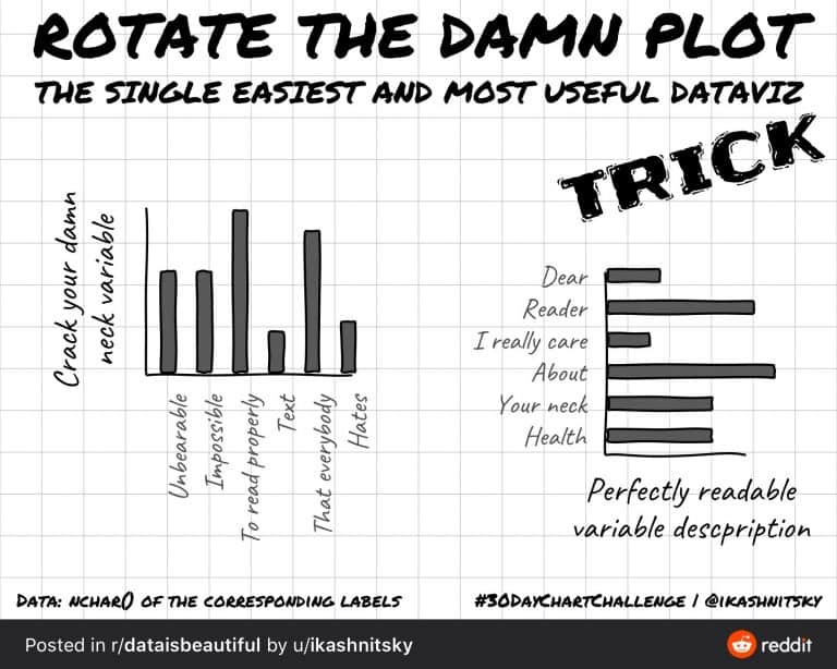
(Having said all that, even the above chart isn’t perfect. Anyone else got neck ache?)
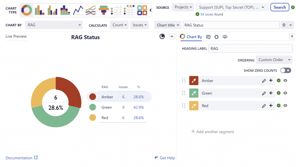
The best charts are the ones that mean something at a glance. Hence why those that use red, amber and green (RAG) coloring are so great. Everyone knows that red is bad and green is good. The following is a sample pie chart produced using our Custom Charts for Jira app. It gives an instant snapshot of completed, in progress, and unresolved work in Jira using RAG coloring, with percentages and issue counts down the side for added clarity.
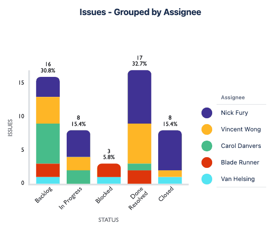
And here’s a bar chart made with Custom Charts for Jira. This is a visual representation of a team’s board, but more useful because you can see how the work is broken down. It takes the statuses (board columns) and lets you see what percentage of the work is assigned to the individual users, and how you’re progressing through the work. The colors are distinctly different and consistent throughout the chart and you’ve got the key on the side so there’s no confusion as to what the individual colors mean. Finally you’ve got added clarity with the values and percentages on top of each bar.
4 common data visualization mistakes
Most chart makers aren’t deliberately trying to mislead people. Ugly charts and graphs are typically the result of common mistakes that are very easy to make, particularly if you’re a data visualization newbie. Here’s 4 to try and avoid.
1. Wrong type of chart. Sometimes you might choose a graph or chart that isn’t well suited to the insights you’re trying to convey. For example, a line graph will give the impression that something is increasing or decreasing, so this isn’t the best type of visualization to use if you’re not charting over time and/or dates. In addition, you might create a pie chart based on assignee to see how much work each assignee has. However, what you really want to know is how many tickets they have in a specific status, or for a specific version, in which case a stacked bar chart or grouped bar chart might be better.
2. Too many variables. Data visualization is about telling a story. If you’re telling a story, you don’t inundate your audience with extraneous, unnecessary, or irrelevant details.
With data visualization, you might not just bore your audience to death with too many variables, but confuse and distract them from the point you’re trying to make as well. So, identify only what you need to convey and exclude everything else. Then pick the format that’s going to convey the data in the clearest manner possible.
3. Improper scaling. If you want to show the difference between data points in a chart or graph, understand what scale you’re using and stick to it.
4. Poor color choices. This is probably obvious from some of the examples given above. But in summary, just be careful not to use too many colors, or go against people’s color assumptions (e.g. red for good and green for bad), or use colors that are too similar. You also need to take into consideration members of your audience who may be colorblind.
Conclusion
Effective data visualization is the crucial final step of data analysis, and without it, important insights and messages get lost. And while inaccurate or misleading charts are great for poking fun at, they can have profound repercussions. Bad data visualizations lead audiences to misunderstand the true data, resulting in poor business decisions and even legal/regulatory ramifications. For example, a misleading chart in a financial report could cause investors to buy or sell shares of a company’s stock.
So, understanding how to properly visualize data, knowing the pitfalls to avoid, and being able to identify discrepancies between numbers and any visualizations produced from them, is essential in the modern business environment.
If you’re ready to start experimenting with visualizations in Jira, our Custom Charts for Jira app gives you the ability to easily create colorful and digestible charts and graphs directly on the Jira dashboard. It offers much more than the standard Jira reporting feature set, giving you more control over how your data is presented and more scope to avoid the problems outlined in this article.
For more detail about how best to visualize your data in Jira, check out our Make Better Reports with Jira Visualization article.
And remember, the internet’s a great place to find plenty more examples of bad data visualizations (such as on WTF Visualizations). Looking at enough of these will give rookie chart makers a sense of what to avoid in their own visualizations and the things to look out for in the visualizations of others.
Sign up for a demo
Request Demo

