Visualize cross-team dependencies in Jira. Spot risk before it becomes delay with Gantt Charts for Structure PPM.
Bring schedule, dependencies, and progress onto the Jira dashboards your stakeholders already use.

Schedules live in one tool, execution lives in another, and by the time leadership sees the timeline it's a screenshot in a slide deck. Putting the Gantt view directly on a Jira dashboard fixes that: Schedule, dependencies, and rolled-up status show up where teams already check blockers and burndowns, drawn from the same underlying Jira data.
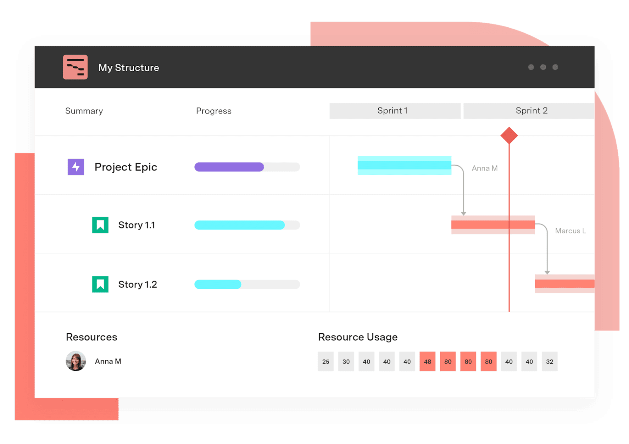
A dashboard Gantt view is a timeline of Jira work — issues, epics, initiatives, releases — rendered alongside the rest of a Jira dashboard. Instead of leaving Jira to see a schedule, the timeline sits next to the issue lists, charts, and filters teams already rely on.
For organizations using Gantt Charts for Structure PPM, the dashboard view is delivered through a first-party gadget that renders a configured Structure timeline on the dashboard itself. Stakeholders open one Jira dashboard and see schedule, dependencies, and progress without switching to a separate planning tool.
The result is a single place where execution data and schedule data meet — useful for status reviews, steering committees, and any meeting where someone asks, "What's the plan and where are we on it?"
One source of truth. Schedule, status, and Jira issues live together, so the timeline can't drift from reality.
Less context switching. Stakeholders don't open a second tool to see the plan — the timeline is one click from their other Jira widgets.
Faster status conversations. Reviewers move from a rolled-up timeline to the underlying epics and stories without leaving the dashboard.
Audience-specific dashboards. Program, portfolio, and release teams each configure their own dashboard and pull the Gantt view that matches it.
Start by deciding who the dashboard serves. A program manager's dashboard needs detail down to the sprint and dependency level. A portfolio dashboard for executives needs the same data rolled up to initiatives and milestones. Build the underlying Structure hierarchy first, then add the gadget so the timeline reflects the same hierarchy as the rest of the dashboard.
When you add the gadget, configure four things to match the audience: Which Structure to load, the hierarchy depth to display, the starting date (Project Start, Today, or a Custom date), and the zoom level (Days, Weeks, Months, Quarters, or Years). Toggle on the WBS view if reviewers need an issue list alongside the chart — the WBS view typically supports Key and Summary columns. If the underlying chart has baselines, surface them in the gadget so leadership can see slippage against the original plan.
Pair the gadget with related Jira dashboard widgets — issue lists filtered by the same Structure, sprint progress widgets, custom charts pulling Structure data — so the dashboard tells one coherent story instead of three disconnected ones.
Gantt Charts for Structure PPM is the most flexible Gantt solution for Jira. It runs on top of Structure PPM, so every timeline draws from a configurable hierarchy that teams shape to match how they plan — Agile, Waterfall, or hybrid.
That hierarchy is what makes a dashboard-friendly Gantt view possible. Collapse the Structure to show only parent initiatives for an executive dashboard. Expand it for a program manager who needs sprint-level visibility. Build multiple Structures — one per portfolio, program, or release — and surface the timeline that matches each dashboard's audience.
Where the first-party gadget is available depends on the platform and edition:
Data Center. The gadget is fully available. Add it to any Jira dashboard, point it at an existing Structure and chart, and it renders in place.
Cloud (standalone Gantt extension). The gadget is available when the standalone Gantt extension is installed alongside Structure.
Cloud (Structure PPM Advanced edition). When Gantt is bundled as part of Structure PPM Advanced on Cloud, the dashboard gadget is currently unavailable. For dashboard reporting on Structure data in this scenario, Tempo points users to Custom Charts for Jira, which supports Structure-sourced reporting on Jira dashboards and in Confluence.
The gadget is a read-only view tuned for reporting and review. It is configurable on the dimensions reviewers care about: Which Structure to load, hierarchy depth, starting date (Project Start, Today, or Custom), and zoom level (Days, Weeks, Months, Quarters, Years). The WBS toggle adds an issue list beside the chart, generally with Key and Summary columns. Baselines configured on the underlying chart can be displayed in the gadget so reviewers can monitor slippage at a glance.
What the gadget does not do is substitute for the main Structure board. Drag-and-drop rescheduling, creating dependencies, and other edits stay in the full Gantt view. The gadget is for the audience that needs to see the plan, not change it.
For Cloud Advanced customers without the standalone extension, Custom Charts fills the dashboard reporting gap — pie, bar, stacked bar, line, table, and tile charts can all pull from a Structure hierarchy and live alongside other widgets on the same Jira dashboard.
Gantt Charts for Structure PPM
Get visualization options for portfolio scheduling, quarterly planning work, capacity visualization, project retros, complex waterfall infrastructure projects, and more.
Start a Free TrialCouldn't find what you need?Go to our documentation
Yes. Gantt Charts for Structure PPM ships a Gantt dashboard gadget that renders a configured Structure timeline directly on a Jira dashboard. It is fully available on Data Center, and on Cloud when the standalone Gantt extension is installed. For Cloud customers on the Structure PPM Advanced edition without the standalone extension, the gadget is currently unavailable and Tempo points users to Custom Charts for Jira for dashboard reporting.
No. The Gantt dashboard gadget is read-only. It is built for reporting, status reviews, and stakeholder visibility. Drag-and-drop rescheduling, dependency creation, and other edits happen in the full Structure Gantt view, not in the gadget.
Reviewers can choose which Structure the gadget loads, set hierarchy depth, pick the starting date (Project Start, Today, or a Custom date), and set the zoom level to Days, Weeks, Months, Quarters, or Years. A WBS toggle adds an issue list alongside the chart, typically with Key and Summary columns. Baselines configured on the underlying chart can be displayed to show slippage against the original plan.
A standalone Gantt tool stores its own copy of the schedule, which means manual sync work and inevitable drift. A Jira dashboard Gantt chart reads live from Jira issues and Structure hierarchies, so the timeline updates as the underlying work updates – and dashboard reviewers see the same data the planning team is working from.
Visualize cross-team dependencies in Jira. Spot risk before it becomes delay with Gantt Charts for Structure PPM.

Visualize Jira issues by status, assignee, priority, or any custom field. Custom Charts for Jira makes pie charts ready in minutes – no JQL required.
Build a workload management dashboard in Jira with Custom Charts. See assignee load, WIP, and time in status on one screen to rebalance work fast.

Gantt Charts for Structure PPM slice-based configurations allow you to create custom rules for specific sets of issues.

BigPicture can't answer your CFO's CapEx question. Compare Structure PPM, Jira Plans, BigGantt, EazyBI, and Jira native on financial governance.

Connect delivery, capacity, and financial data in real time with Tempo's Custom Charts, Structure PPM, and BI Connectors.
Search and filter Jira data without JQL. The Custom Charts simple search gadget lets any team member self-serve reports from a dashboard.
Plan sprints inside a longer schedule. Connect agile execution to portfolio delivery dates with Gantt Charts for Structure PPM.

Depending on the department and requirements, Structure can be 'unfolded' to track KPIs in Jira, in real time.