See how Custom Charts for Jira renders bar graphs, grouped bars, and stacked bars from any JQL, filter, board, or project.
Turn issue lists into a clear picture of project composition – who owns what, where work is stacking up, and which slices need attention.

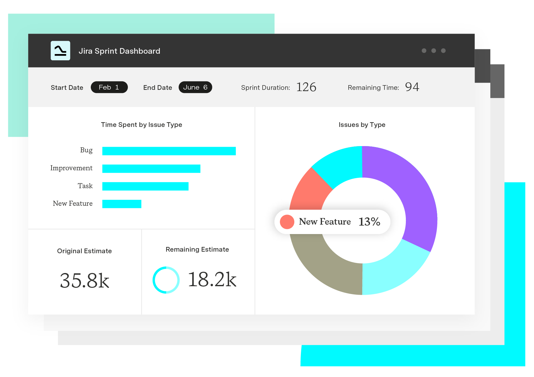
A Jira pie chart is a circular visualization that breaks a set of Jira issues into proportional slices, grouped by a field of your choosing. Group by status to see how much work is open vs. done. Group by assignee to see workload split. Group by priority to see how much critical work is in flight. Each slice represents a count (or sum) of issues for that value, and the chart updates as the underlying Jira data changes.
Jira's native dashboard gadgets give you a basic pie chart bound to a single saved filter and a fixed list of fields. That covers simple cases, but it falls short the moment you want to chart a custom field, combine data across projects, or share a dashboard with someone who doesn't know JQL.
Custom Charts for Jira fills that gap. It lets any user build, customize, and share pie charts — alongside bar, line, table, funnel, and tile charts — on Jira dashboards and Confluence pages, without touching configuration files or asking a Jira admin for help.
Instant composition view. A pie chart shows the makeup of a project at a glance — status distribution, priority mix, assignee load — without scrolling through hundreds of issues.
Stakeholder-friendly reporting. Executives, clients, and cross-functional partners can read a pie chart in seconds, even if they have never logged into Jira.
Faster anomaly detection. When one slice grows out of proportion, you spot bottlenecks, overloaded assignees, or runaway bug counts before they derail a sprint.
Reusable on dashboards and in Confluence. A single chart can sit on a team dashboard, a leadership dashboard, and a Confluence status page, keeping every audience aligned to the same data.
The fastest path is to build the chart on a Jira dashboard and let it pull live data. With Custom Charts, the workflow looks like this:
1. Add the Custom Charts gadget to a Jira dashboard. 2. Pick the issue source: A saved filter, a project, a board, or a JQL query. 3. Choose pie chart as the chart type. 4. Select the field to group by (status, assignee, priority, sprint, fix version, label, or any custom field). 5. Apply colors, ordering, and labels so the slices match how your team thinks about the work. 6. Save the chart and share the dashboard with the people who need to see it.
A typical use case: A delivery lead drops a status pie chart and an assignee pie chart side by side on a sprint dashboard. The status chart shows how much work is still open. The assignee chart shows whether load is balanced. Both update automatically as the team moves issues through the board.
Custom Charts is a Jira-native reporting app that extends pie charts — and 10+ other chart types — well beyond what Jira ships with by default. It supports system fields, custom fields, and fields from third-party apps, and it lets every user (not just power users) build the chart they need.
Custom Charts works across Jira projects, so a single pie chart can pull from multiple projects or a Structure hierarchy. It includes a Simple Search gadget that lets viewers filter live dashboards without writing JQL, and it integrates with Timesheets so pie charts can summarize logged time by account, issue type, or assignee. Time in Status reporting is built in, so a pie chart of cycle time bottlenecks is a few clicks away.
Charts and dashboards can be shared inside Jira, embedded in Confluence pages, and exported, which means the same view of project composition reaches engineering, the PMO, and the exec team without anyone rebuilding the report.
Sprint status mix. Group by status to show To Do, In Progress, In Review, and Done. The chart reveals whether the sprint is on track or back-loaded.
Workload by assignee. Group by assignee to expose imbalance — one person carrying half the sprint while another sits at two issues.
Bug distribution by priority. Group by priority across the bug backlog to show how many criticals and highs are still open, helping triage decisions.
Custom Charts for Jira
Build charts and dashboards to evaluate delivery, capacity, and speed for all teams with Jira's most flexible custom reporting app
Start a Free TrialCouldn't find what you need?Go to our documentation
Jira's native pie chart gadget is limited to a fixed set of fields. Custom Charts supports custom fields, including fields added by third-party apps, so you can group a pie chart by anything your team tracks.
Yes. Custom Charts supports cross-project reporting through saved filters, JQL, or a Structure hierarchy as the data source, so one pie chart can summarize work across an entire program.
Custom Charts can be embedded in Confluence pages and exported, so stakeholders who live outside Jira still see the same live view of the data.
A pie chart is best when you want to show proportion – how a whole splits into parts – with a small number of categories. A bar chart is better when you need to compare exact counts, show many categories, or trend values over time. Custom Charts supports both, so you can pick the format that matches the question you are answering.
See how Custom Charts for Jira renders bar graphs, grouped bars, and stacked bars from any JQL, filter, board, or project.

Gantt Charts for Structure PPM slice-based configurations allow you to create custom rules for specific sets of issues.
Build a workload management dashboard in Jira with Custom Charts. See assignee load, WIP, and time in status on one screen to rebalance work fast.
Colors, tables, advanced JQL search, and anything else you need to create the perfect visualizations in Jira and Confluence with Custom Charts.

Surface schedules, dependencies, and project status on a Jira dashboard with the Gantt Charts for Structure PPM gadget.
How to easily tailor your Custom Charts for Jira & Confluence to different audiences using the accompanying gadget/macro, Simple Search.

Don’t let pie charts’ dodgy reputation scare you. Learn how to use this powerful visualization tool to illustrate data in simple, meaningful ways.