Visualize Jira issues by status, assignee, priority, or any custom field. Custom Charts for Jira makes pie charts ready in minutes – no JQL required.
See who is doing what, where work is stuck, and whether anyone is drowning – all on a single Jira dashboard built from live data.

A workload management dashboard is a Jira dashboard built around a specific question: How is work distributed across the team, and where is it stuck?
Instead of one chart in isolation, it brings together several views – issues per assignee, work-in-progress by status, time in status, priority mix – and presents them as a single view a manager can scan in under a minute.
The point is not to replace the board. Boards show the flow of individual issues. This view shows the shape of the team's commitments. It tells you whether one engineer is sitting on a dozen open tickets, whether In Progress has quietly grown to three times the size of the sprint commitment, or whether a single status is acting as a bottleneck.
Built with Custom Charts for Jira, this pattern lives directly inside Jira and updates as the underlying issues move – no exports, no spreadsheets, no waiting on a weekly report.
Faster rebalancing decisions. When assignee load is visible, managers can reassign work before the overloaded person becomes the schedule risk.
Honest work-in-progress numbers. A WIP chart by status exposes how much work is open versus how much the team thinks is open.
Earlier signal on blockers. Time in Status reporting shows when issues are stuck in review, QA, or waiting states longer than they should be.
One source of truth for status conversations. Standups, 1:1s, and steering reviews all pull from the same view, which cuts time spent reconciling numbers.
A practical setup usually combines four to six charts, each answering a specific question:
1. Issues per assignee – a bar or pie chart that shows total open issues by person, so imbalance is visible at a glance. 1. Work-in-progress by status – a bar chart of every In Progress, In Review, and Blocked status across the team. 1. Time in Status – a chart showing how long issues sit in each status, which surfaces flow problems. 1. Priority mix per assignee – a stacked bar chart that reveals whether one person is carrying all the high-priority load. 1. Issue list of overdue or blocked items – a filtered list at the bottom for the conversations that need to happen. 1. Simple Search filter – a gadget that lets the viewer slice the entire view by sprint, team, or label without editing any chart.
Set it as the team's default view, walk through it in standup, and use it as the agenda for capacity conversations with stakeholders.
Custom Charts is the reporting layer that makes this pattern practical to build and maintain. It supports 10+ chart types – pie, bar, 2D grouped bar, stacked bar, line, table, funnel, tile – and lets users group by any Jira field, including custom fields and fields from third-party apps. Cross-project reporting is built in, so a single view can cover one squad or an entire program.
Time in Status reporting is native to Custom Charts, which is what turns a basic assignee chart into an actual workload diagnosis tool. The Simple Search gadget gives non-technical viewers a no-JQL way to filter live data, so executives and program managers can answer their own questions without asking a Jira admin to spin up a new view. Dashboards can be shared inside Jira, embedded in Confluence, and exported, so the workload picture reaches every audience that needs it.
A note on scope: This pattern is about visualizing existing Jira work to inform day-to-day rebalancing and reporting. For forward-looking team capacity planning, time-off scheduling, and resource allocation across multiple projects, Capacity Planner is the dedicated product.
The two work well together – Custom Charts shows what is happening now, Capacity Planner plans what is coming next.
Engineering team standup view. Issues per assignee, WIP by status, and a blocked-issues list, refreshed live for the daily standup.
Service desk supervisor view. Open tickets per agent, priority mix, and time in status for First Response and In Progress, so the supervisor can rebalance queues mid-shift.
Program manager cross-team view. Workload split across squads using a Structure hierarchy or multi-project filter as the data source, embedded in a Confluence status page for the weekly program review.
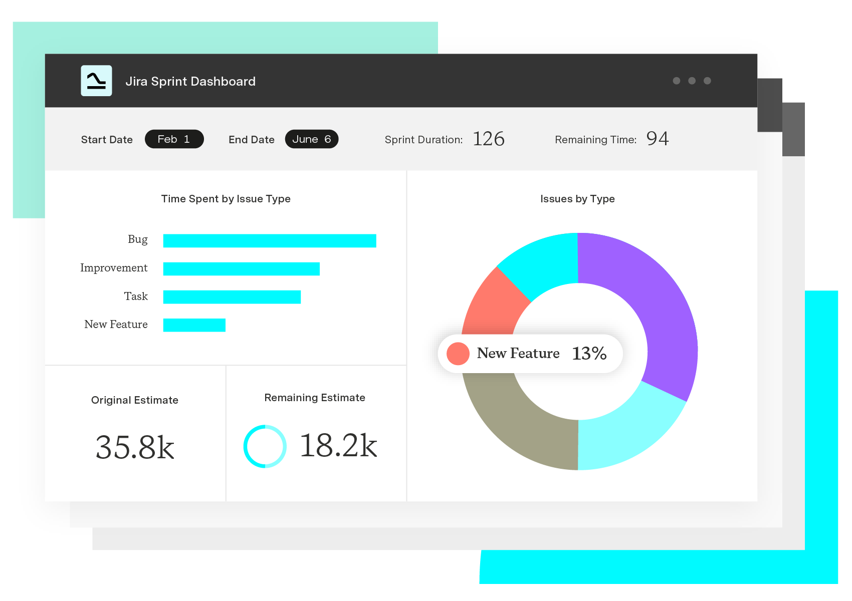
Custom Charts for Jira
Build charts and dashboards to evaluate delivery, capacity, and speed for all teams with Jira's most flexible custom reporting app
Start a Free TrialCouldn't find what you need?Go to our documentation
A workload management dashboard built with Custom Charts visualizes the work currently in Jira – who is assigned what, how much is in progress, where things are stuck. Capacity Planner is a separate product focused on forward-looking resource and capacity planning, including time off, allocations, and scheduling across projects. Many teams use both: the dashboard for day-to-day rebalancing, Capacity Planner for upcoming commitments.
Yes. Custom Charts supports saved filters, JQL, and Structure hierarchies as data sources, which means one dashboard can summarize workload across teams, products, or an entire program.
No. The Simple Search gadget lets dashboard viewers filter every chart by sprint, team, label, or any other field through a no-code interface, so non-technical stakeholders can answer their own questions live.
Yes. Custom Charts dashboards can be embedded in Confluence pages and exported, which makes them usable for executive reviews, client status meetings, and any audience that does not work inside Jira directly.
Visualize Jira issues by status, assignee, priority, or any custom field. Custom Charts for Jira makes pie charts ready in minutes – no JQL required.

Surface schedules, dependencies, and project status on a Jira dashboard with the Gantt Charts for Structure PPM gadget.

We look at Dashboard Hub's strengths and weaknesses and explain why Custom Charts for Jira is the superior dashboard reporting app.

Jira Work Management was made with business teams in mind. So was our flagship app, Custom Charts for Jira. Let's see how they work together.
Discover blockers, assess workloads, and find out how long projects are taking, in a range of eye-catching charts on time in status in Jira.
Let’s dive into the five ways integrating Strategic Roadmaps with Structure will help solve your toughest planning challenges in Jira.

This guide walks through every real way to share a Jira dashboard externally, when each one fits, and a decision framework so you stop guessing.
Build a customizable interactive Jira Dashboard with Simple Search, directly in your Jira Dashboards.

Knowing the status of work is just as important as knowing when it will finish. See an aggregate of how long work takes for future estimation.