All you need to know about ServiceNow and Tempo’s connectors, why you should connect these tools together, and the use cases

The Power BI dashboard templates for ServiceNow, accessible via our Power BI Connector for ServiceNow, give you and your teams all the tools you need to understand, report, and share your ServiceNow data.
What do they do? They provide you with downloadable files that you can import into Power BI to visualize your ServiceNow data – all done in minutes so you can focus on actually analyzing your data instead of burning hours just to check it.
The templates come with pre-configured data sources, tables, and fields, eliminating users needing to spend hours configuring the required report elements.
This blog will cover all the templates now available and also give you a step-by-step guide so you can start working on your own dashboards right away.

Power BI Dashboard Templates offer analytical instruments so you can quickly start working on acquiring data from your processes. You get a centralized view of all the critical KPIs relevant to your template to save time on manual set up.
It covers processes such as incident management, problem management, problem requests, change management, and configuration item management.
Once you’ve got access to thes dashboards – over time you can begin to understand more about your workflows. What is working well, what needs improvement, and where your investments would have the most impact.
That means the data is always in your corner when it comes to making decisions so you are never just firing blind when you need to put your money on the line. You can rest assured that you have real-time statistics that will have a tangible impact on your processes and improve the quality of service you are providing.
These templates were drawn up from requests from our users about the most essential aspects of ITSM work within ServiceNow.
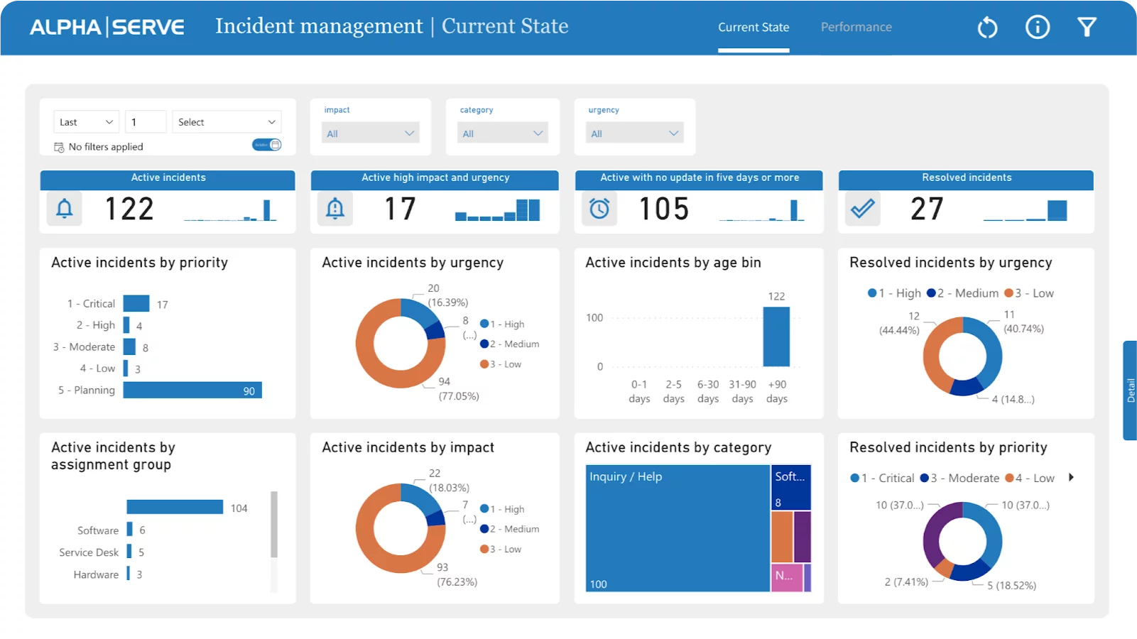
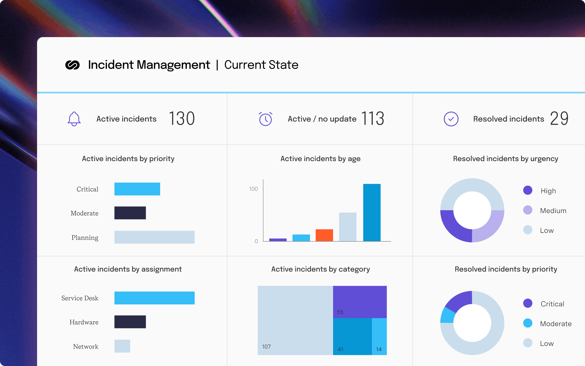
The ServiceNow Incident Management Dashboard displays all incidents, their priority, urgency, status, and resolution time.
It also has tabs for current state and performance reporting – meaning you can spot all trends and bottlenecks to improve your porcesses.
The dashboard also displays graphs and tables that show incident patterns, including the number of events raised each day by priority or urgency and the average resolution time.
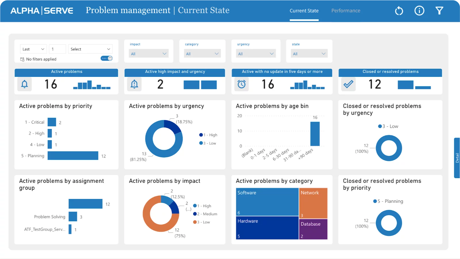
ServiceNow Problem Management Dashboards show problem statuses over time. That means your IT teams can watch problem resolution progress in real-time and then analyze that data through trend analysis, graphs, charts, and more.
It can organize your issues through a multitude of KPIs, such as priority, impact, urgency, and resolution time, so you can see your critical areas at a glance or quickly create reports for executives.
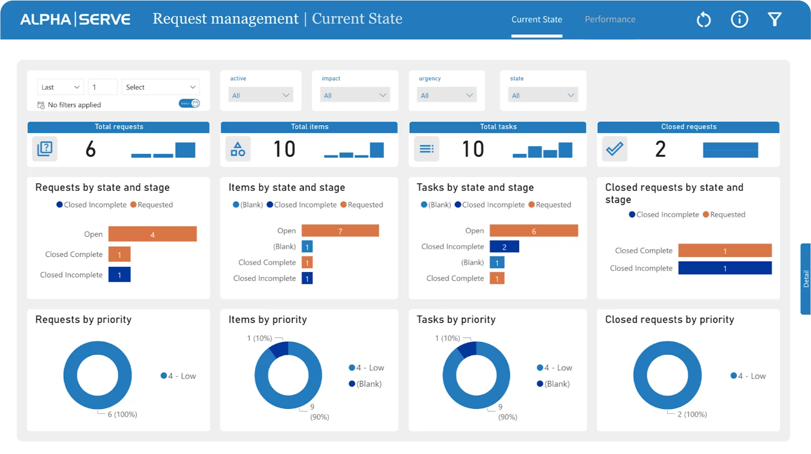
This dashboard is designed to evaluate end-user service request fulfillment for customer service teams or request management. These reports offer KPIs and metrics to measure your process performance.
These current state reports track KPIs like request metrics, linked items, and tasks. You can view these by priority, state, and stage to assess request handling and find where you can make improvements in your team.
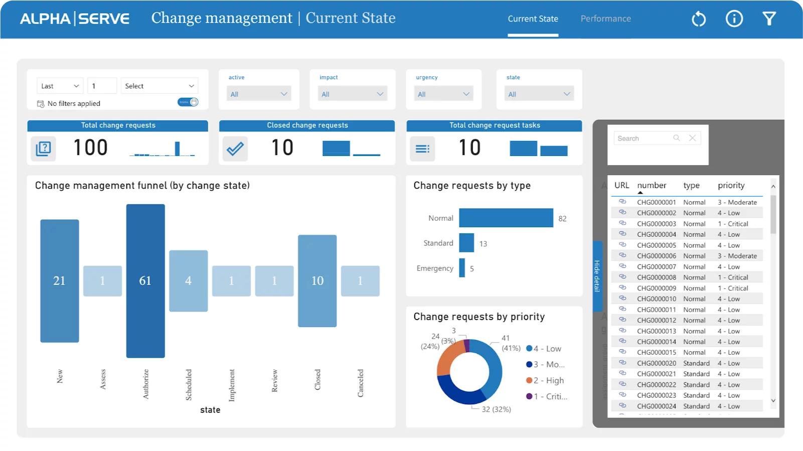
Users may rapidly access and manage changes in ServiceNow using the Change Management Dashboard. It displays all change requests, their status, priority, and impact in one place. A change management funnel template on the dashboard helps users track changes from request to review.
Our report template measures change management effectiveness with indicators like change priority and urgency, average closure time, and accumulated open requests by priority.
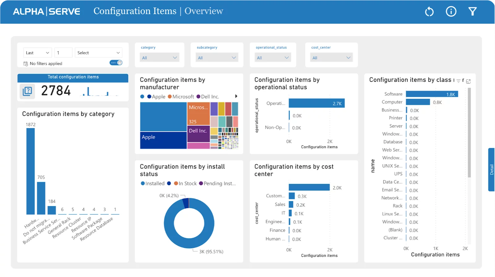
This dashboard lets you manage and view configuration items organization-wide, improving IT infrastructure understanding and decision-making. Our configuration item template then provides an overview of your IT infrastructure – displaying some key information and making admin work and maintenance easier.
ServiceNow's configuration items template also provides visualizations of the your IT infrastructure by manufacturer, operational and installation state, class, and cost center.
Learn how to use Power BI Dashboard Templates for ServiceNow with this step-by-step guide:
Install the Power BI Connector for ServiceNow by following the provided instructions.
To create a new dashboard, click the "New from Template" button on the Power BI Connector Dashboard page.
Choose the desired template and press the "Create Data Source" button.
Configure the automatically generated data source by providing a custom name and description, then proceed to the next step by clicking "Next".
Now, copy the data source URL and download the .pbit file by clicking the "Next" button.
First, to import the Power BI template into Power BI Desktop, launch Power BI Desktop. Then, click on "File" and select "Import" followed by "Power BI template" Finally, locate and select the .pbit file downloaded in the previous step.
Enter the copied data source URL into the designated field.
Choose "Basic" Authentication and enter your login details.
Enjoy your ServiceNow dashboard on Power BI and leverage its capabilities to analyze your ServiceNow data effectively.
Feel free to customize your dashboard further according to your needs. Please consult our Documentation for detailed instructions.
Power BI Connector for ServiceNow
Connect ServiceNow to Microsoft Power BI for advanced insights and streamlined integration, enabling comprehensive data analysis and improved decision-making.
Start a Free TrialAll you need to know about ServiceNow and Tempo’s connectors, why you should connect these tools together, and the use cases

Everything you need to know about ServiceNow and Tempo’s connectors, why you should connect these tools together, and the use cases.

Agile templates are great additions to any project manager’s toolbox. Learn how roadmap, project planning, & other templates improve project outcomes

Discover how roadmapping your project management with workflow templates builds efficiency into your processes and consistency into your results.
Our Custom Charts/Assets for Jira integration lets you report on asset data on JSM dashboards, boosting the effectiveness of your ITSM team.

Streamline your project management workload and get ahead on the planning process by adding these 5 top resource planning templates to your toolbox.

When things go wrong, a standardized IT incident management protocol can help you and your team get back on track faster than an ad hoc process.
Simplify your product management practice by incorporating some easy-to-use product management templates to roadmap your projects.
Data is powerful but only when it's used correctly. That means visualizing it, the essential final step of data analysis. Find out how.