Our Custom Charts/Assets for Jira integration lets you report on asset data on JSM dashboards, boosting the effectiveness of your ITSM team.
Improve your Jira Software reporting with Custom Charts for Jira

Key Takeaways
Jira dashboards allow reporting across multiple projects and boards, making them more flexible than native board reports that are locked to single layouts.
Custom Charts for Jira enables teams to create dashboard reports based on story points, time estimates, and custom number fields rather than just issue counts.
Stacked bar charts in Custom Charts help teams quickly identify overloaded team members and work-in-progress bottlenecks that native Jira reports cannot easily visualize.
The Simple Search gadget in Custom Charts allows dynamic filtering of line graphs and 2D charts for historical epic, version, and release tracking across projects.
If you and your team use Jira Software projects and boards to manage your work, some great options to keep track of your progress come built into the platform. However, if you want a view that spans multiple projects, or includes work that other teams are doing in Jira Service Management or business-side Jira projects, you've probably already realized that you need to be taking advantage of dashboards.
Those with Scrum or Kanban boards can view some reports based on their work, but you can't pull multiple projects or related external work into your board reporting. This can be particularly challenging when you are looking to report on program-level work, or if some of your work isn't included in your board.
This article explains why Jira dashboards are the way forwards, and how Custom Charts for Jira can make those dashboards pop.
We've covered board reporting before, so we won't dig into it too much here. Jira board reports are genuinely useful if you're an agile team running Scrum or Kanban. But if you aren't running sprints, or you need to track more than one team at once, you're going to need some creative ways to slice and dice that information.
The biggest benefit of Jira dashboards? You can report on data across projects and boards. So if you're part of a software team where separate people handle deployment and release, you can see all of it in one place – even if they're not working in your sprints.
One report a lot of teams skip is the control chart. It tracks cycle time and lead time for any sprint, version, or date range, so you can spot outliers and understand how predictably work moves through your system. That project data is gold when you're trying to unblock delivery. With Custom Charts, you can recreate the control chart as a scatter or line graph and stick it next to your other program-level gadgets for a single, always-current view of throughput.
Here are a few reports to supplement your board reporting and give you a wider view of your team's progress.
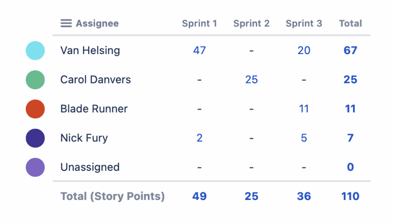
If you use agile estimation, you already know that the number of issues in a sprint matters way less than the number of story points. Sprint 1 and Sprint 2 in the image above could both have 5 issues, but one has a lot more work involved.
Native board reports like the Jira Velocity Charts and Jira Sprint Reports show this data, but they're locked to a single layout. There's no way to change the chart type, swap axes, or combine multiple fields.
With marketplace apps like Custom Charts for Jira, you can create dashboard reports that don't just look at issue counts – they can look at your estimates too. This works if you estimate by time, using the out-of-the-box original/remaining estimates or custom number fields. A two-dimensional chart that shows story points by assignee, like the one above, gives you a quick read on your team's capacity.
For definitions and examples, see Atlassian's documentation for the velocity chart and the sprint report.
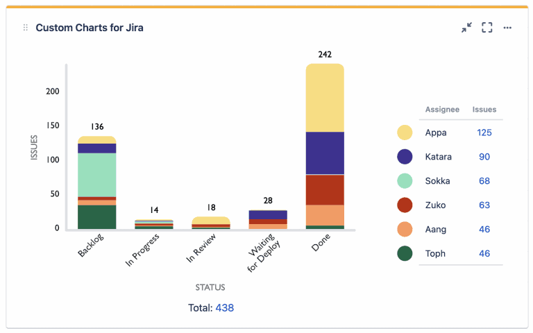
If you want more insight into how your board breaks down, Custom Charts for Jira lets you build a stacked bar chart like the one above. It's a different way to look at the work. Beyond seeing how many tickets each team member has in each status, you can switch the count to story points or original estimates, same as the two-dimensional filter statistics chart.
Stacked bar charts make it obvious when someone's overloaded or when work-in-progress is ballooning. That quick visual cue helps the team spot bottlenecks early. Agile, waterfall, Kanban – a fast read on flow keeps people focused on finishing work, not just starting it.
There isn't a great way to see this natively in Jira (though the Cumulative Flow Diagram can help with bottleneck identification).
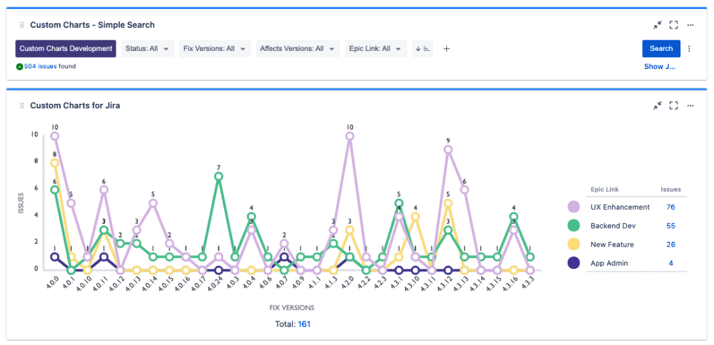
Epic and Version Burndown Charts are great tools for tracking progress toward a goal. However, if you want to look at historical information, they are a little less valuable. In Custom Charts for Jira, you can pair our 2D line graph with our Simple Search gadget, which allows you to dynamically filter charts on your dashboard, as shown above. You could also, for example, use Simple Search to filter down to only new features, so you could see how often we are releasing new features, as opposed to user experience (UX) enhancements.
This information can also be sliced to see how many issues of each status are in each fix version, filtered down to only unreleased versions, etc. The possibilities for release reporting are very powerful, and in fact we use charts like this to manage the releases for Custom Charts itself.
We're not going to lie. We LOVE Jira dashboards and will sing their praises till the cows come home. That's exactly why we built Custom Charts for Jira for them. Sure, there are some very valuable reports in Jira Software that software teams need which can't (yet) be replicated as gadgets on a dashboard, such as the Cumulative Flow Diagram and the Velocity Chart. That's why, for the moment, you still need board reporting.
That said, there are a lot of reports you can build on a dashboard, and even more with Custom Charts. And you can customize your Custom Charts reports so that they're more targeted, and visualize them in more engaging and memorable ways.
In time, we hope that all the board reports will be available through the Jira dashboard. Currently only a handful are, but Jira dashboards are just better, frankly. And more dynamic. And we love them. Did we mention that we love them?
Sign up for a demo
Request Demo
Custom Charts for Jira
Build charts and dashboards to evaluate delivery, capacity, and speed for all teams with Jira's most flexible custom reporting app
Start a Free TrialCouldn't find what you need?Go to our documentation
The control chart is a built-in Jira report that tracks how long each issue spent in the statuses you select. It plots those times on a scatter chart and adds lines for the average, rolling average, and standard deviation, so you can spot delays and outliers fast. For more detail, check Atlassian's control chart documentation.
A control chart shows whether your cycle times are steady. Consistent times give you confidence when forecasting schedules. Wider swings tell you where you may need to adjust staffing, refine workflow steps, or clear blockers.
Jira doesn't let you place its built-in control chart on a dashboard. Custom Charts for Jira lets you create a cycle-time or lead-time chart and add it to any dashboard, so you can see it alongside your other metrics.
It complements it. You can still open the standard control chart inside each board. Custom Charts for Jira lets you build flexible, dashboard-ready visuals using the same data but with more filter, format, and sharing options.
Our Custom Charts/Assets for Jira integration lets you report on asset data on JSM dashboards, boosting the effectiveness of your ITSM team.

Jira Align scales up your agile practices, Custom Charts keeps your teams on point. Together, they help enterprises operate effectively at scale.
Issue history reporting in Custom Charts for Jira & Confluence lets you make burndown reports for sprints, epics, and releases across multiple teams.
Jira Work Management was made with business teams in mind. So was our flagship app, Custom Charts for Jira. Let's see how they work together.
Even the Empire needed better project visibility. Discover why custom Jira reporting beats standard dashboards for complex projects.

When you report on epics in Jira, you get a big-picture view of the work being done. Find out how to visualize your epics on Jira dashboards.

Custom Charts templates make it easier to onboard new teams to Jira and get them up and running with ready-made charts and dashboards.
Now you can make detailed reports on the status and progress of your custom structures on a Jira dashboard.