Creating Jira reports and charts for color vision deficiency
Tempo Team
Data storytelling is like any other kind of storytelling. You want your audience to understand and be engaged. If none of your audience speaks English, you wouldn’t tell them a story in English. Likewise, if your audience is color vision deficient, you wouldn’t make charts out of your Jira data that rely heavily on color to be understood.
Okay sure, it’s unlikely that your entire audience, particularly if you have a large team, is going to be color vision deficient. 8% of men and only 0.5% of women are color vision deficient, so that’s 16 out of 200 men, and 1 out of 200 women. That means, if your team or audience is all women, you probably don’t need to worry too much. For everyone else, it’s worth considering making your charts optimal for color blind readers. (Best bet, of course, is to ask your team and find out.)
Having said that, some of this blog’s advice on using color in your Jira dashboard reports is relevant whether your audience is color vision deficient or not. It’s just good data visualization.
Let’s dive in and I’ll explain what I mean.
Color vision deficient-safe colors – red and blue, avoid green
Red and blue are considered color vision deficient-safe colors. In particular, “blue is the safest hue”. Most color vision deficient people see red and green as the same or similar colors, which is why it’s not good to combine them. It’s also not good to combine green with blue. Basically, if green’s your favorite color, I’m sorry for your loss.
If you want to create a color vision deficient-friendly palette, try to use two basic hues: blue and red (orange and yellow are good too).
In our Jira dashboard reporting app, Custom Charts for Jira, and sister app for Confluence, Custom Jira Charts for Confluence, we offer a color picker with all of our charts. You can choose from 22 default options, select from the full color palette, or enter a custom hex code so you can have exactly the color you need.
But what if all the colors clash?
Well, yes, totally opposite colors like red and blue can clash. That’s why there’s so much temptation to build charts with nice, coordinated color schemes. But, red-green color vision deficient software developer Peter Cardwell-Gardner says:
“It may be tempting to choose colors near each other (e.g. blue/purple) as they can give your overall image a visually appealing cohesive look. But choosing to do so will completely torpedo my ability to understand your chart.”
So, it can come down to a choice between beauty and understandability. And when it comes to reporting on how your teams and projects are progressing, understandability must win.
(Although fear not: all the reports in Custom Charts are beautiful, whatever color they are )
And, if you are worried about clashing colors, there’s a different way to go about this…
The other option (if you want colors similar to each other): Vary lightness
Basically, you can ignore everything I just said in the previous two sections and use any color you like – as long as you make one much darker than the other. Lots of data visualization teachers have told students over the years, “Get it right in black and white.” The idea is that if you print a colorful bar chart with a black and white printer and it’s readable, color vision deficient people will be able to read it too. And remember, there are some people with total color blindness, which means the only 100%-safe colors are black and white.
So, green fans, all is not lost! You can combine red and green if they have dramatically different lightnesses. It means that if you want to make a RAG (red, amber, green) chart to visualize the health of your projects, you can. Although, bear in mind that color vision deficient readers won’t see one as good or bad necessarily. Red will likely appear as a darker olive/orange and the green a lighter shade of the same. Yellow/amber is generally a great one to add to the mix because yellow is so light, therefore it contrasts well with other colors.
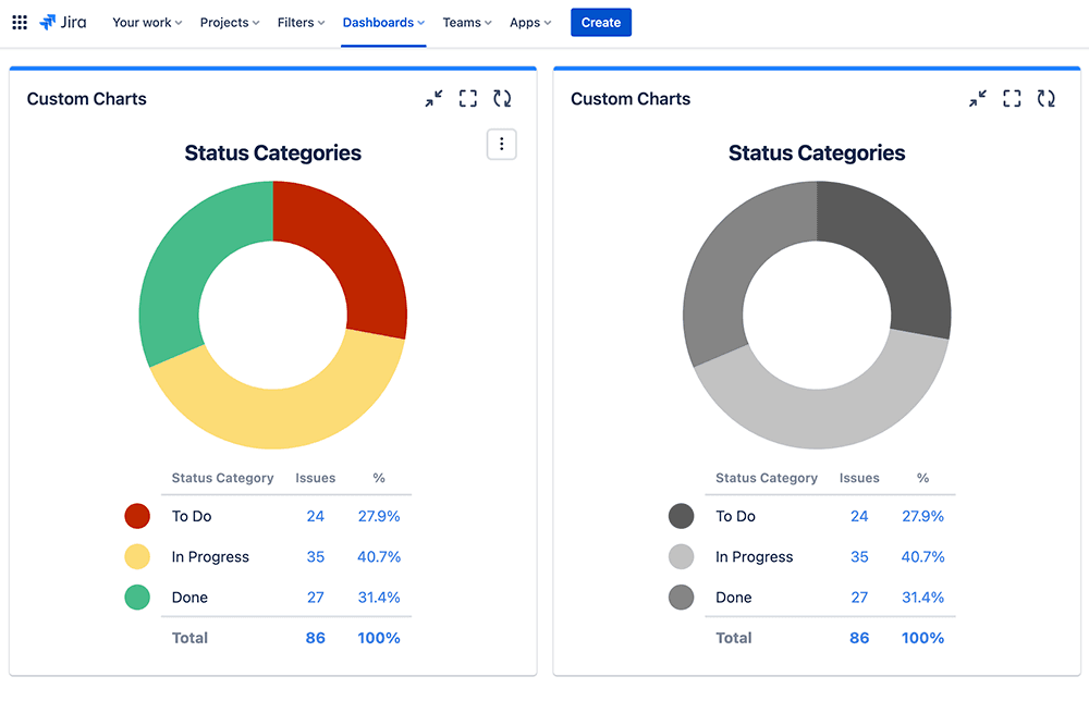
The default red and green we use in Custom Charts for Jira and Confluence already varies in lightness; the red is much darker than the green. Below, on the left, is how a RAG chart looks in full color, and on the right is how it looks in black and white.
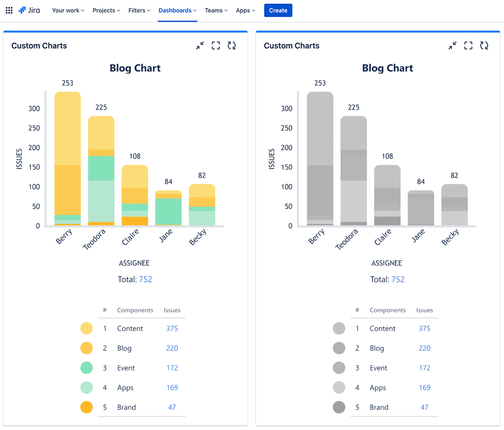
The “get it right in black and white” advice isn’t just useful for color vision deficient-friendly Jira reporting. If your colors are sufficiently different in lightness, it’s good for everyone’s understanding. For example, in the Custom Charts 2D stacked bar chart below, the similar lightness of the sections in the bars makes it difficult for anyone to immediately grasp what’s going on.
Rely less on color, more on other visual indicators
The more colors you use, the more trouble your audience will have telling them apart. This is again true for all your readers, and especially for your color vision deficient ones.
Green-blind data analyst Lee Durbin says:
“If I see lots of colors being used in a chart (say, more than 3 or 4) I tend to tune out if other visual indicators like annotations aren’t being used.”
If your charts rely heavily on color to be understood, here are 3 things you can consider.
1. Reducing colors by showing only the most important values
Only show the values that are most fundamental to the data story you’re trying to tell. In our previous article on good and bad data visualization, we talked about the importance of not having too many segments in our pie charts. Sooner or later, they’ll become unreadable and useless to everyone, not just color vision deficient people. Ask yourself, what are the one or two insights you want your audience to take away?
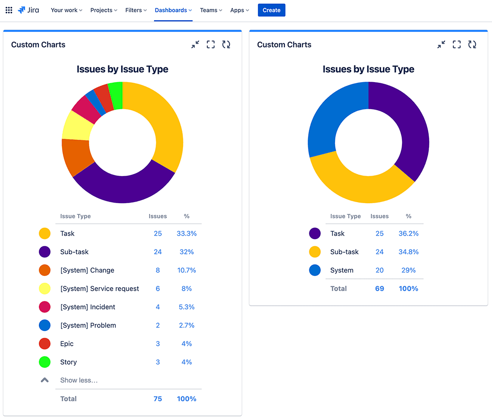
The left chart is messy, the right is better (less is more!)
2. Choose charts where you don’t need color to see what’s happening
In a line chart, readers are looking at the direction of the line and the labels in the axis and/or above the line. In a bar chart, they’re looking at the height of the bars and the labels in the axis and/or above the bars. You don’t have to rely on a color code in a legend to understand either chart.
So, have a look at the chart you’re proposing to make and see if a different chart type might suit your audience better.
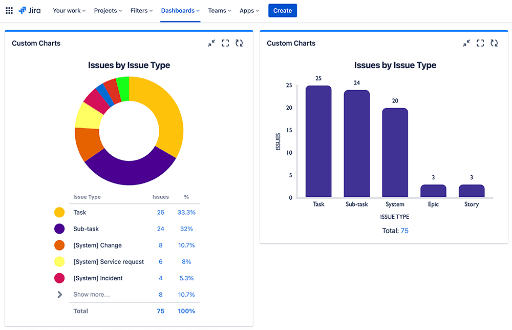
Do we really need all those colors? The bar chart says no
3. Make your charts interactive
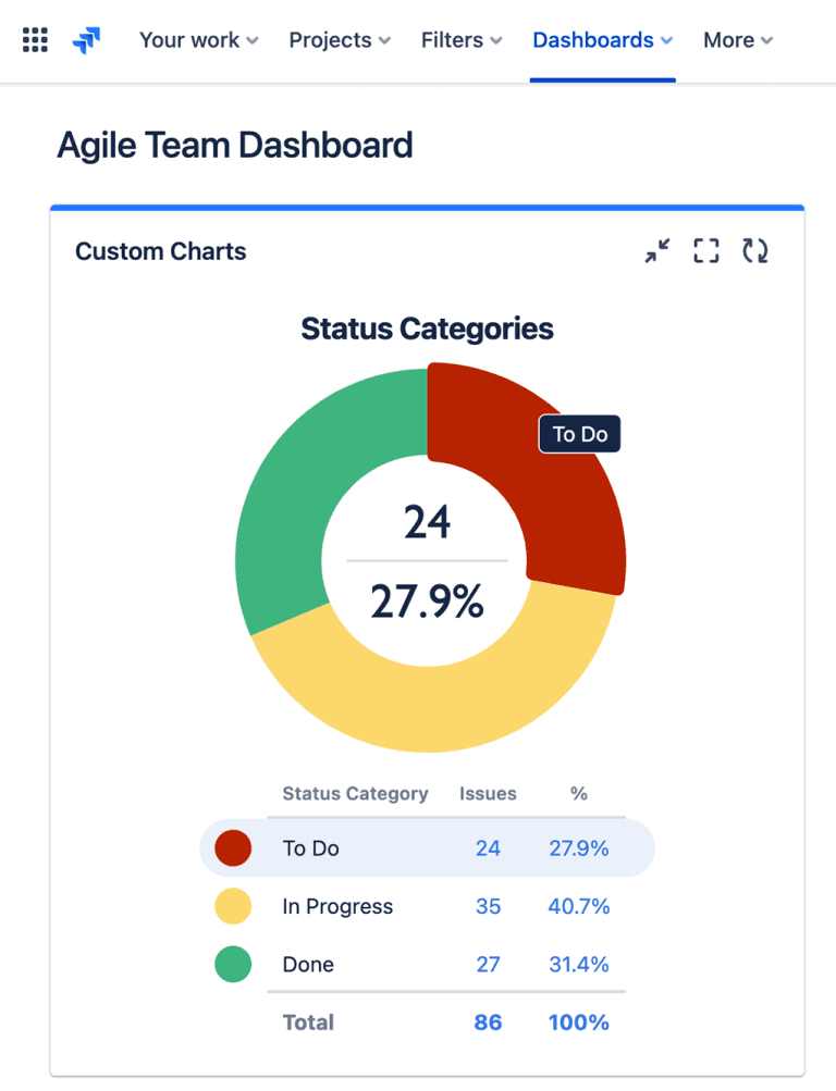
Another visual indicator that’s useful for color vision deficient readers is hover effects. You can see in the Custom Charts pie chart below that when a person hovers over a segment, the segment will do 4 things:
stand out from the rest
a label will appear on it
the value on the legend will be highlighted
the data for that segment will appear in the center of the pie
Conclusion
There are many ways you can make your Jira dashboard reports easier for color vision deficient readers to understand. Stick to color blind-safe hues like blue, red, and yellow, and go for contrasting colors rather than similar ones. Alternatively, you can choose colors that are similar (and use green!) if you make them sufficiently different in lightness.
The ideal approach is to rely less on color and more on other visual indicators, such as labels and hover effects, and by reducing the values on your charts to only show the key data. This is good for all readers, and especially for color vision deficient ones.
Of course, the best thing to do is to ask if anyone on your team is color vision deficient, find out what type of color blindness they have, and once you’ve built your chart, see whether they can decipher it.
With out-of-the-box Jira, you don’t get any choice over the use of color, nor chart type, in your dashboard gadgets, which makes it impossible to customize them for color vision deficient readers. With Custom Charts for Jira and Confluence, you can select from a range of chart types, add or change labels, and choose an appropriate palette from a full color picker.
Feel free to have a play in our interactive Custom Charts playground. Better yet, try Custom Charts for Jira for free on your instance.
Sign up for a demo
Request Demo

