Visualize sprint progress with Tempo Burndown Reports. Track time, forecast accurately, and stay on schedule – all within Jira.
Taking a project from kick-off to delivery requires a plan. And to make that plan, you must know what work needs to be completed and how long it will take.
All this data needs a home — that’s where the burndown chart comes in. This powerful visualization tool empowers business leaders to quickly evaluate the effort and resources their teams require to get from Point A to Point B and cross the finish line by the project's due date.
Don’t let poor planning hinder your work before it’s even begun. Implement burndown charts into your process so you can respond to unexpected backlogs, allocate resources, and prioritize tasks to keep your team and projects on track.
A burndown chart is a line graph used by project managers or team leads to visually compare a project’s outstanding work against how long it will take to complete. The tool is best suited for Agile project management, as it’s designed to track iterative work broken down into smaller tasks and deliverables. Equipped with the chart’s estimations, managers can make informed decisions when setting project completion dates.
The chart plots a project’s actual iterative progress against a linear line representing ideal progress. By comparing the actual and idea data, managers can see whether the initiative is moving forward as planned, ahead of schedule, or falling behind. This knowledge allows project leaders to hold their teams to the timeline, identify and respond to roadblocks, and strategically manage time and resources. When the team is running behind schedule, it’s time to pick up the pace, identify the cause of the bottleneck or stall, and dedicate more effort to get the project back on track for the deadline.
Project managers frequently pair burndowns with burnup charts, which illustrate the work they’ve already completed and how much time it took. In simple terms, burning up shows how close you are to completion while burning down helps you estimate what it will take to get there.
There are two types of burndown charts:
Agile: Charts progress over the lifetime of a project
Sprint: Plans and analyzes outcomes of short iterations
As with any project management tool, burndowns have a learning curve. First things first: What goes on a chart?
A burndown chart has five components:
X-axis (horizontal): Represents the timeline to project completion
Y-axis (vertical): Represents the total work or effort necessary to deliver the project
Ideal work remaining line: The linear line that charts estimated project progression
Actual work remaining line: The plotted points representing a project’s real-time progress
Story points: Establish the scale of the Y-axis
Let’s talk axes. Vertically, story points represent the required effort of a task defined by work, complexity, risk, and uncertainty. For example, your Y-axis might span from 0–100 to represent a sliding scale of overall effort or mark a relative estimation of the effort required for each task. The second scenario would require you to make informed guesses about the unique effort required for each iterative task — if you believe the project’s most difficult task is 15x more effort than its easiest task, you would mark the Y-axis with 15 story points. Alternatively, you could divide the vertical axis into the number of tasks you must complete during a sprint or the total hours you expect to dedicate to the project.
On the horizontal axis, each tick mark represents a day in the project timeline. If your team has 15 days to complete the initiative, the X-axis should be marked 0–15, representing the days left to complete the work.
The starting story point of the graph is in the upper left corner — it represents the total effort on the project or sprint's first day. The project’s endpoint is the final story point at the graph's bottom right. And the straight line plotted between the starting and endpoints designates the ideal work remaining line.
Begin by plotting the total quantity of work or effort against the time necessary to complete individual project tasks, overcome potential delays, and conduct testing. As you move through development, update the chart by tracking progress and outstanding work. Plot each day’s results based on the amount of work the team completed, then link these points to draw a line representing actual work remaining.
At the start of the project, the ideal and actual lines should be similar. As time passes and your team addresses production and development challenges, the actual work line will fluctuate above or below the ideal. When it’s higher, you’re facing a backlog and potential delay. When it’s below the ideal, it means the project is ahead of schedule. Successful project completion sees both lines meeting the x-axis on the final day of scheduled work.
A burndown chart is a relatively simple and easy-to-use tool. But, as with any tool, understanding its advantages and shortcoming will help you leverage it successfully.
Speed: See a project’s status at a glance. With this data, you can efficiently update project stakeholders and sponsors or the daily scrum.
Productivity insights: Visualize your team’s workflow and identify bottlenecks. A significant difference between your ideal and work lines means you must address productivity issues with your team before they result in a delay (or adjust future time estimates if the roadblock is unavoidable).
Direct comparisons: Compare work needed against the time left to complete the sprint or project. Not only does this equip you with a realistic timeline, but it also keeps your team motivated by visually connecting their efforts with the overall project goals.
Unity: Keep every team member on the same page. Because a burndown chart acts as a daily log to track completed work and illustrate what’s still outstanding, it provides a single information source for the team to monitor workflow and output.
Lack of detail: The chart only shows the number of story points completed at any time, not backlog or changes in scope. A sharp decline in the work line could result from clearing the backlog or changing the number of story points. You can compensate by creating a line that tracks backlog jobs completed in your burnup chart.
Equal weight: A burndown chart doesn’t differentiate between easy and difficult tasks. Perhaps your team accomplished 12 tasks during one sprint but only five in the next. In a burndown, there’s no way to indicate that those five tasks were the most challenging of the project.
Trends: The chart doesn’t tell you if the team is delivering high-priority tasks — only that they’re completing work. This data and similar workflow trends are lost in the simplicity of a burndown.
Estimates: A burndown relies entirely on estimates. If you overestimate the ease of a task or how long it takes, you could skew the results. Adding an efficiency factor can help adjust your estimates. After the project's first iteration, recalculate to produce a more accurate line chart.
Grab a calculator, pen, and paper and get ready to plot. Here’s how to draft a chart:
Estimate how much work a project or sprint will take. Begin by considering the baseline for your ideal timeframe.
A 5-day sprint that requires 80 work hours will have a daily effort of 16 hours (80 / 5 = 16 work hours). Your effort trajectory begins at 80 on Day 0 and marks the amount of work left at the end of each day.
Day 0: 80 hours
Day 1: 80 - 16 = 64
Day 2: 64 - 16 = 48
Day 3: 48 - 16 = 32
Day 4: 32 - 16 = 16
Day 5: 16 - 16 = 0
Once you’ve calculated the estimated effort, plot your ideal work line with your starting point of 80 on the y-axis for Day 0 and endpoint of 0 on Day 5.
Record the time needed to complete each task per day using a chart or timeline tool. Then, compare your pace against the goal’s timeline to ensure you deliver on schedule.
Day 1 | Day 2 | Day3 | Day 4 | Day 5 | Total | |
Task 1 | 6 | 5 | 4 | 5 | 3 | 23 |
Task 2 | 2 | 4 | 4 | 3 | 5 | 17 |
Task 3 | 3 | 7 | 4 | 5 | 6 | 25 |
Task 4 | 3 | 3 | 4 | 3 | 2 | 15 |
Daily hours | 14 | 19 | 16 | 15 | 16 | 80 |
At the end of the fifth day, the total hours worked across all four tasks should equal 80, the same amount as your initial estimate.
Ensure team members can access a spreadsheet or time tracking and reporting platform to record their hours.
Calculate each task's daily effort using the same process as your estimate. The numbers may or may not match the estimated hours, depending on actual complexity or issues that slowed progress.
Day 0: 80 hours
Day 1: 80 - 14 = 66
Day 2: 66 - 19 = 47
Day 3: 46 - 16 = 30
Day 4: 30 - 16 = 14
Day 5: 14 - 16 = -2 (which equates to 0)
How do your initial estimates compare against the actual time logged for each task? Review whether the results exceed or fall short of the estimates to adjust your process for the next project.
Plot the total work hours as a story point on your burndown chart each day, then connect it to the previous point to create the actual work line. It won't be as linear as your ideal work line unless your estimates are 100% accurate — as long as your progress averages out around the ideal line, you shouldn’t fret.
If you're working on an Agile or Scrum project, a burndown chart can help you better manage your sprints. With the tool, you can track how much work you have left and see when you're ahead or behind schedule by comparing the actual work completed against the baseline.
You can also use a burndown to:
Develop a work management baseline by comparing planned versus actual work
Evaluate discrepancies through a gap analysis
Stay apprised of resource allocation and task management issues
Gather information for future sprint planning
Remember: while the above example of plotting a burndown uses hours of work versus time, you could also represent effort as relative estimation story points or the number of tasks remaining. However, the number of tasks is only useful if each is small enough that you expect to complete at least one per day.
Time tracking made easier with Roadmunk by Tempo To create an effective burndown chart, you need the right project management tools.
Timesheets by Tempo helps team members quickly and easily clock their productivity time so you can deliver accurate updates to your burndown chart. Jira-integrated Strategic Roadmaps by Tempo visually tracks each task’s progress through the development pipeline and generates status reports and roadmaps for stakeholders and project sponsors.
With Tempo’s powerful project management tools, you’ll have everything you need to create a burndown chart, allocate resources, and keep your team on track to deliver their best work — right at your fingertips.
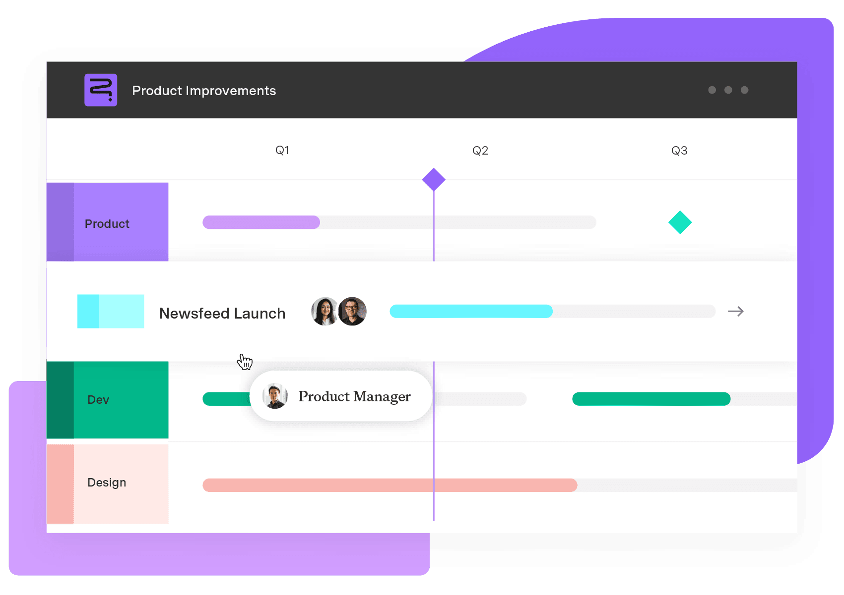
Strategic Roadmaps
Build your portfolio vision with Strategic Roadmaps. With powerful visualization capabilities, you can communicate strategy to the entire organization and gain alignment around strategic objectives, product goals, and milestones.
Start a Free TrialVisualize sprint progress with Tempo Burndown Reports. Track time, forecast accurately, and stay on schedule – all within Jira.

Improve task prioritization by learning how to conduct the Pareto analysis and use the 80/20 rule to deliver outcomes with the greatest impact.
Epics and stories are part of your working hierarchy. Learn how they help you and your teams break work into manageable chunks.

Learn what a perceptual map is, explore the four main types, and follow helpful tips to help you visualise market positioning and brand strategy.

Issue history reporting in Custom Charts for Jira & Confluence lets you make burndown reports for sprints, epics, and releases across multiple teams.

Track completed work and scope changes with burnup reports in Timesheets and Custom Charts. Visualize progress based on logged time across Jira.

Don’t let pie charts’ dodgy reputation scare you. Learn how to use this powerful visualization tool to illustrate data in simple, meaningful ways.

Learn how the impact vs. effort matrix prioritizes your team’s to-do List. This intuitive method reveals which work delivers the most corporate value.

Structure's portfolio-management capabilities by help you create data-informed timelines, adapt to the unexpected, and deliver results more reliably.