How Scrum Masters can boost agility with an agile dashboard in Jira
Tempo Team
In agile software development, it’s the responsibility of Scrum Masters and product owners to make sure the teams they manage are continuously improving their delivery and way of working. The best way of doing that is through visualization. Visualization creates transparency and triggers discussions that provoke action.
In Jira, visualizing what teams are doing happens on Scrum and Kanban boards. Visualizing how teams are doing is best achieved through Jira dashboards. A Jira dashboard telling Scrum Masters what progress they’re making on stories, epics, and versions can help them identify and alleviate delays, reduce undue pressure on the team, and improve planning and prioritization. It can also be used to keep higher-level managers better informed.
You can use native Jira gadgets on your dashboard, but you’ll soon run into walls. Although there are a lot of gadgets to play with, they all give you pre-configured charts with limited customizations. What if you want to display the data differently? What if you want a bar chart instead of a pie chart? Or you want to report on a second variable in the same chart? Or you want different colors? Unfortunately, with out-of-the-box Jira, you’re a bit stuck.
However, the Atlassian Marketplace has dashboard reporting apps like Custom Charts for Jira that fill the gap. With Custom Charts, you can build whatever chart you like and display the data exactly how you want it. If you’re stuck for time and a pre-configured chart would be helpful, Custom Charts comes with chart templates. The good thing about these is that if there’s something you don’t like, you can change it, whereas if there’s something you don’t like in the native charts, tough luck.
Now let’s walk through a bunch of charts, made with Custom Charts for Jira, that Scrum Masters and product owners can use to improve the productivity, efficiency, and happiness of their agile software teams.
You can find out more about making some of the charts in this video.
Jira Epic progress 2D grouped bar chart
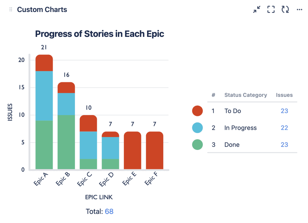
In the 2D grouped bar chart above, we’re charting by the epics in the Jira instance and grouping by the status category of the stories in those epics. As epics are larger bodies of work usually related to an organization’s broader goals, a report like this can offer a Scrum Master or product owner a good overview of how well the team is progressing towards those goals.
As you can see, we’re making headway on epics A, B, C, and D, but not so much on epics E and F. In fact, all of the issues in epics E and F are in “to do”. None are “in progress”. It could be a matter of timing or prioritization, or it could mean that the assignees working on these issues need some help.
To investigate the outstanding stories further, you can simply click on the bars and open up a list of those issues in another tab.
Time in status of Jira Issues bar chart
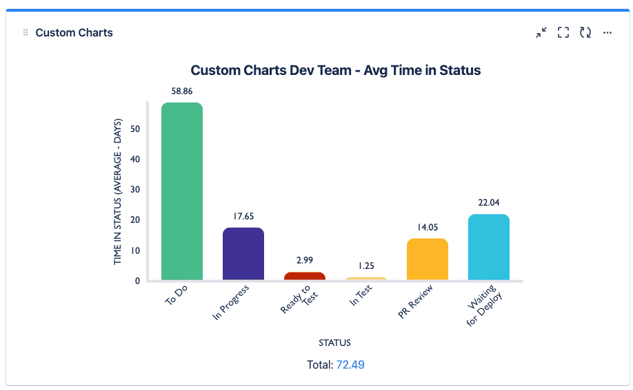
Time in status is a great way of seeing how long issues are taking to complete and spotlighting where there could be bottlenecks in the workflow.
In the bar chart above, we’re charting by time in status in our Jira development project. As the team works in Kanban, this is why things spend longer in “To Do” than they would in a sprint.
The chart shows that the testing process is actually running pretty smoothly, with tickets moving along quickly. However, they’re tending to stay in “Waiting for Deploy” much longer. This could suggest to product owners that there are some bottlenecks in the release process.
Releases by Jira issue type 2D table chart
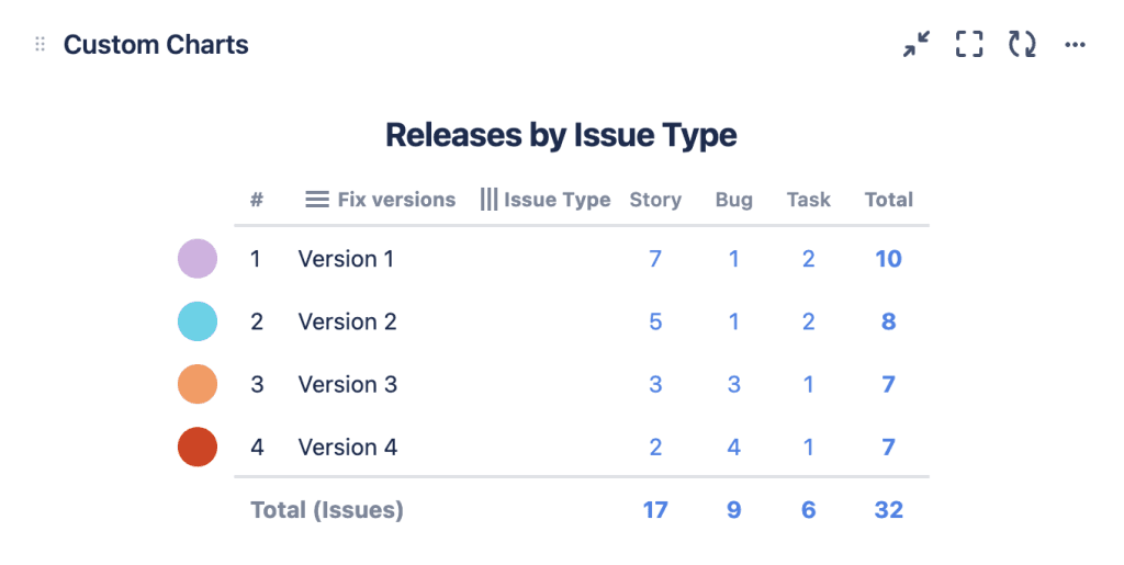
In the 2D table chart above, we’re charting by our fix versions in Jira and grouping by the issue type. Here, we’re trying to see how many bugs we’re fixing versus how many stories, epics, and tasks are being resolved per release. This is an important metric to keep an eye on if you’re a Scrum Master or product owner looking to improve delivery. If the team becomes too focused on bug fixes, then it could mean that they’re not delivering what the customer wants fast enough.
In the chart, you can see that in versions 1 and 2, the team were focused on resolving lots of user stories, with only a couple of bug fixes. However, versions 3 and 4 had steep increases in bug fixes. This insight can prompt a product owner to investigate why the software is experiencing more bugs. It also makes them more alive to the possibility that the team could be stressed due to the increased bugs, and might need extra support.
Sprint velocity tile chart
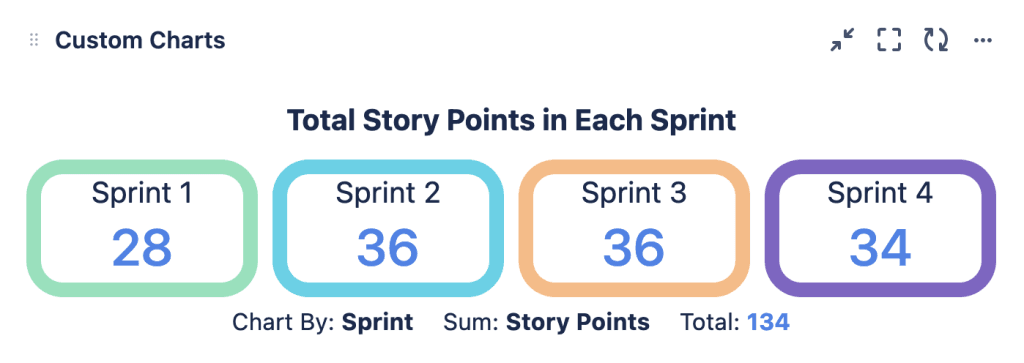
The tile chart above is a great way of spotlighting some important numerical data points. Here we’re looking at sprint velocity. So we’re charting by sprint and calculating the sum of story points to see how many story points were completed in the last four sprints.
As you can see, the team’s velocity increased in sprint 2 but dropped a little in sprint 4. We don’t want decreases in velocity to become a pattern, so this needs investigating further. Were some team members out of office? Were there bottlenecks? Of course, it could be that the team is overproducing and the decrease is because they’ve been enjoying a bit of extra time for other things!
In any case, what the Scrum Master can do is click on the tiles for each sprint and see a list of those issues to investigate the changes in velocity further.
Blockers pie chart
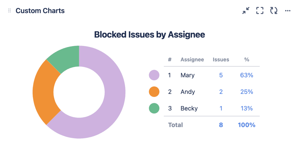
A pie chart is a great report to choose if you only have a few data points to visualize and, in particular, if those data points are sufficiently different in size. It might be fair with baked pies to have equal slices, but in a pie chart, equal slices don’t make for a good data story. Only when you can tell the slices apart do you get a good sense of the message being conveyed.
The pie chart above has 3 different-sized slices, each one bigger than the other. Here we’re looking at blocked issues by assignee and can see that Mary has the most blocked issues, Andy the second most, Becky the least. A Scrum Master can look at this as an indication that Mary may need some extra help.
Backlog monitoring Jira issue list
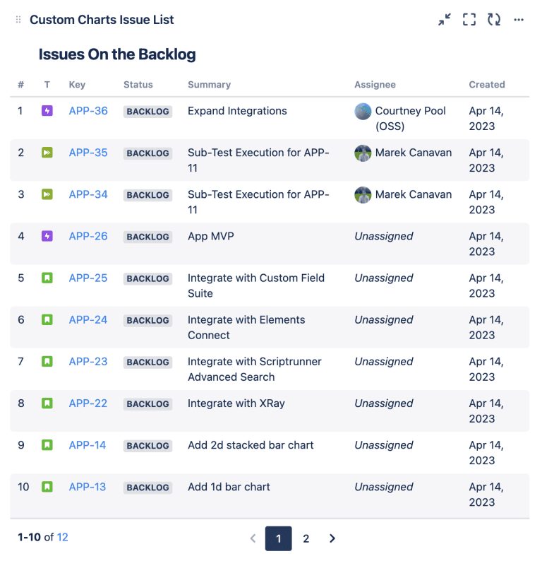
All the visualizations mentioned in this article can be generated from a single gadget: the Custom Charts gadget. But Custom Charts also comes with a separate gadget, the Issue List, which allows you to add a list of issues matching a search filter to your dashboard.
The issue list above is backed by a Jira Query Language (JQL) search to return a list of all the issues in our backlog. So these are the issues that the Scrum Master or product owner, together with their team, still need to make some decisions on, i.e. whether or not to assign them to the next sprint and start working on them.
Users can customize the columns that appear. We have the Summary of the issue and the Created date, which lets us keep track of how long these issues have been sitting in the backlog. You could also add the Reporter, the Assignee (if there is one), or the Epic the issues are part of.
Simple Search

Like the Issue List, Simple Search is a separate gadget that comes with Custom Charts. You can connect Simple Search to any of the charts on the dashboard and use it to filter the data down further, by changing the items in the Simple Search dropdowns. For example, you might want to only see issues with a specific assignee across all the charts.
Scrum Masters and product owners can also use Simple Search to create tailored views of the dashboard for different audiences. With the Simple Search tabs function, you can have certain values pre-selected. Then, when you click on them, the dashboard automatically updates to show the relevant data points without you having to scroll through all the dropdowns.
This is especially useful if you need to report on specific metrics to higher-level managers, because there’s only one button to push and then they have the insights they need.
Conclusion
It’s super important for Scrum Masters and product owners to be reporting regularly and consistently on their team’s effectiveness. Often the problem is not having the right tools to make the reports they need.
Reporting starts with a list of questions. What do you want to know about your team’s performance, workload, and delivery? As a starting point, our article about the basics of Jira reporting has a list of the most likely questions most teams will be asking.
Once you’ve formulated your questions, the reports you build need to answer them. With out-of-the-box Jira, that gets difficult, because the gadgets available are too limited and inflexible. You can create a Jira dashboard natively that shows some agile metrics, but either they’re not quite the metrics you want, or they’re not displayed in the best, most useful way.
With Custom Charts for Jira, you can visualize your agile metrics exactly how you want to. The possibilities are endless and the charts above are only a fraction of the visualizations you can make to inspire your team to action.
Sign up for a demo
Request Demo

