SAFe Reporting in Jira: How to Measure the Flow of Your Agile Release Train
Tempo Team
Progress reporting in scaled agile and specifically the Scaled Agile Framework (SAFe) is all about the Agile Release Train. The Agile Release Train (ART) is a collection of different teams working together to deliver solutions in a value stream. So, instead of reporting on just one team and how it’s doing, you’re reporting on all of them.
The three areas to be measured in SAFe
The formal term for progress reporting in SAFe is flow reporting. Flow is actually just one of the three areas that should be measured in SAFe. Here’s a little rundown:
Competency: how proficient is the organization in the practices that enable business agility?
Flow: how efficient is the organization at delivering value to the customer?
Outcomes: do our solutions meet the needs of our customers and the business?
Measuring competency involves doing assessments to see how agile your organization is, while outcomes involves looking at metrics such as sales statistics, time to resolution, customer satisfaction scores, customer retention, feature acceptance, and employee engagement.
Some of these metrics, such as customer satisfaction, time to resolution, and feature acceptance, can be measured in Jira.
But competency and outcomes are almost like the before and after in SAFe. Competency is can we do it (the before) and outcomes is do our customers like it (the after).
And if competency and outcomes are the before and after, then flow is the during. And Jira focuses on the during because it’s a tool for managing work, from creation to completion. Therefore, the SAFe reports you make out of Jira data are mostly going to focus on flow.
So let’s delve a bit deeper into some examples of flow reporting in Jira.
Flow reporting in Jira
There are six metrics for measuring flow in Jira:
1 | Flow distribution | the proportion of each work item type in the flow, e.g. how many features versus bugs across Planning Intervals (PIs) |
2 | Flow velocity | the number of tasks completed in a given time period such as a sprint/iteration or PI |
3 | Flow time | the same as lead time, i.e. the time that elapses from when an item enters the workflow to when it is released to a customer |
4 | Flow load | total number of work items in progress across all steps of the flow (active or waiting) |
5 | Flow efficiency | active work time (not including time spent waiting) versus overall lead time (including time spent waiting) |
6 | Flow predictability | how many work items you completed versus how many you planned |
In Jira, your Release Train Engineer (the chief Scrum Master for the entire Agile Release Train) will need to use dashboard reporting rather than project reporting to measure these six flow metrics. This is because dashboard reports can span multiple teams, whereas project reports only focus on one (projects and teams in Jira are typically synonymous in SAFe).
There are several out-of-the-box dashboard gadgets that can serve your purposes here, such as a Created vs Resolved Issues line chart for measuring flow predictability. However, you’ll soon run into problems if you want to customize your flow reports (e.g. change colors, labels, chart types, show/hide certain data etc). Because native Jira doesn’t let you.
Moreover, not all of these metrics are covered by the native gadgets. For example, you can look at flow time using a Jira Control Chart, and flow load with a Jira Cumulative Flow Diagram, but these are project reports only, not gadgets you can add to a dashboard. As such, they will only look at flow load and time in a single project. Not much good when the whole point of SAFe and Agile Release Trains is to monitor the progress of multiple projects/teams at once. By the same token, you can’t report on flow efficiency either.
There are plenty of options on the Atlassian Marketplace, however. A Jira dashboard reporting app like Custom Charts for Jira will allow you to build a program dashboard displaying all your flow metrics in a series of fully customizable charts.
Let’s look at some examples of each chart in turn.
Flow Distribution Report

The only 2D chart available out of the box on Jira dashboards is a table. Tables are useful when you need to draw attention to figures, but they’re not very visual. To tell good, engaging data stories, you need at least a few reports on your dashboard that offer visual, at-a-glance insights.
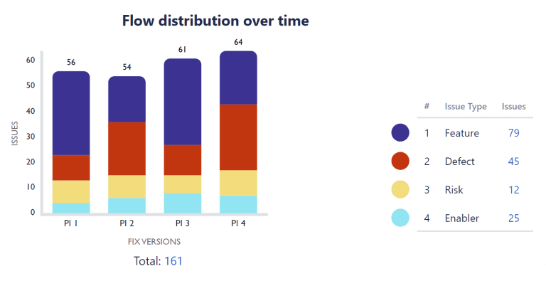
Like the 2D stacked bar chart above. This Flow Distribution Report, made with Custom Charts for Jira, shows the amount of each issue type in each of our Planning Intervals (previously known as Program Increments). We’ve selected Fix Version from the Chart By dropdown, as we use Fix Versions in Jira to represent Planning Intervals in SAFe. In order to make the chart 2D and see the issue types in each PI, we’ve selected Issue Type from the Group By dropdown.
It’s important to track the balance of features and enablers (work required to support future functionality) against the number of defects and risks. Features and enablers offer the most value to customers whereas risks and defects do not. So you want to see most of your teams’ time being taken up by the former.
In the chart above, PI 2 and 4 are the most concerning, as there were more defects than features in these Planning Intervals. Simply hover over the bars for the exact figures, and you can click into them for a list of the issues.
Fortunately, looking at the flow distribution over time, we can see that overall the Agile Release Train is still working on 79 features compared to 29 defects, which means the ART is delivering value. It’s worth a conversation, though, particularly in light of the most recent PI having so many defects.
Flow Velocity Report

In the Custom Charts funnel chart above, we’re looking at the number of completed story points across Planning Intervals. The chart offers a nice at-a-glance visual showing that the flow velocity of the Agile Release Train increased a lot between PI 10 and 11, but dropped heavily in PI 12.
Higher velocity implies higher output and indicates that process improvements have been implemented to remove delays. But the significant drop in PI 12 warrants investigation. Were team members absent? Did teams deliberately slow down because they delivered so much in PI 11? Is one team in the ART blocking another?
Flow Time Report

Tile charts in Custom Charts are a good way of spotlighting figures, and you can use color-coding in the frames to draw attention to particular ones. Here we are measuring the total time elapsed for releases within each PI.
We can see that releases within PI 11 took the longest: 18.5 days on average. And we have highlighted this with an orange tile. Flow time has improved by PI 12, so this can prompt discussions about what was different in PI 11 and what slowed down our delivery, so that we can stay on the right track going forwards.
Flow Load Report

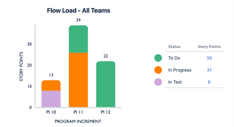
The 2D stacked bar chart above shows work in progress or waiting across our three PIs. You can see that the flow load increased a lot between PI 10 and PI 11, and there is nothing in the testing status, which would suggest that there is excess work that the ART is struggling to keep up with. The likely result is that queues will start to build up, increasing future flow times.
In this scenario, PI 12 is a future interval and work hasn’t started yet, which is why all the story points are in “to do”. However, that’s a LOT of “to-do” items when we already had a lot on our plate in PI 11. As soon as the interval gets started, these story points will be added to any work left unfinished in PI 11. This means we’ll see another big jump in flow load in PI 12.
What a chart like this tells us is that we need to work on reducing our flow load. We can check our velocity to see if that’s gone down, but if it hasn’t, then we need to reduce the amount of work we’re adding to each PI. We’re trying to do too much.
Scaled agile practitioners recommend Cumulative Flow Diagrams for tracking flow load. As there is no Cumulative Flow Diagram available as a gadget in Jira, we are working on a feature that will allow teams to build one on the dashboard with Custom Charts. So, even though you have 2D bar charts and line charts to measure flow load in Custom Charts, Cumulative Flow Diagrams will make our app even more suitable for organizations practicing SAFe.
Flow Efficiency Report

In the table chart above, you can see how the active work time (not including time spent waiting) compares to the overall lead or flow time (including time spent waiting) between Planning Intervals.
These figures indicate that a lot of waiting time seems to be hampering the ART’s efficiency.
You can also use this chart to get a flow efficiency percentage from the totals. Simply divide the average active work time by the average lead time and multiply by 100.
8.3 days / 16.2 days x 100 = 51%
Therefore, the ART’s flow efficiency is currently at 51%. This can prompt a discussion about why teams are having to wait to deliver on the PI goals, and what might be blocking them.
Flow Predictability Report

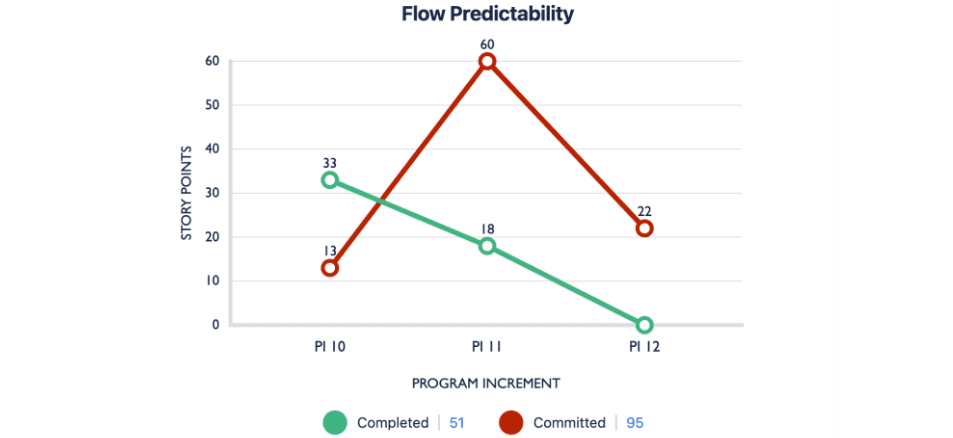
We are using Custom Charts’ 2D line chart for our Flow Predictability Report, and tracking how many story points our teams completed against how many they had planned to complete in each PI.
The closer the green line is to the red line, the better your teams are at predicting how much they can deliver in each PI. Low or erratic predictability means delivery commitments are not realistic.
The chart above shows that our ART’s predictability in PI 10 and 11 is low. In PI 10, our teams delivered much more value than they planned, and in PI 11, they delivered much less.
However, this can still change. PI 12 is a new interval; the ART has started planning the work, but they’re yet to complete any. Therefore, you don’t want to use PI 12 as a measure of predictability just yet.
The good thing about Custom Charts is that as the teams complete work, the chart will start updating in real time and the green line will go up. Therefore, there is still a chance for the green line and the red line to match. If they do, your flow predictability will have improved.
Conclusion
By tracking these six flow metrics, your Agile Release Train can make data-driven decisions to improve the quality and speed of their work continuously.
The reports above are designed to trigger discussions about what’s happening. Sometimes, a chart will imply a problem, but clicking into the segment and bringing up a list of those issues could provide a quick explanation. Other times, it might appear from the visuals that everything is going well when drilling down into the issues shows that, in fact, it isn’t.
This is one of the reasons for having a Jira dashboard showing all six flow metrics side by side. For example, your flow time could look great, i.e. you’re improving your speed. BUT if your flow distribution shows that most of your work comprises bugs and defects, it means you’re struggling to deliver real value to your customers.
The charts in this article are only a few of the ones you can make on the Jira dashboard to measure flow in SAFe, if you have a dashboard reporting app like Custom Charts for Jira. They’re made simply by clicking fields in the Chart By and Calculation dropdowns, as well as the Group By dropdowns for the 2D charts. If you want to report on more complex metrics and data sets, you also have the option of using Jira Query Language (JQL).
If you’d like to know more about SAFe reporting in Jira and Custom Charts, book a free Jira Reporting Session where our experts answer questions, do demos, and fix problems live.


