A quick guide to Xray Test Management reporting in Custom Charts for Jira
Tempo Team
Many software development teams and organizations using Jira find themselves looking for test case management integrations. These integrations allow developers to track and manage software testing directly from Jira issues, reducing silos and the confusion of having multiple tools. Understanding quality assurance (QA) and testing as part of the development process is essential, and being able to report on that information even more so.
Xray Test Management for Jira is one of the most popular and trusted Jira marketplace apps for test case management, manual and automated software testing, and QA in Jira. It won the award for fastest-growing marketplace app in 2019 in the Atlassian Partner Awards. Incidentally, Custom Charts for Jira won the same award a year later. Sounds like a good pairing!
And it is. Custom Charts works directly with Xray custom fields such as Requirements Status, Test Type, Steps Count, Test Run Status, and any Xray JQL options, so that software teams can make engaging customized reports on test cases. Let’s dive in to a few of the reports you can make using these fields.
The Xray fields available depend on whether you are using Jira Cloud or Data Center. All of the charts you see below use fields in Jira Data Center. On Cloud, you can report on fields like Due Date, but the Xray-specific data is not available.
Requirements Status
To chart by the “Requirements Status” of your test issues, simply select the field from the Chart By dropdown list.
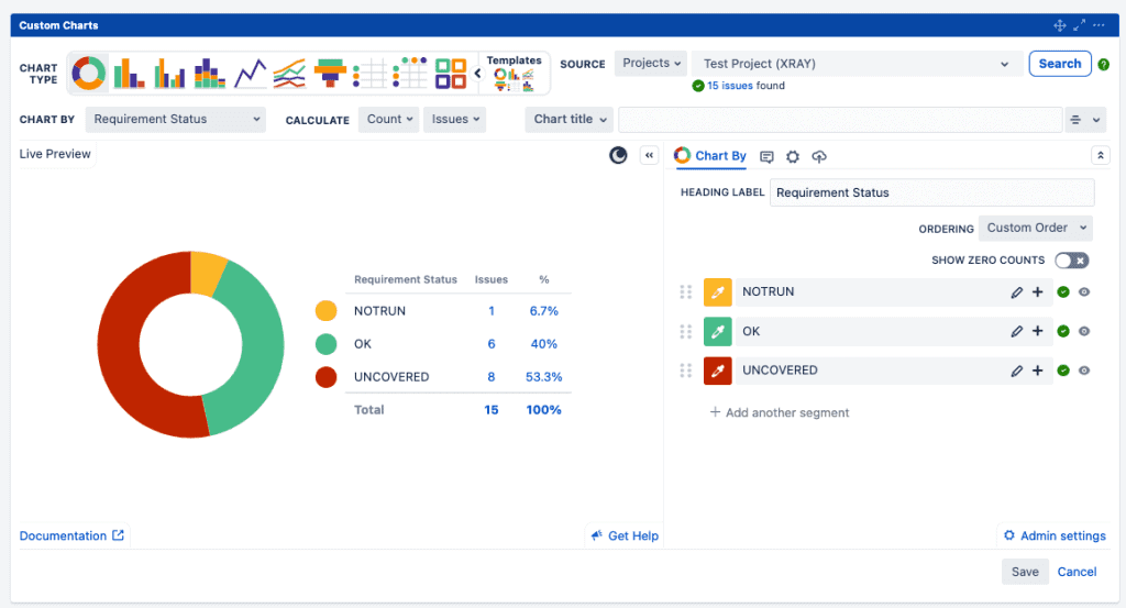
The chart above shows the status of your testing requirements, providing a high-level overview of progress made toward testing. We’ve chosen to display the data in a pie chart because there are 3 values that are sufficiently different in size, which helps make for an engaging data story. Requirements Status reporting can identify if more test requirements need to be written, and whether the associated tests have been run or not.
Xray data pairs well with Simple Search, too. Simple Search is a separate gadget that comes with Custom Charts and can be connected to one or more charts on the dashboard so that you can dynamically filter the data. For instance, you could get granular insights such as the test requirement status for stories only in the current sprint, or broader insights like what percentage of all the testing requirements have been run.
Test Type
Selecting “Test Type” as the Chart By option breaks down the segments into the default test types of Manual, Cucumber, and Generic. The Calculation in the bar chart below has been selected as “Step Count” to show the total number of steps for those tests. The ability to calculate test count instead of issue count adds more depth to the information, which allows these charts to be more useful for data-based decision-making.
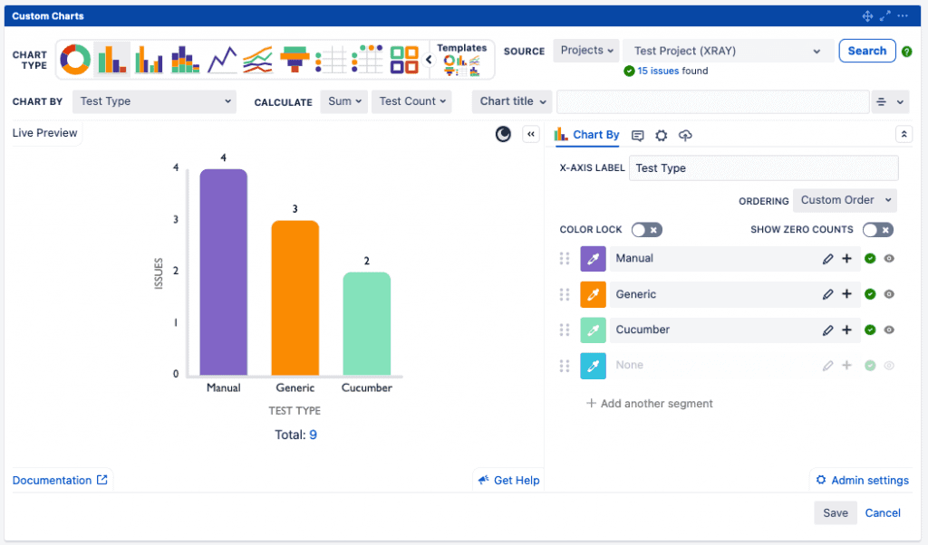
Understanding the Test Type breakdown can also be useful at a high level to understand how testing is completed in your organization. If you are looking to streamline your testing process or you’re having trouble pinpointing the cause of bottlenecks, then identifying how much of your testing is manual is essential.
Testing Dates
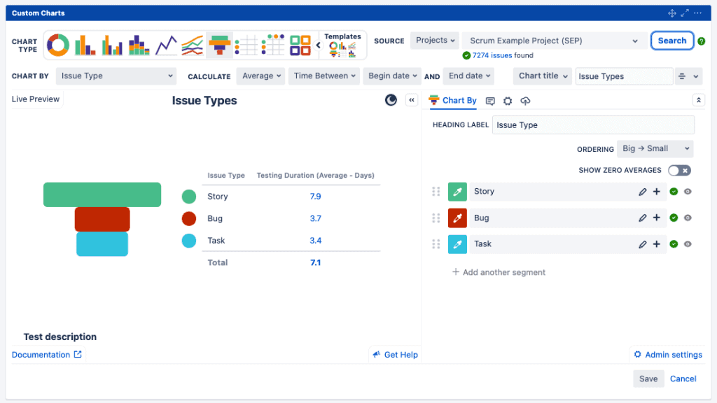
Use the Time Between calculation option to see how long tests are taking. Xray comes with Begin/End dates, and calculating the average time it takes tests to be completed can help you understand if there are any bottlenecks or limitations that need to be addressed. In the funnel chart below, we’ve even renamed this column to Testing Duration to make it clear to users viewing the chart what this value represents. We’ve broken it down by issue type, but this chart could also be useful if you wanted to display testing duration by assignee, component, or even epic.
Test Run Status
One of the most important pieces of information while you’re testing is the status. Have your tests passed or failed? Xray represents this with the “Test Run Status” field. Simply select “TestRunStatus” as the Chart By field and you have a high-level overview of how well your tests are passing. Custom Charts supports both out-of-the-box test statuses as well as custom ones created in your instance.
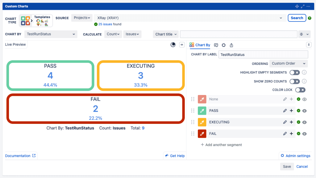
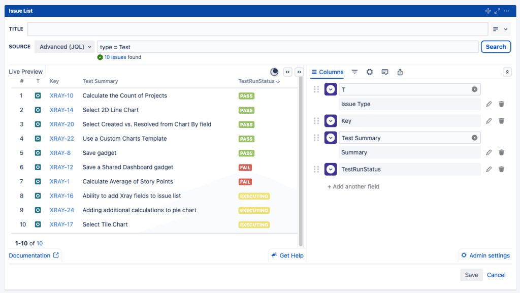
In the example above we’ve displayed this information in a tile chart, and we’ve used RAG (red, amber, green) coloring because RAG is good for spotlighting favorable, neutral, and unfavorable values. You can also use the Issue List gadget below (another gadget that comes with Custom Charts) if you want to see more information about each test and its status. Between the two gadgets you can either see a high-level view or drill into individual tests to help identify why they are failing and get back on track.
Using Jira Query Language
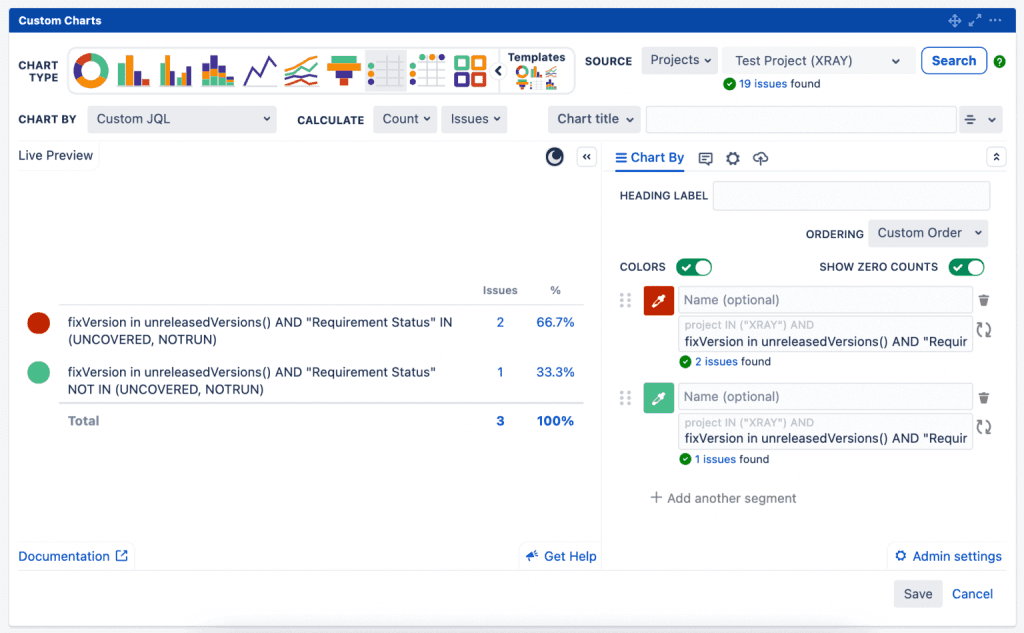
If you have more specific data that you want to see, you can always use Jira Query Language (JQL) to pull it in. Use Chart By – Custom JQL to create complex queries for your data. For example, combine search terms to show issues with a “Requirement Status” of UNCOVERED and NOTRUN for the unreleased versions, like in the table chart below. This blends your Xray-specific JQL with Jira’s release reporting to provide insight into testing status for upcoming releases. We’re showing the full JQL in the table, but you can add names to the segments in the table to make it easier for teams to read!
Get creative!
There are lots of ways to report on your Xray testing data in Custom Charts for Jira, including simple charts based on your testing fields, custom JQL, or date comparisons.
Take advantage of the different chart types available to you – we’ve shown examples of pie charts, tables, bar charts, and funnels, but your testing data can be pulled into any chart type. You can also add a second variable to your reporting and chart in 2D, e.g. you could use our two-dimensional stacked bar charts to look at testing status by version, sprint, or assignee. You can color-code your charts and change the display names so it is readable to your team.
Both Xray Test Management for Jira and Custom Charts for Jira are available on the Atlassian Marketplace. You can also trial Custom Charts for Jira in our app playground.
Sign up for a demo
Request Demo

