Affinity diagram: Organize ideas and solve problems visually
Tempo Team
You’ve gathered valuable ideas from brainstorming sessions, customer feedback, and process improvements. But when that information is scattered across documents and sticky notes, it’s hard to spot patterns and extract meaningful insights.
That’s where an affinity diagram helps. This simple visual tool helps you organize related concepts so you can identify connections and turn ideas into clear, actionable steps.
Here, we’ll show you how to create an affinity diagram, with examples and recommended tools to get you started.
What is an affinity diagram?
An affinity diagram is used for organizing ideas, data, or insights into clear categories or themes. It allows teams to synthesize complex or unstructured information by grouping related concepts and uncovering patterns or relationships.
When teams collaborate to assemble an affinity diagram, they’re better equipped to identify key issues and develop solutions. For example, a team collecting customer feedback might sort comments into themes like “response time,” “staff knowledge,” and “communication.” This helps them spot patterns – such as delays due to insufficient training – and take targeted action, like improving staff development.
How to create an affinity diagram
Teams such as designers or cross-functional project groups typically begin the affinity diagram process after collecting qualitative data. Here’s how to build an affinity diagram:
1. Collect input or ideas
Gather all relevant ideas, insights, or data points, such as customer feedback or research findings.
2. Write each idea on a separate card
Write each idea or data point on its own sticky note or card. Keep ideas separate to add flexibility and help you synthesize information more effectively in the next step.
3. Group similar ideas into clusters
Once you’ve written down every idea, sort the cards into clusters based on patterns or common themes. Look for recurring concepts or issues; this is where the affinity diagram reveals connections that weren’t obvious at first.
4. Give each group a clear header
As categories emerge from the data, label each group with a header that reflects the shared theme or insight. These labels make the affinity chart easier to understand and reference.
5. Discuss and prioritize the groupings
Finally, review the clusters with your team. Prioritize the most important ones, and determine the next steps. Collaboration deepens your understanding of the data and ensures alignment on priorities.
Affinity diagram examples
Let’s explore real brainstorming examples and see how they fit into an affinity diagram:
Product development: Organizing customer feedback
A mobile app team faces an overwhelming amount of feedback, including app store reviews, support tickets, and survey responses. Some users complain about slow load times, others request a dark mode, and many find the checkout process confusing.
Through affinity mapping, the team organizes similar ideas into clusters:
Usability issues: Confusing checkout, difficult navigation
Performance problems: Crashes, slow load times
Feature requests: Dark mode, saved favorites
As clear patterns emerge, the team knows where to focus: Address usability first, then performance, and finally, new features.
Process improvement: Streamlining workflows
A company asks employees how to improve workflows. Responses include:
“Too many emails slow me down.”
“Meetings take up my whole day.”
“I can never find the right document.”
“We use way too many different tools.”
Individually, these are just complaints. But an affinity chart reveals patterns:
Communication overload: Too many emails and meetings
Organization issues: Scattered tools, lost documents
By identifying these themes, leadership can implement tools like Jira reports and charts to improve efficiency. Jira’s project management software centralizes task management, reducing the need for excessive emails and meetings, while its integration with tools like Tempo improves organization. Additionally, its charts provide visual insights, helping teams stay on track and make informed decisions.
Marketing strategy: Understanding customer behavior
A marketing team uses affinity grouping to organize user feedback, which includes:
“I only buy when there’s a discount.”
“Behind-the-scenes content keeps me engaged.”
“I prefer short videos over long articles.”
“Product descriptions need more details.”
“I follow brands that post interactive content.”
By sorting these comments, the team identifies key categories:
Pricing sensitivity: Interest in discounts
Content preferences: Behind-the-scenes, short videos, interactive posts
Product information: Need for detailed descriptions
These insights tell the team they need to refine design ideas and map out strategies for content creation and promotional campaigns.
Software development: Prioritizing feature requests
A project management software company gathers user research to guide future updates. Feature requests include:
“Assign multiple people to one task.”
“Improve the mobile app experience.”
“Add a dark mode option.”
“Automate task reminders.”
“An AI-powered assistant would help.”
Using the affinity diagram process, they group the requests into these themes:
Collaboration improvements: Assigning multiple users to a task
User experience enhancements: Better mobile app, dark mode
Automation and AI features: Automated reminders, AI assistant
The team can now prioritize updates based on user needs.
Recommended tools for creating an affinity diagram
Organize ideas, identify themes, and move from insights to action with tools that support affinity diagramming. You can create one using physical sticky notes or digital tools like Miro, Jira, or Confluence for collaborative mapping and documentation.
Step | Action | Example | Suggested Tools |
Collect ideas | Gather raw data, feedback, or observations from participants. | Customer feedback on website usability. | Miro, MURAL, sticky notes, spreadsheets |
Write ideas on separate cards | Write each idea or data point on a separate sticky note or card. | "Navigation is confusing," "slow page load time," “frequent crashes” | Miro, Trello, sticky notes, spreadsheets |
Group similar ideas | Cluster similar ideas or themes together. | Group "slow load time" with "frequent crashes." | Miro (drag-and-drop), Jira, spreadsheets |
Label the groups | Name each group with a header that summarizes the theme. | Group: "Technical Issues" | Miro (labels), Trello (tags), spreadsheets |
Prioritize the groupings | Discuss and prioritize clusters based on importance. | Prioritize "Technical Issues" for immediate fixes. | Jira (priority setting), Miro (voting) |
Refine and define | Define insights and actions based on the categories. | Action: Improve website load time by optimizing images. | Jira (tasks), Confluence with linked pages, Jira reports and gadgets |
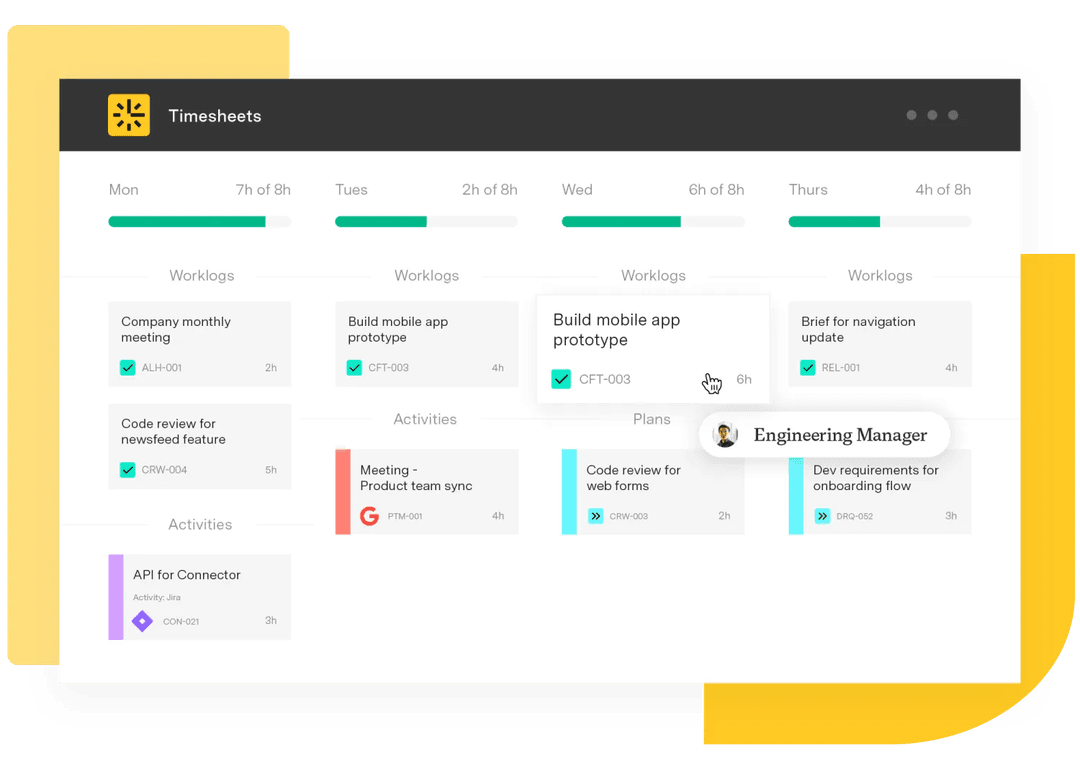
Driving clarity and collaboration with Tempo
After your team organizes and groups ideas with an affinity diagram, the next step is to turn those insights into real, impactful action. Tempo’s project management tools help you do just that.
Timesheets lets you track time spent across tasks, helping your team stay focused, identify bottlenecks, and make faster, data-informed decisions based on the priorities in the affinity diagram. When paired with dashboards in Custom Charts for Jira, you get a clear, real-time view of project progress and team performance, ensuring the most critical initiatives stay on track.
Custom Charts also enables you to create tailored visualizations, like pie charts, to help you dig deeper into the data. These charts allow you to spot trends, analyze resource usage, and communicate insights across teams.
Want to improve clarity and collaboration in your projects? Try Tempo today and start turning ideas into actions.