A five-step process for building portfolio dashboards with Tempo
Building effective portfolio dashboards requires more than picking the right charts or connecting data sources. The most successful implementations follow a structured process that starts with understanding decision needs and ends with sustainable governance practices.
Step 1: Define decision outcomes
Before you design a single chart or choose any metrics, identify the specific decisions your dashboards need to support. This foundation step determines whether your dashboards become indispensable decision tools or unused reporting artifacts.

Identify key stakeholders and their decision points
Map your stakeholder ecosystem first. Every portfolio has multiple audiences with different information needs. Executives focus on strategic alignment and investment returns. PMOs concentrate on resource allocation and delivery predictability. Teams need workflow optimization and performance feedback.
Document specific decision scenarios for each group. Don't just list stakeholder types – identify the actual decisions they make regularly. For example, executives might decide whether to continue funding underperforming initiatives, while PMOs decide how to reallocate resources when priorities shift.
Understand decision timing and frequency. Some decisions happen in quarterly planning cycles, while others occur weekly or even daily. Match your dashboard refresh rates and detail levels to actual decision-making rhythms.
Identify decision triggers and escalation points. Understand what information prompts stakeholders to take action. This helps you design alerts and thresholds that surface problems when intervention is still possible.
Map decisions to required insights
Work backward from decisions to data requirements. For each decision scenario, identify what information stakeholders need to choose confidently. This prevents metric proliferation and ensures every element serves a purpose.
Distinguish between nice-to-know and need-to-know information. Dashboards lose effectiveness when they include too much interesting but non-actionable data. Focus on insights that directly influence specific choices.
Consider decision confidence levels. Some decisions require high confidence with detailed analysis. Others benefit from directional indicators that guide general approaches. Match information depth to decision stakes.
Ready to turn your portfolio management dashboards into a strategic decision engine?
Download the guideEstablish success criteria for dashboard effectiveness
Define specific outcomes beyond user satisfaction. Successful dashboards should improve decision speed, increase planning accuracy, or reduce time spent gathering information. Set measurable goals for dashboard impact.
Plan for adoption indicators. Track which stakeholders actually use dashboards regularly versus those who revert to asking for manual reports. Low adoption usually indicates misaligned design rather than user resistance.
Measure decision quality improvements. Monitor whether decisions made with dashboard support lead to better outcomes than previous approaches. This might include improved delivery predictability or more accurate resource planning.
Step 2: Architect your metrics strategy
Effective portfolio dashboards require carefully selected metrics that work together to provide complete pictures without overwhelming users. Your metrics strategy should balance different indicator types and serve multiple organizational levels.
Leading indicators: Predictive signals
Team velocity and capacity trends help predict future delivery capabilities. Track story points completed over time, but also monitor velocity stability and capacity utilization. These indicators help forecast whether teams can meet upcoming commitments.
Risk emergence and mitigation patterns provide early warning of potential problems. Monitor how quickly new risks are identified, how effectively they're being addressed, and whether risk profiles are improving over time.
Quality trend indicators predict whether current development practices will create future maintenance burdens. Track code coverage, technical debt accumulation, and defect detection rates to identify areas needing process improvements.
Stakeholder engagement levels signal potential alignment issues before they impact delivery. Monitor meeting attendance, feedback response rates, and stakeholder satisfaction trends to identify relationship risks.
Lagging indicators: Outcome measures
Delivery performance and schedule adherence measure whether teams consistently meet their commitments. Track on-time delivery rates, schedule performance indices, and milestone achievement across the portfolio.
Financial performance and value realization show whether investments are generating expected returns. Monitor budget variance, actual ROI versus projections, and time to value realization for completed initiatives.
Quality outcomes and customer satisfaction measure whether delivered work meets expectations. Track defect rates in production, customer feedback scores, and support request volumes for released features.
Strategic alignment achievement shows whether portfolio work advances organizational objectives. Measure progress toward strategic goals and assess whether resource allocation matches declared priorities.
Balanced scorecards: Avoiding metric tunnel vision
Include multiple performance dimensions. Don't focus exclusively on delivery speed, cost efficiency, or any single aspect of performance. Balanced scorecards help stakeholders optimize across competing objectives.
Connect operational metrics to strategic outcomes. Show how team-level performance contributes to PMO goals, and how PMO metrics support executive objectives. This connection helps stakeholders understand their role in broader success.
Balance efficiency with effectiveness. Measure not just how fast work gets done, but whether the right work is being completed. Include metrics that capture value delivery alongside productivity indicators.
Monitor leading and lagging indicators together. Combine predictive metrics with outcome measures to provide both early warning capabilities and accountability for results.
The metrics hierarchy: From operational data to strategic insights
Ground-level metrics support daily decisions. Teams need metrics that help optimize their immediate work – sprint progress, quality indicators, and workflow efficiency measures.
Management-level metrics enable coordination. PMOs need metrics that help balance resources, manage dependencies, and ensure portfolio-wide delivery. These metrics aggregate and contextualize team-level data.
Executive-level metrics drive strategic choices. Leaders need metrics that connect portfolio performance to business outcomes. These metrics should inform investment decisions and strategic direction adjustments.
Cross-cutting metrics connect organizational levels. Some metrics serve multiple audiences by providing different views of the same underlying performance. Design these carefully to avoid confusion while maximizing insight value.
Step 3: Engineer data connectivity with Tempo tools
Great portfolio dashboards require reliable, current data from multiple sources. Tempo's Portfolio Collection provides several approaches to data integration that reduce manual reporting overhead while improving accuracy.
Integrations: Connecting your data ecosystem
Start with Tempo Custom Charts for native Jira integration. Custom Charts pulls real-time data directly from Jira projects, saved filters, or custom JQL queries. This eliminates data export and import cycles that introduce delays and errors.
Connect to enterprise systems with Tempo BI Connectors. For organizations using Power BI, Tableau, or other business intelligence platforms, BI Connectors enable sophisticated analysis that combines Jira data with financial and strategic information from other systems.
Leverage Confluence integration for stakeholder communication. Custom Charts works in both Jira dashboards and Confluence pages, enabling portfolio reporting that integrates with existing communication workflows and documentation practices.
“Having a consistent view of your entire portfolio is a competitive advantage. With Tempo’s Portfolio Collection, you get tailored insights built on real-time Jira data – with no-code, enterprise dashboards that are effortless for non-technical users to build.” - Nigel Budd, UK Agile Practice Lead at Eficode
Breaking down data silos: Technical and organizational challenges
Address system integration complexity gradually. Start with data sources that provide the highest value with the least integration effort. Jira often contains the richest project information and requires no additional integration when using Tempo tools.
Solve organizational data challenges alongside technical ones. Data silos often reflect organizational boundaries rather than technical limitations. Ensure that stakeholders understand how data sharing supports better portfolio decisions.
Establish data ownership and stewardship practices. Assign clear responsibility for data quality in each system. Portfolio dashboards are only as reliable as their underlying data sources.
Plan for data governance and security requirements. Enterprise portfolios often include sensitive information that requires access controls and audit trails. Ensure your integration approach meets organizational security and compliance standards.
Data quality foundations: Ensuring accuracy and consistency
Implement data validation at the source. The most effective approach to data quality is preventing problems rather than fixing them later. Establish standards for how information gets entered in Jira and other source systems.
Create feedback loops for data quality issues. When dashboard users identify data problems, ensure there's a clear process for reporting and resolving these issues. Quick resolution maintains confidence in dashboard accuracy.
Monitor data completeness and consistency. Track whether required fields are populated, whether information is entered consistently across teams, and whether data quality is improving over time.
Document data definitions and calculation methods. Ensure that stakeholders understand how metrics are calculated and what data sources contribute to each measurement. This transparency builds trust and enables proper interpretation.
Real-time vs. batch processing: Choosing the right refresh strategy
Match refresh rates to decision-making needs. Real-time updates make sense for operational metrics that guide daily work. Strategic indicators might only need daily or weekly updates to remain useful for planning decisions.
Consider system performance and user expectations. Real-time updates require more system resources and can slow dashboard loading times. Balance currency with performance based on actual user needs.
Plan for different update frequencies within the same dashboard. Some metrics might update hourly while others refresh daily or weekly. Custom Charts automatically refreshes data based on your source configuration, allowing mixed refresh strategies within single dashboards.
Build in data lag communication. When dashboards include data with different refresh rates, help users understand what information is current versus slightly delayed. This prevents misinterpretation of mixed-currency data.
Step 4: Design for clarity and action with Custom Charts
Effective dashboard design goes beyond making charts look attractive. The best dashboards guide users toward insights and actions while minimizing cognitive overhead.
Layout principles: Scannable, actionable, and contextual
Apply the five-second rule for executive dashboards. Key stakeholders should be able to understand portfolio health and identify areas requiring attention within five seconds of viewing a dashboard. Place the most critical information prominently and use visual hierarchy effectively.
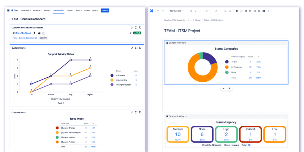
Group related information logically. Custom Charts allows you to organize multiple charts within the same dashboard or page, enabling logical information clustering that matches how stakeholders think about their work.
Provide progressive disclosure for detailed analysis. Start with summary views that highlight exceptions or areas needing attention. Allow users to drill down into details when they need more information for specific decisions.
Chart selection guide: When to use what visualization type
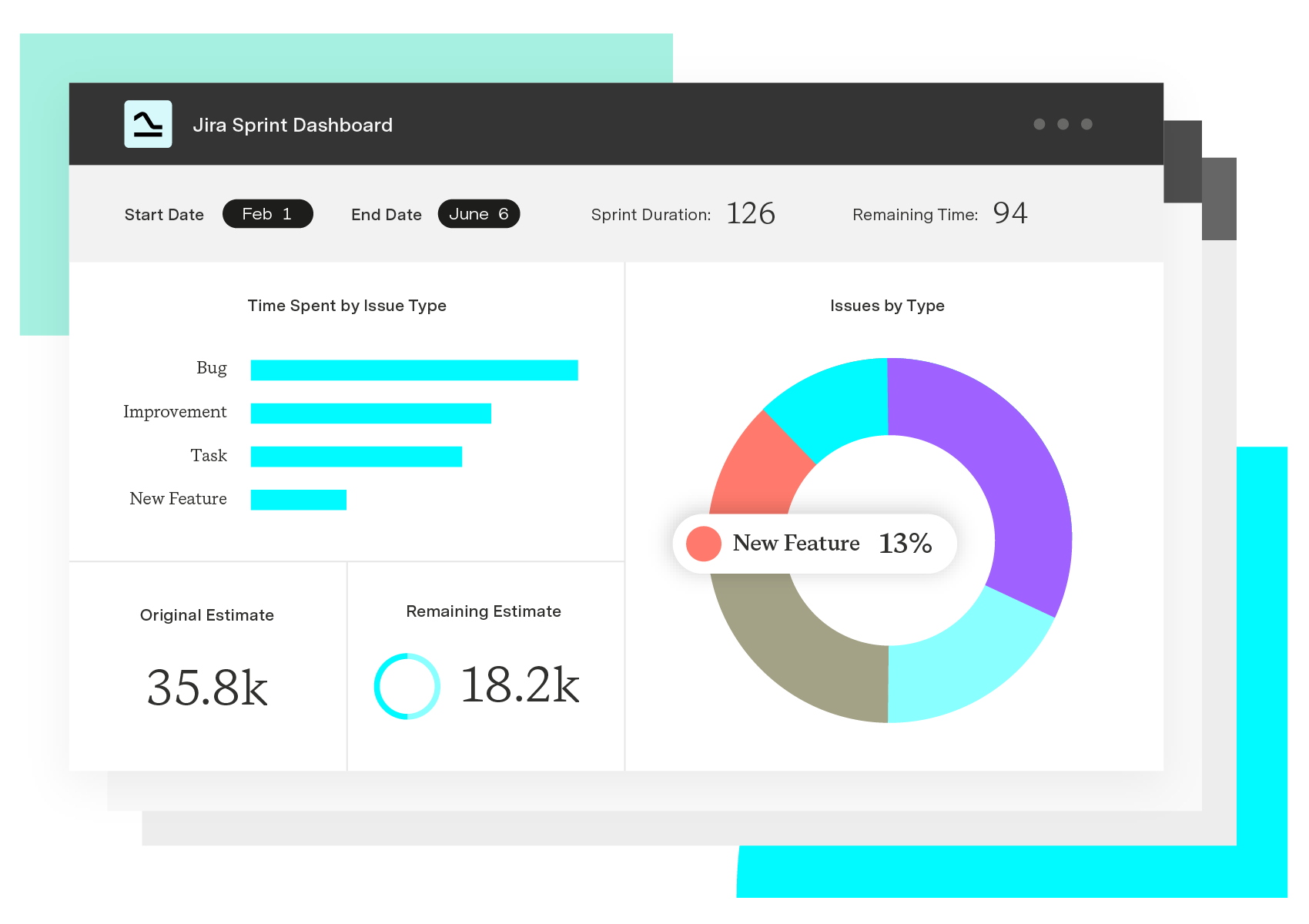
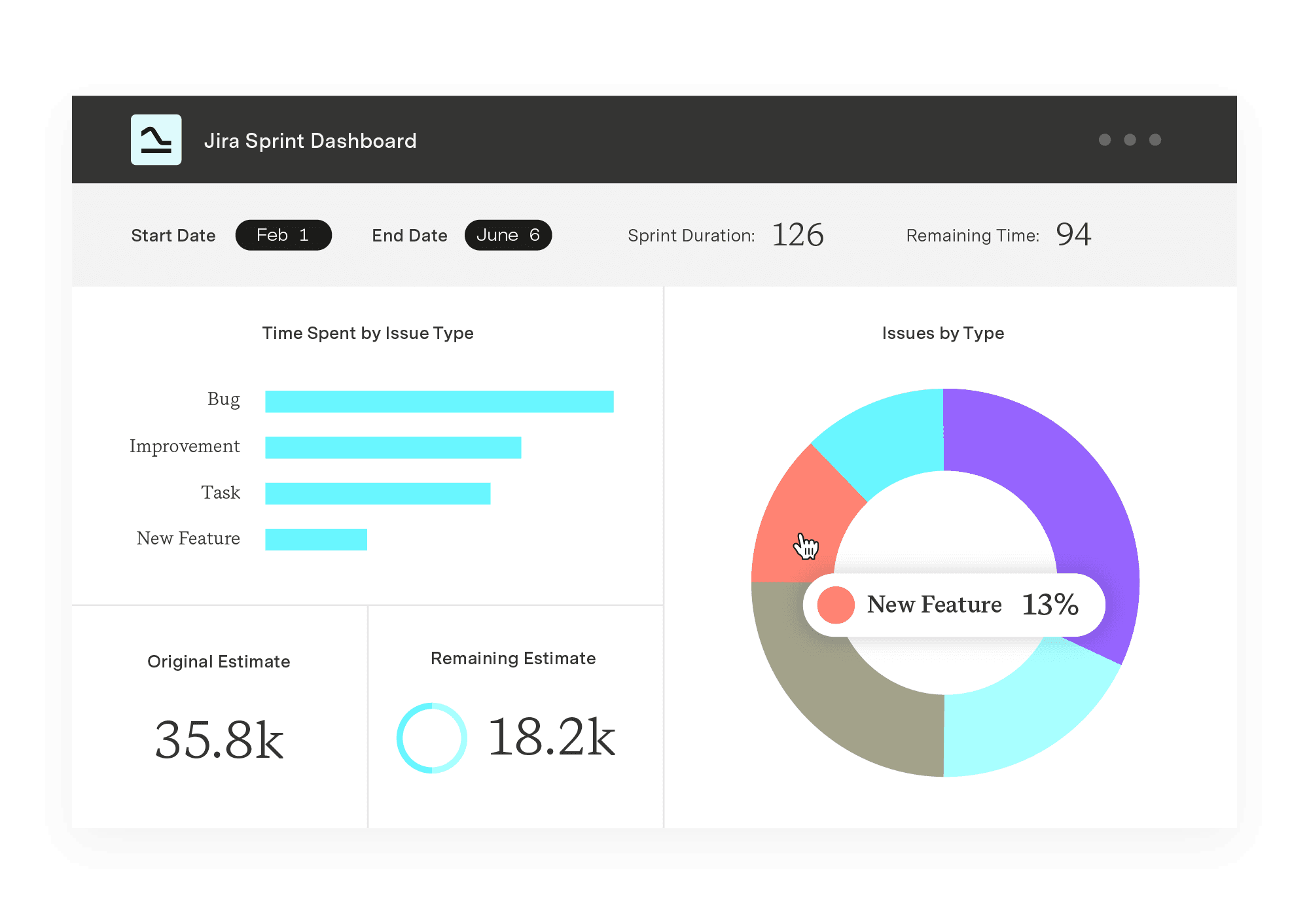
Use pie charts for part-to-whole relationships. Pie charts work well for showing budget allocation across strategic themes or resource distribution across different project types. Limit pie charts to seven or fewer segments for clarity.
Choose bar charts for comparisons between categories. Bar charts effectively show performance differences between teams, projects, or time periods. Custom Charts offers both standard bar charts and 2D grouped or stacked variations for more complex comparisons.
Apply line charts for trend analysis over time. Line charts excel at showing velocity trends, budget burn rates, or risk accumulation patterns. 2D line charts can compare multiple trends simultaneously while maintaining readability.
Use table charts for detailed data exploration. When stakeholders need to examine specific data points or compare detailed information across multiple dimensions, table charts provide structured views that support analysis.
Apply funnel charts for process flow analysis. Funnel charts work well for showing how work flows through different stages, highlighting bottlenecks and conversion rates between process steps.
Interactive design: Drill-down capabilities and filtering
Enable dynamic filtering for different perspectives. Custom Charts supports dynamic filtering through Simple Search gadgets that automatically connect to charts on the same dashboard or page. This allows stakeholders to explore data from different angles without creating multiple static charts.
Provide click-through navigation to underlying data. When dashboard users identify concerning trends or outliers, they should be able to access the underlying Jira issues or detailed information that explains the patterns they're seeing.
Support saved views for common analysis scenarios. Different stakeholders often need to view the same data with different filters or time ranges. Custom Charts templates allow you to save common chart configurations that can be reused across different contexts.
Design for exploration without overwhelming complexity. Interactive features should enhance understanding rather than adding confusion. Focus on interactions that directly support common decision-making scenarios.
Performance optimization: Fast load times and responsive interfaces
Optimize data queries for dashboard performance. Custom Charts allows filtering through saved Jira filters or custom JQL, enabling efficient data retrieval that focuses on relevant information rather than processing entire datasets.
Balance detail with loading speed. Dashboards that take too long to load won't be used regularly. Consider whether all information needs to be visible immediately or if some details can be accessed through drill-down interfaces.
Plan for scalability as portfolios grow. Dashboard performance should remain acceptable as the number of projects, teams, and data volume increases. Test performance with realistic data volumes during development.
Step 5: Implement governance and evolution
Successful portfolio dashboards require ongoing management and improvement. The organizations that get lasting value from their dashboards treat them as living systems rather than one-time implementations.
Dashboard lifecycle management: Creation, maintenance, retirement
Plan for regular maintenance and updates. Dashboards need periodic review to ensure they remain relevant as organizational priorities evolve. Custom Charts templates make it easier to maintain consistency when updating multiple related dashboards.
Create retirement processes for outdated dashboards. Obsolete dashboards create confusion and reduce confidence in active ones. Establish criteria for when dashboards should be retired and communicate changes to affected stakeholders.
Document dashboard purposes and maintenance responsibilities. Each dashboard should have clear ownership, documented purposes, and defined maintenance schedules. This prevents dashboards from becoming orphaned or misunderstood over time.
User adoption strategies: Training, change management, feedback loops
Provide context-specific training rather than generic tool tutorials. Stakeholders need to understand how dashboards support their specific work, not just how to use dashboard features. Connect training to real decision-making scenarios they encounter regularly.
Build feedback mechanisms into dashboard interfaces. Tempo provides support resources directly within Custom Charts admin settings, but also create your own feedback channels for stakeholders to suggest improvements or report issues.
Start with pilot implementations and expand gradually. Begin with stakeholder groups most likely to embrace dashboard-driven decision making. Use their success to build momentum for broader adoption across the organization.
Address resistance through demonstration rather than mandate. Show how dashboards solve real problems that stakeholders currently face. Voluntary adoption based on demonstrated value creates more sustainable change than top-down requirements.
Continuous improvement: Regular review and refinement processes
Schedule regular dashboard review sessions. Quarterly reviews help identify what's working, what needs adjustment, and what new capabilities might be needed. Include both technical performance and user experience in these assessments.
Track decision outcome improvements. Measure whether dashboard-supported decisions lead to better results than previous approaches. This might include improved delivery predictability, more accurate resource planning, or faster problem resolution.
Build capability maturity over time. Start with basic metrics and visualization, then add predictive analytics, automated alerts, and sophisticated analysis capabilities as organizational sophistication grows.
Practical implementation with Tempo's Portfolio Collection
Tempo provides the technical foundation for this five-step process while integrating seamlessly with existing Atlassian environments. Begin by implementing the Portfolio Collection.
Getting started with Custom Charts
Begin dashboard creation in familiar environments. Add Custom Charts gadgets directly to Jira dashboards or Confluence pages where stakeholders already work. This reduces adoption friction by embedding insights into existing workflows.
Use saved filters to define your data scope. Custom Charts can pull data from existing Jira saved filters, leveraging filter logic you've already developed while ensuring consistent data definitions across different charts.
Start with basic chart types and add complexity gradually. Custom Charts offers multiple visualization options including pie charts, bar charts, line charts, and tables. Begin with simple visualizations that clearly communicate key insights, then add sophisticated analysis as stakeholder comfort grows.
Connecting data across your technology stack
Extend insights into existing BI platforms. Tempo BI Connectors allow you to incorporate Jira portfolio data into Power BI, Tableau, and other analytics tools. This approach preserves investments in existing platforms while adding project-level detail.
Maintain data consistency across different tools. When portfolio data appears in multiple systems, ensure calculation methods and definitions remain consistent. Document how metrics are calculated in each environment to prevent confusion.
Plan for data security and access control. Portfolio information often includes sensitive strategic and financial data. Ensure your integration approach meets organizational security requirements and provides appropriate access controls.
Measuring dashboard success and return on investment
Effective portfolio dashboards should deliver measurable improvements in organizational performance. Track both immediate efficiency gains and longer-term decision quality improvements.
Immediate efficiency improvements
Reduce time spent gathering portfolio information. Measure how much time stakeholders previously spent collecting and analyzing portfolio data manually. Effective dashboards should dramatically reduce this overhead.
Decrease meeting time devoted to status reporting. Portfolio reviews should shift from information sharing to decision making when dashboards provide current status visibility. Track whether meeting quality improves alongside reduced duration.
Accelerate problem identification and response. Monitor how quickly issues are identified and addressed compared to previous approaches. Dashboard-driven early warning systems should enable proactive rather than reactive management.
Decision quality enhancements
Improve delivery predictability and planning accuracy. Track whether portfolio commitments become more reliable as dashboard visibility improves. Better information should lead to more accurate estimates and scheduling.
Enhance resource allocation effectiveness. Monitor whether resource conflicts decrease and utilization optimization improves with better portfolio visibility. Effective dashboards help prevent overcommitment and underutilization.
Increase stakeholder confidence and alignment. Survey stakeholders regularly to understand whether dashboard-driven transparency improves their confidence in portfolio management and organizational alignment.
The path forward: Building portfolio dashboard capabilities
Implementing effective portfolio dashboards with Tempo tools positions organizations for sustainable competitive advantage through better decision-making and stakeholder alignment.
Start with pilot implementations that demonstrate value quickly. Choose high-visibility, high-impact dashboard applications for initial development. Success with these pilots builds momentum for broader implementation.
Build internal capabilities alongside technical implementation. Develop organizational expertise in dashboard design, data analysis, and stakeholder engagement. These capabilities become more valuable over time as dashboard sophistication increases.
Plan for evolution and continuous improvement. Portfolio dashboards should grow more sophisticated as organizational maturity increases. Design initial implementations that can expand rather than requiring replacement as needs evolve.
The organizations that master portfolio dashboards don't just improve their current performance – they build capabilities that compound over time and create sustainable competitive advantages.
Ready to transform your portfolio management with dashboards that drive better decisions? Explore Tempo's Portfolio Collection and start building the measurement capabilities your organization needs to thrive.
Get real-time Jira insights for portfolio governance and confident decisions.
Try the Portfolio Collection