The ultimate guide to portfolio management dashboards
Is your portfolio management dashboard an array of disconnected reports, or a strategic decision engine?
Let's face it – change happens really fast these days. Planning cycles are shorter and strategies have to be agile. What once required annual planning now demands quarterly adjustments. To thrive in this world, it’s critical to have portfolio-level visibility. Without it, strategic initiatives fail to deliver value. Executives are stuck making decisions based on static, outdated reports.
As recently as 2023, $48 trillion was invested in projects annually, with just 35% of those projects considered successful. How many of your projects are part of the successful 35%?
Projects never exist in isolation from one another. Focusing time, costs, and effort on one area of the business means taking it away from somewhere else.
"Once you have determined how many projects you can support, and what mix of projects you need to support your strategy, similar projects must compete against other similar projects for budget and staff for the resources dedicated to that category of project." - Robert Cooper
Are you equipped with the data you need to confidently make those decisions?
With distributed teams and multi-unit projects, the only way to truly understand what’s working across the business is to build a portfolio management dashboard that serves as the central nervous system for strategic decisions.

Adaptive advantages
Your portfolio management dashboard allows you to align strategy with outcomes.
It gives you the information you need to adapt in real-time – a live dashboard can surface insights and risks before problems emerge.
With a good dashboard, you gain the ability to make informed trade-offs between competing priorities. It shows where time, costs, and effort are currently deployed, and how plans are tracking against progress. Scenario modeling – based on real-time data – turns strategic planning from a gut-check into a science.
A 2024 report by PwC Switzerland found that effective portfolio management can reduce project spend by 20-30% while improving stakeholder satisfaction and leadership commitment.
In this guide, we’ll dive into portfolio management reports and dashboards for every level: executive, PMO, delivery teams, and cross-cutting reports.

Portfolio-quality data
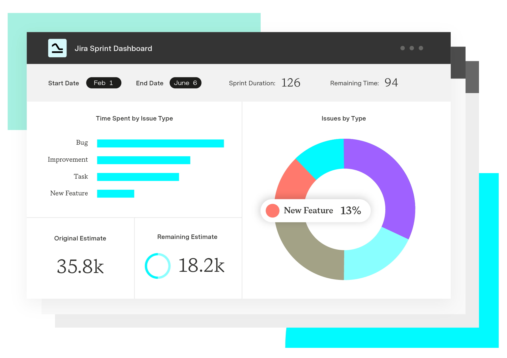
Ultimately, the quality of your portfolio-management dashboard depends on the quality of data feeding it. Tempo developed the Project Collection to help companies get accurate time, cost, and capacity data across every team.
Essential portfolio dashboards
Executive level
Strategy heatmap: Visual alignment of initiatives to strategic objectives
Portfolio bubble chart: Initiative size (budget) vs strategic value vs risk
Investment distribution pie chart: Budget allocation across strategic themes / pillars
ROI waterfall chart: Expected vs. actual returns across portfolio
Budget burn rate: Planned vs. actual spending over time
Investment horizon chart: Short-term vs. long-term investment distribution
Cost-benefit analysis matrix: Initiatives plotted by cost vs. expected benefit
RAG status dashboard: Red/Amber/Green health indicators
Risk heat map: Likelihood vs. impact of portfolio risks
Performance gauge charts: Overall portfolio health score
Example metrics
Strategic alignment score (% of budget aligned to top priorities)
Portfolio strategic coverage (% of strategic objectives with supporting initiatives)
Investment balance (innovation vs. operational vs. regulatory)
Time to strategic impact (average time from funding to value delivery)
Portfolio ROI (overall and by initiative)
Budget variance (% over/under planned spend)
Value realization rate (% of expected benefits achieved)
Payback period (average time to break even)
PMO-level
Capacity vs. demand chart: Available capacity vs. requested work
Resource allocation matrix: People/skills mapped to projects
Utilization heatmap: Team utilization rates across time periods
Skills gap analysis: Required vs. available competencies
Milestone timeline/Gantt: Critical milestones across portfolio
Velocity trends: Team productivity over time
Cycle time distribution: Time from start to completion
Predictability chart: Planned vs. actual delivery dates
Risk burndown chart: Risk mitigation progress over time
Issue age distribution: How long issues remain open
Dependency network diagram: Cross-project dependencies
Impact analysis matrix: Potential impact of delays/issues
Example metrics
Overall utilization rate (% of capacity used)
Skills availability score (% of required skills available)
On-time delivery rate (% of commitments met)
Schedule performance index (earned value)
Average cycle time (project duration)
Commitment reliability (% of promises kept)
Quality metrics (defect rates, rework %)
Active risk count (by severity level)
Average time to resolve issues
Dependency health (% of dependencies on track)
Escalation rate (issues requiring leadership attention)
Interested in creating the perfect planned vs actual report in Jira?
Get the checklistOperational teams
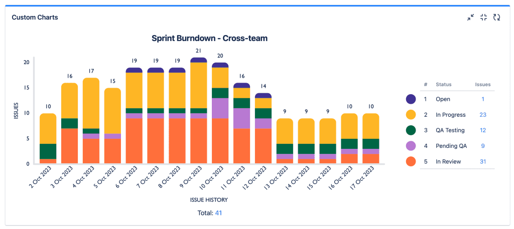
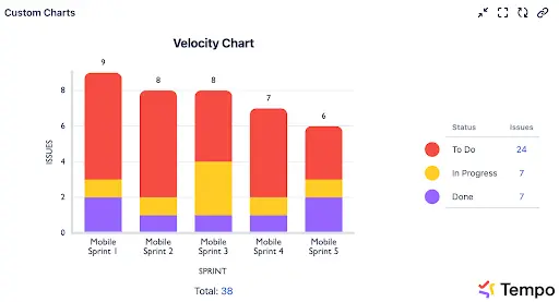
Sprint burndown charts: Work completion within iterations
Velocity charts: Story points completed over time
Cumulative flow diagrams: Work-in-progress flow
Lead time scatter plots: Time from request to delivery
Workload distribution: Distribution of work across team members
Learning and development progress: Skills advancement tracking

Example metrics
Sprint goal achievement rate
Velocity (story points per sprint)
Work-in-progress limits compliance
Flow efficiency (active work time vs. total time)
Mean time to recovery (MTTR)
Team satisfaction score
Innovation time (% spent on new ideas)
Cross-cutting dashboards
Trend forecasting: Future performance based on historical data
Scenario analysis: What-if modeling for different portfolio configurations
Early warning indicators: Leading metrics that predict problems
Executive summary cards: Key messages for different stakeholder groups
Progress storytelling: Visual narratives of portfolio journey
Comparison charts: Performance vs. previous periods
Action item tracking: Follow-up items and accountability
Value stream maps: End-to-end flow of value delivery
Cross-portfolio dependencies: Connections between different portfolios or programs
Ecosystem health: External dependencies and partner performance
Effective portfolio management doesn’t depend on using every single one of these dashboards and KPIs. However, some of them should be relevant to teams at any organization.
To decide which are most important for yours, follow this dashboard development framework.

Five-step dashboard development framework
Step 1: Define decision outcomes
Identify key stakeholders and their decision points
Map decisions to required insights
Establish success criteria for dashboard effectiveness
Step 2: Architect your metrics strategy
Leading indicators: Predictive signals (team velocity, risk scores)
Lagging indicators: Outcome measures (delivery dates, budget performance)
Balanced scorecards: Avoid metric tunnel vision
Step 3: Connect data sources
Integrations: Jira, Confluence, financial systems, and BI platforms
Break down data silos: Align on consistent data points or equivalencies
Data quality foundations: Ensure accuracy and consistency
Real-time vs. batch processing: Choose the right refresh strategy
Step 4: Design for clarity and action
Layout principles: Scannable, actionable, and contextual
Chart selection: When to use what visualization type
Interactive design: Drill-down capabilities and filtering
Performance optimization: Fast load times and responsive interfaces
Step 5: Implement governance
Dashboard lifecycle management: Creation, maintenance, retirement
User adoption strategies: Training, change management, feedback loops
Continuous improvement: Regular review and refinement processes
Portfolio dashboard design principles
As you develop your dashboards, consider these design principles:
Hierarchy: Most critical information prominently displayed
Scannability: 5-second insight rule for executives
Actionability: Every chart should suggest next steps
Context: Targets, benchmarks, and historical comparison
Drill-down: Summary-to-detail navigation paths
Real-time: Fresh data that reflects current reality
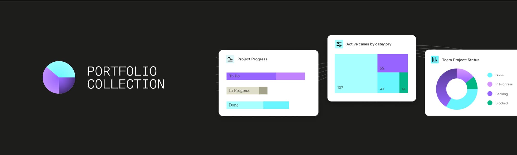
Tempo’s Portfolio Collection: Adaptive planning, scenario modeling, and surfacing predictive insights
To help teams build enterprise-quality dashboards – with no technical expertise needed – Tempo developed the Portfolio Collection. This toolset offers real-time Jira insights for portfolio governance and confident decisions.
“Having a consistent view of your entire portfolio is a competitive advantage. With Tempo’s Portfolio Collection, you get tailored insights built on real-time Jira data – with no-code, enterprise dashboards that are effortless for non-technical users to build.” - Nigel Budd, UK Agile Practice Lead at Eficode
This collection bundles three popular tools:
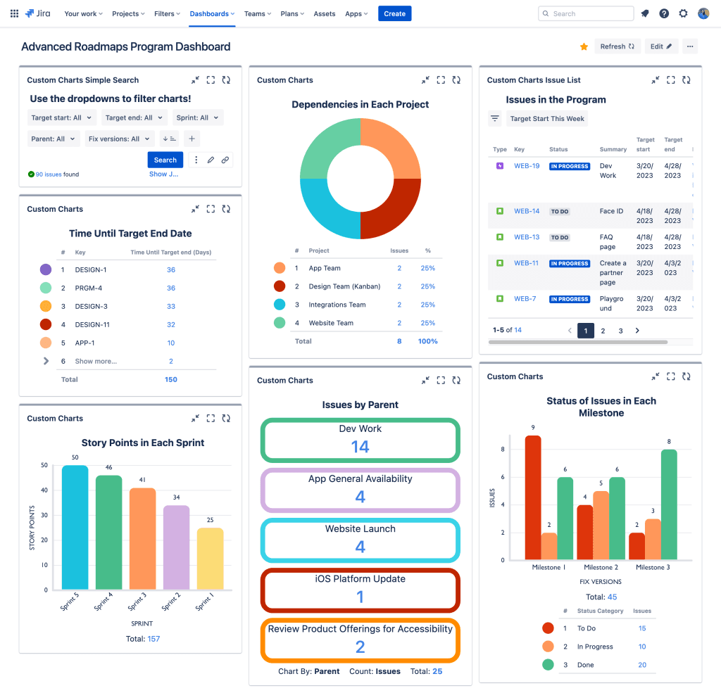
Custom Charts for Jira: Create comprehensive charts, graphs and reports in Jira using simple, no-code functionality.
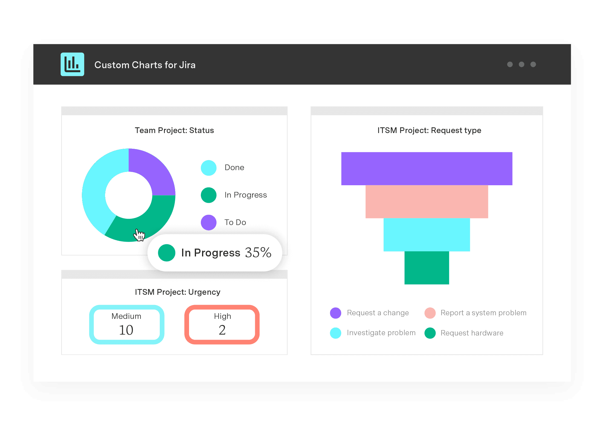
“The fact that it’s super easy for anyone to make charts, tables, and reports that deliver the exact information that they want helps bridge the gap between teams. Everyone can use these tools, so everyone does.” - Heather Morgan, Sales and Partner Director at ReleaseTEAM
Custom Charts for Confluence: Effortlessly build charts, reports, and dashboards in Confluence based on real-time Jira data.
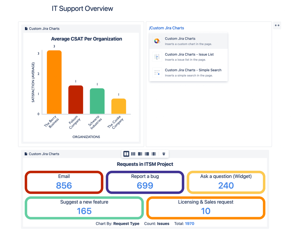
“Custom Charts is just so intuitive. It lets you build what you want quickly, with the freedom to tell the data story you want to tell, not the one the tool makes you tell.” - Marianne Gosselin, CIO at Nimbax
BI Connectors for Jira: Connect Jira to Power BI, Tableau, BigQuery and other BI tools. Build custom Jira reports with standard, custom fields, filters, and templates.
Case study: Inmarsat takes a 10,000-mile view
Founded in 1979, Inmarsat is a global satellite communications company based in the UK. The business implemented Custom Charts across multiple teams and found it to be an extremely popular tool – providing standardized reporting across the company and at every level.
Now, users make reports directly in Jira, not a separate platform or database. Teams and their managers are seeing live data in the system they’re actually working in. This helps Inmarsat achieve a single source of truth, improving collaboration between personnel and departments.
Get real-time Jira insights for portfolio governance and confident decisions.
Try the Portfolio Collection