Ecosystem mapping: A guide to visualizing your network
Tempo Team
It’s easy to feel like projects and partnerships are a jumble of moving parts. You know that customers, partners, and suppliers matter – but seeing how they all influence each other and your business? That’s where it gets tricky.
Ecosystem mapping organizes complex relationships into a clear, visual picture, showing how value flows between actors and opportunities. With a well-crafted map, you can make decisions with confidence and uncover insights that might otherwise stay hidden.
Let’s explore what ecosystem mapping is, why it matters, and how to build your own maps step by step.
What is ecosystem mapping?
Ecosystem mapping is the process of visually representing the broader environment in which your organization operates. Instead of guessing how this ecosystem works, you create a map that shows the different entities around you – customers, partners, competitors, suppliers, and other stakeholders – and how they interact.
Unlike a simple workflow diagram or service blueprint, an ecosystem map shows how value flows across boundaries. It reveals where dependencies exist and how influence spreads between different people and businesses.
Depending on the format that works best for your team, your map could take the form of an ecosystem diagram or an ecosystem chart. Some organizations use a ready-made ecosystem map template to speed up the discovery process, while others lean on specialized mapping tools.
No matter the format, the goal is to visualize complexity in a way that helps your team identify patterns and strengthen collaboration.
Why are ecosystem maps important?
It’s hard to make good decisions when you only see part of the picture. An ecosystem map pulls everything into view so you don’t have to guess what drives your environment.
With a map, you can:
Visualize the whole system: Instead of focusing on one team or process, you get a holistic view of your business ecosystem.
Find new opportunities: An ecosystem diagram chart reveals untapped partnerships, spaces for collaboration, or gaps in the customer journey you hadn’t noticed.
Spot risks early: By mapping out dependencies, you can identify weak spots or bottlenecks before they become problems.
Ecosystem mapping helps you move with clarity. Plan strategically and build stronger, more resilient relationships across your network.
How to create ecosystem maps
Creating an ecosystem map doesn’t have to be complicated. Think of it as breaking down a messy web of relationships into something your team can actually see and use.
Here’s a five-step process to follow:
1. Define the core value proposition and scope
Clarify what you want the ecosystem mapping exercise to achieve. Are you mapping a customer journey or service design? How many people and organizations do you need to include?
Set boundaries – geographic, organizational, or time-based – and decide on the level of detail, whether it’s a high-level ecosystem diagram or a more detailed ecosystem chart. A ready-to-use ecosystem map template can speed things up.
2. Identify all relevant actors
Next, list the stakeholders who play a role in or influence the system. Don’t stop at direct players. Include indirect entities like data providers that impact your organization.
As you list stakeholders, remember these steps to make sure your map is comprehensive:
Run a stakeholder discovery session
Collect data from reports and analytics
Include both direct and indirect actors
Document roles, needs, and incentives
3. Map relationships and value exchanges
Visualize how these entities interact and show how value flows across boundaries. Use different line weights or colors to represent the strength and type of connection. Frameworks like affinity diagrams, user story mapping, or journey mapping can help organize complexity. It’s also a good idea to highlight key dependencies and integration points.
4. Analyze the map for insights
Once the ecosystem illustration is complete, step back and look for patterns. Where are the bottlenecks? Are there single points of failure? Where do opportunities for new partnerships or collaborations emerge? Combine stakeholder engagement with data to validate your findings and translate them into next steps.
5. Iterate over time
An ecosystem map isn’t a one-off. Update it as markets change, new partnerships form, or environmental priorities shift. Consider publishing an interactive map for better collaboration and include it in strategic roadmaps or leadership planning sessions.
Examples of ecosystem mapping
An ecosystem map doesn’t have to be fancy. Even a simple sketch can unlock insights you’d otherwise miss. The key is to make relationships, flow, and dependencies visible – then use those insights to guide smarter decisions.
Here are three practical scenarios with step-by-step breakdowns you can recreate on a whiteboard or in a tool like Jira.
A software product ecosystem
Imagine you’re a SaaS company offering a project management tool. You want to understand how your product fits into the bigger picture of what your customers use.
How to do it step-by-step:
Place your product in the middle of the page
Around it, draw the tools your customers connect to most (Slack, Google Drive, Jira).
Add customer groups (freelancers, SMEs, enterprises) and link them to integrations they use.
Add infrastructure providers (AWS, Stripe, Twilio) below the product, since they keep it running.
Use arrows to show the flow of value, which could include money (subscription fees), data (API calls), or support (customer tickets).
What it reveals:
If you see that most customers use Slack with your tool, an official Slack partnership may unlock growth.
If AWS is your only host, that’s a risk you might want to mitigate.
A healthcare ecosystem
Say you run a regional clinic and want to improve patient care coordination.
How to do it step-by-step:
Put “Patients” at the center.
Surround them with key providers: clinic, hospital, specialists, labs, pharmacies.
Add insurers and government payers around the next layer.
Draw arrows to show how information and money move:
Patients → Clinic (appointments)
Clinic → Labs (tests)
Insurer → Clinic (reimbursements)
Overlay geography if relevant. Some patients might live far from labs or pharmacies.
What it reveals:
Patients may face delays because lab results don’t flow back quickly.
Some areas may lack easy access to pharmacies, creating health deserts.
A project portfolio ecosystem
Picture a project management office (PMO) managing dozens of initiatives at once. You want to see how projects, resources, and priorities connect.
How to do it step-by-step:
Write down each active project as a node (Project A, Project B, Project C).
Group teams and resources, like design, engineering, and QA, and link them to the projects they’re working on.
Draw arrows between projects where dependencies exist (Project B can’t finish until A delivers).
Use color-coding to mark projects by strategic priority (green = core, orange = nice-to-have).
Add budget or capacity data to see where resources are over-allocated.
What it reveals:
Two high-priority projects are both pulling on the same design team, which could risk a bottleneck.
Some projects may not align with strategic goals and could be paused.
Visualizing your project ecosystem with Tempo
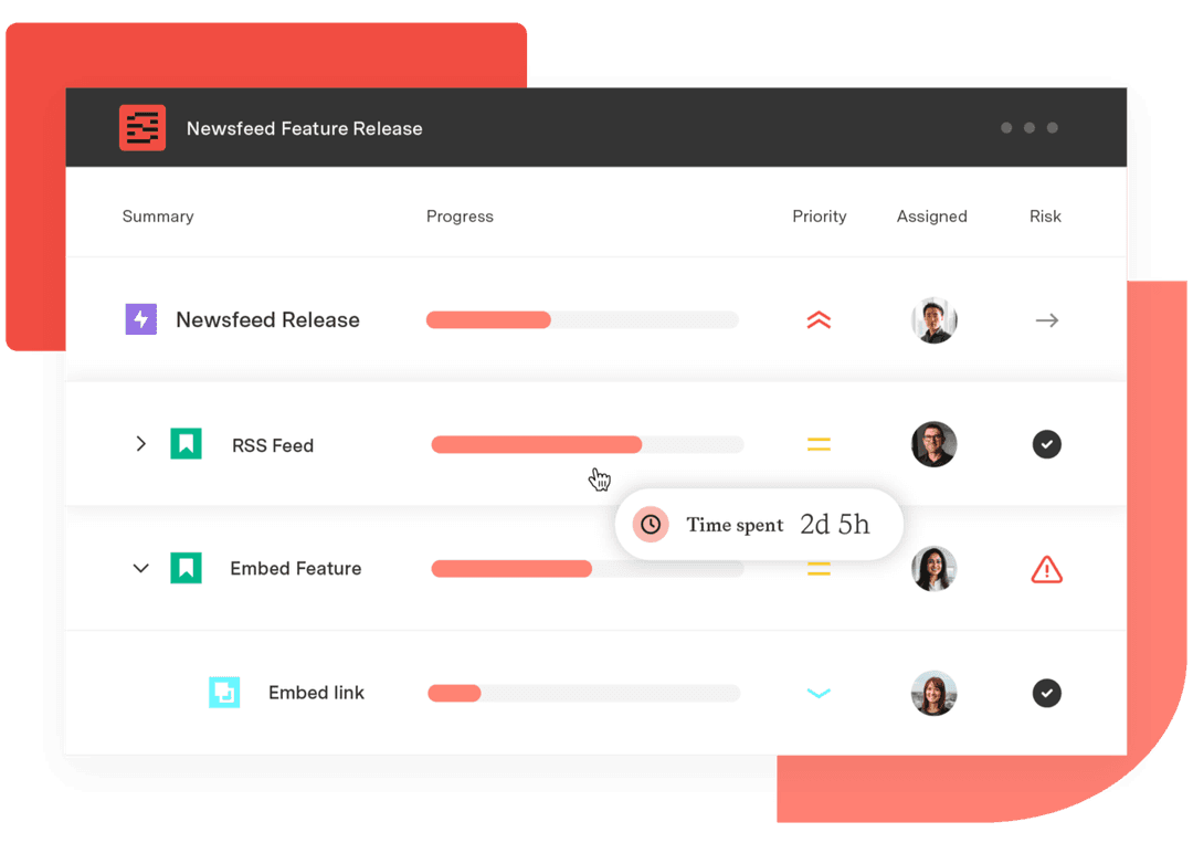
An ecosystem map is powerful, but it can only take you so far if it sits in a static diagram. Projects shift, and what looked accurate last quarter might already be outdated today. That’s where Tempo comes in.
With Structure PPM, you can bring your project and portfolio ecosystem into Jira and see how every piece connects in real-time. Add Custom Charts for Jira, and those connections become interactive insights you can share, explore, and act on. The result is a living ecosystem that grows with your work and helps you make smarter, faster decisions.
If you’re ready to move from static diagrams to dynamic decision-making, try Tempo and start visualizing your project ecosystem with confidence.