
How to prioritize features using weighted and unweighted scorecards
Key Takeaways
A scorecard shifts prioritization from opinion to a documented set of inputs stakeholders can inspect and challenge.
Unweighted scorecards score each criterion equally – well-suited to lean teams that want a quick, repeatable process without heavy setup.
RICE (Reach x Impact x Confidence / Effort) is the most widely used weighted method, and it fits cases where features span very different work types.
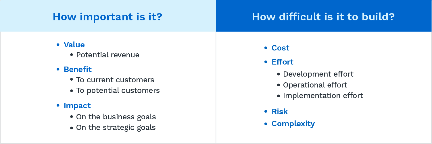
A product prioritization scorecard gives product managers a defensible way to rank features by scoring each one against the same set of criteria – usually some version of value, cost, risk, and strategic fit.
Feature ideas are a dime a dozen. A prioritization scorecard puts real numbers and weight to break down which are most important for the product.
Unweighted scorecards for feature prioritization
Prioritization is a game of constraints. The winner isn't the team that ships the most features. It's the team that ships the right ones within a limited set of resources.
Unweighted scorecards compare desirable features against how realistic they are to build (feasibility). A simple scorecard gets everyone on the same page about what makes a feature worth building. And it forces realistic expectations about what's actually possible with the resources you have.

This guide covers the three most popular unweighted scorecards. All three measure features against one primary dimension – value – paired with one of the following:
Cost covers everything that goes into building a feature: developer hours, operational overhead, implementation, maintenance. It can mean time, money, or both.
Complexity captures how technically hard a feature is to build. Technical architecture, implementation, testing, and UX complexity all count.
Risk is mostly used by new products and startups still finding their footing. More on that below.
How the three unweighted methods compare
Each unweighted method pairs value with a different second dimension. Running a structured cost-benefit analysis before scoring helps quantify the tradeoff clearly. Here's how the three stack up:
Method | What value pairs with | What it measures | Best for |
|---|---|---|---|
Value vs. Cost | Developer hours, FTEs, operational expenses | Economic tradeoff of building vs. the payoff | Teams with clear cost visibility and a resource-constrained backlog |
Value vs. Complexity | Technical architecture, implementation, testing, UX | How technically hard a feature is relative to its payoff | Engineering-led scoring when cost data is fuzzy but complexity is known |
Development risk is the chance a feature hits an unknown problem during delivery. Hard to estimate, because the whole point is you can't predict what goes wrong. Two outcomes are possible: The risk never materializes, or it does and mitigation keeps work on track.
Here are the types of risks a product team should account for during prioritization, along with questions to ask when assessing each potential risk:
Delay risks
What constraints might affect our predicted time to deliver this initiative or feature?
Have we based schedule estimates on as much data as possible, or has it been mostly optimistic guesswork that doesn't account for team capacity?
Have we accounted for every task that can affect how long it will take to build this feature?
Cost risks
How might we go over budget?
Could development scope and requirements change over time as new research or testing findings emerge?
Are we prepared for unforeseen costs, and have we set aside budget for them?
Technical risks
Does the team have all the tools, knowledge, and interdepartmental support needed to build this initiative?
What functional reasons might prevent us from building, delivering, or implementing a potential feature?
Have we accounted for all interdepartmental dependencies? Or were decisions made in silos?
Sign up for a free trial and give one of our product roadmap templates a whirl.
RICE scoring model
RICE started as Intercom's internal scoring system for prioritizing ideas. It's the most structured of the weighted methods, and Atlassian's backlog guide covers how it fits into broader backlog management. The formula: Reach x Impact x Confidence / Effort.

Four factors, one score:
Those numbers combine into one score. That's the point – you get a single number that applies across any type of initiative on the roadmap, regardless of how different they are.

Run each feature through the calculation and rank by score. Here's an example:

Weighted scorecards: Adding reach and confidence to calculations
A weighted scorecard follows the same steps as unweighted methods, with one addition: Stakeholders decide how important each criterion is. That importance gets captured as a weight. Multiply each feature's score by its weight, add them up, and you've got the overall priority score.
The weight is usually a percentage out of 100 or a number out of 10. What makes this valuable: It forces stakeholders to be explicit about which factors matter most before anyone scores a single feature.
Here's a visualization of the weighted prioritization criteria. For this example, the criteria are customer value, impact on business goals, implementation costs, and development risk – each weighted, adding up to 100:

When you ask stakeholders to assign weights before scoring, you're saying: "Decide which of these factors matters most for pushing something toward development – and which ones shouldn't carry the same influence."
Each scoring category (value, cost, impact, risk) has a different level of importance. The weight makes that difference visible and measurable.
For the previous scorecard, here's how you'd calculate the final priority score:

How to create a prioritized scorecard
The steps are the same for both methods. The main hurdle in any prioritization meeting: Making sure every stakeholder understands the criteria and how strategy should inform the scoring.
PMs can't just prescribe weights on their own. The scores need to reflect the priorities of everyone the product's direction affects. A quick stakeholder analysis identifies who should weigh in – usually engineering and design, sometimes CS and sales.
Step 1: Select the features to be scored
How teams arrive at a feature list varies. It starts with a solid idea management process that pulls user research, feedback, and observable data into one place.
Ideas scattered across spreadsheets, inboxes, and random documents don't get evaluated fairly. Centralizing them creates accountability and makes buy-in easier. Once everything's in one place, stakeholders can see that ideas are being considered – and how they stack up against existing priorities.
Step 2: Pick the criteria to be scored
This is a group activity. Not a solo one. Picking the criteria – and their weights, if you're using a weighted scorecard – is one of the most important conversations a PM can have. It surfaces biases, limits scope, and forces clarity on what actually matters.
Your criteria can come from any of the unweighted methods above, from RICE, or from a custom weighted scorecard.
Step 3: Meet with stakeholders to align on the criteria
After picking the criteria, loop in anyone whose work depends on what gets built.
These meetings aren't just about giving departments a voice. They're about surfacing needs that don't fit neatly under "customer satisfaction" or "user experience" – things like operational costs, development risk, and technical complexity. A PM might know those constraints exist. But department leaders should make the case for why they deserve weight.
Step 4: Assign scores to each feature
Score each feature against the agreed criteria. Use a fixed rating system – 1 to 3, or 1 to 5 – not arbitrary numbers. A consistent scale makes comparisons readable at a glance.
If you're an agile product team, our guide to creating an agile roadmap covers how to sequence scored items into a roadmap that adapts as you learn.
Visualize scorecards with a prioritization matrix
If spreadsheets aren't doing it for you, try a 2x2 prioritization matrix. These work with any of the x vs. y scorecards above (value vs. cost/complexity, value vs. risk).
The vertical axis is value. The horizontal axis is effort. Plot each feature on the chart, and the quadrants tell you the build order:
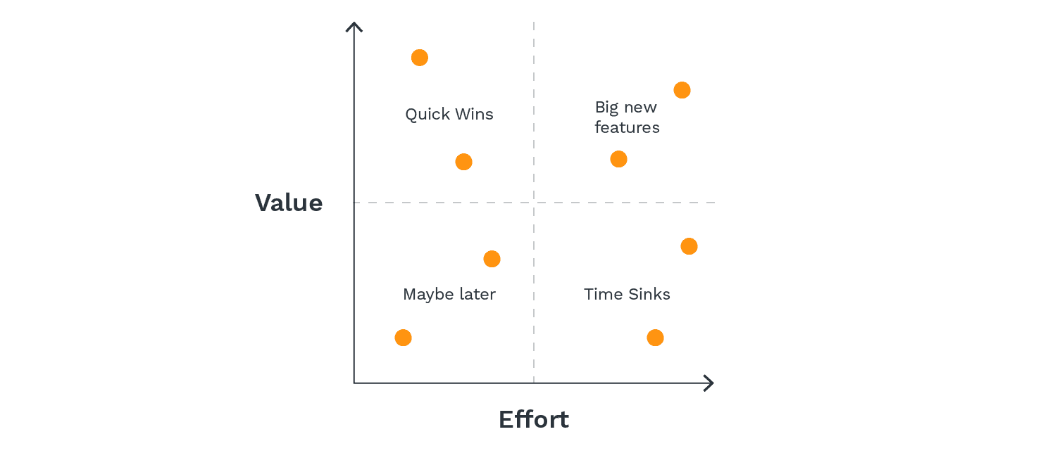
High value, low effort ("Quick wins"): No-brainers. Low cost, low risk, relatively simple on the technical side. Do these first.
Low value, low effort ("Maybe later"): The "we'll get to it when scope opens up" items. Not critical, but they'd make a noticeable difference.
High value, high effort ("Big new features"): These need strategic planning and careful sequencing. Worth doing – just not quickly.
Low value, high effort ("Time sinks"): Skip them. Not worth doing now, probably not worth doing later.
At a glance, the quadrants translate to these actions:
Value | Effort | Action |
|---|---|---|
High | Low | Quick wins – do first |
High | High | Big new features – plan and sequence carefully |
Low | Low | Maybe later – slot in when capacity opens |
Putting the scorecard to use
Pick the lightest method that answers the decision in front of you. An unweighted Value vs. Cost pass on a small batch is usually enough to start – if every feature scores about the same, the criteria need work, not the framework.
Revisit the weights at least once a quarter. Last quarter's scorecard assumed last quarter's strategy and capacity, and at least one of those has shifted.
Sign up for a demo
Request Demo