All you need to know about SAFe reporting in Jira, the three main areas you need to be tracking, and what an agile release train (ART) is.
So you’re implementing the Scaled Agile Framework (SAFe®) and you’re wondering what reporting you have to do.

So you’re implementing the Scaled Agile Framework (SAFe®) and you’re wondering what reporting you have to do. Well, there are three core areas that should be measured in SAFe.
Competency: is your organization proficient in the practices that enable business agility?
Flow: how efficient is your organization at delivering value to the customer?
Outcomes: are your solutions meeting the needs of customers and the business?
Competency and outcomes are the before and after of SAFe. You measure competency to see how ready you are to practice SAFe (through doing assessments). Then you measure outcomes once your solutions have been delivered, e.g. metrics such as sales statistics, feature acceptance, and customer satisfaction scores.
Reporting on flow in SAFe is reporting on the progress and performance of the teams delivering the solutions, as they deliver them. In SAFe, these teams form the Agile Release Train (ART).
As Jira is the tool teams use to manage their work to completion, you can use Jira reports to measure flow in SAFe.
The six main flow metrics are as follows:
1 | Flow distribution | the proportion of each work item type in the flow, e.g. how many features versus bugs across Planning Intervals (PIs) – formerly known as Program Increments |
2 | Flow velocity | the number of tasks completed in a given time period, such as a sprint/iteration or PI |
3 | Flow time | the same as lead time, i.e. the time that elapses from when an item enters the workflow to when it is released to a customer |
4 | Flow load | total number of work items in progress across all steps of the flow (active or waiting) |
5 | Flow efficiency | active work time (not including time spent waiting) versus overall lead time (including time spent waiting) |
6 | Flow predictability | how many work items you completed versus how many you planned |
In Jira, there are two types of reporting: project reports, which only measure one project or team, and dashboard reports, which span multiple projects and teams. Therefore, as the Agile Release Train is a collection of different teams working together, your Release Train Engineer (the chief Scrum Master for the entire ART) will need to use dashboard reporting to measure progress.
Several dashboard gadgets capable of measuring flow come out of the box with Jira. You could, for example, use a created vs resolved issues line chart to measure flow predictability. But native Jira won’t let you customize it if you wanted to change colors or labels, show/hide certain data, or use a different chart type. And there aren’t any native dashboard gadgets that let you measure the flow time, load, or efficiency of your ART.
This is where Tempo’s modular suite of solutions comes in, specifically Custom Charts for Jira. This solution lets you build program dashboards displaying all your flow metrics (and more) in an array of fully customizable charts.
Let’s review some examples.
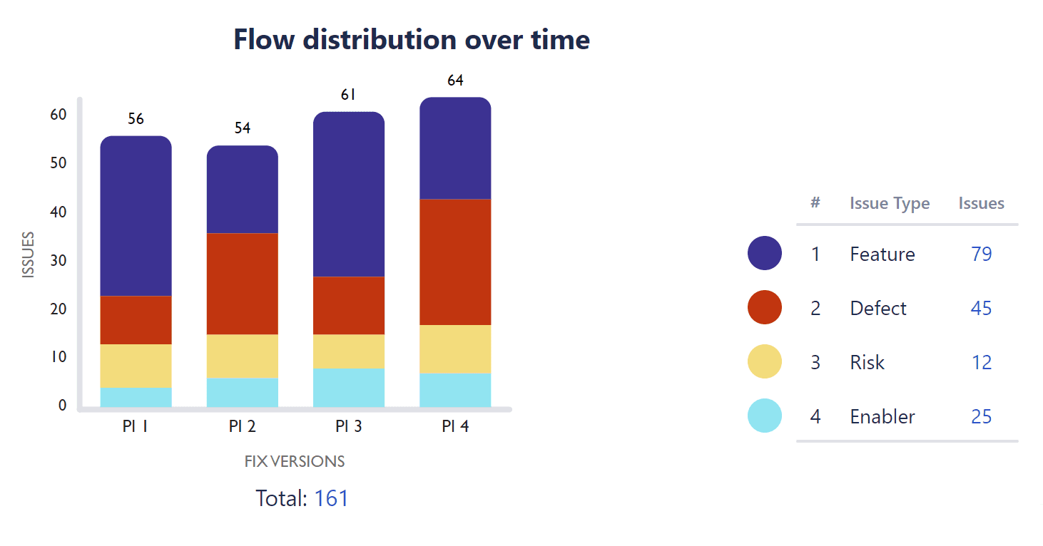
Flow distribution is about making sure you have the right balance of items being worked on. Features and enablers (work required to support future functionality) offer the most value to customers whereas risks and defects do not, so you want your teams working more on the former than the latter.
Looking at this Custom Charts 2D stacked bar chart, we can see that the ART is working on 79 features compared to 29 defects. This means they’re delivering value.
However, there were quite a lot of defeats in PI 4, which is worth investigating to stop this from becoming a trend in future PIs.
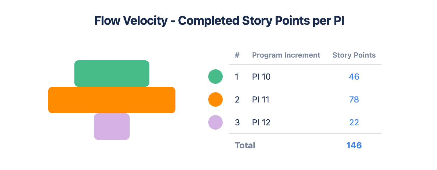
How fast is your ART delivering value? This Custom Charts funnel chart looks at the number of completed story points across PIs. It shows that the flow velocity of the ART increased a lot between PI 10 and 11, but dropped heavily in PI 12.
What does this mean? Were team members absent? Did teams deliberately slow down because they delivered so much in PI 11? Or could one team in the ART be blocking another?
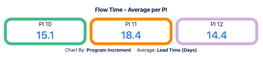
In this Custom Charts tile chart, we're measuring the total time elapsed for releases within each PI. We can see that releases within PI 11 took the longest: 18.5 days on average (which we have highlighted with an orange tile). The fact that flow time has improved by PI 12 can prompt a discussion about what was different in PI 11, so that going forward we can stay on the right track.
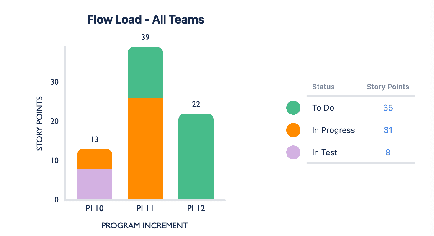
This Custom Charts 2D stacked bar chart shows work in progress or waiting across three PIs. Flow load increased a lot between PI 10 and PI 11, and since there is nothing in testing, it may be that the ART is struggling with excess work.
In this scenario, PI 12 is a future interval, which is why all the story points are still in “to do”. It means that a lot of to-do items are about to get added to any work left unfinished in PI 11. If we don’t look at reducing our flow load, we could start seeing queues building up.
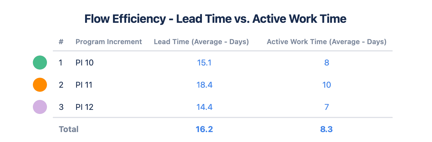
In this Custom Charts table, we can see how the active work time (not including time spent waiting) compares to the overall lead or flow time (including time spent waiting) between PIs.
We can also use the totals to get a flow efficiency percentage. If we divide 8.3 days by 16.2 days and multiply by 100, we get 51%. Therefore the ART’s flow efficiency is only 51%, which should trigger discussions about what’s causing the excess waiting time and how it can be reduced.
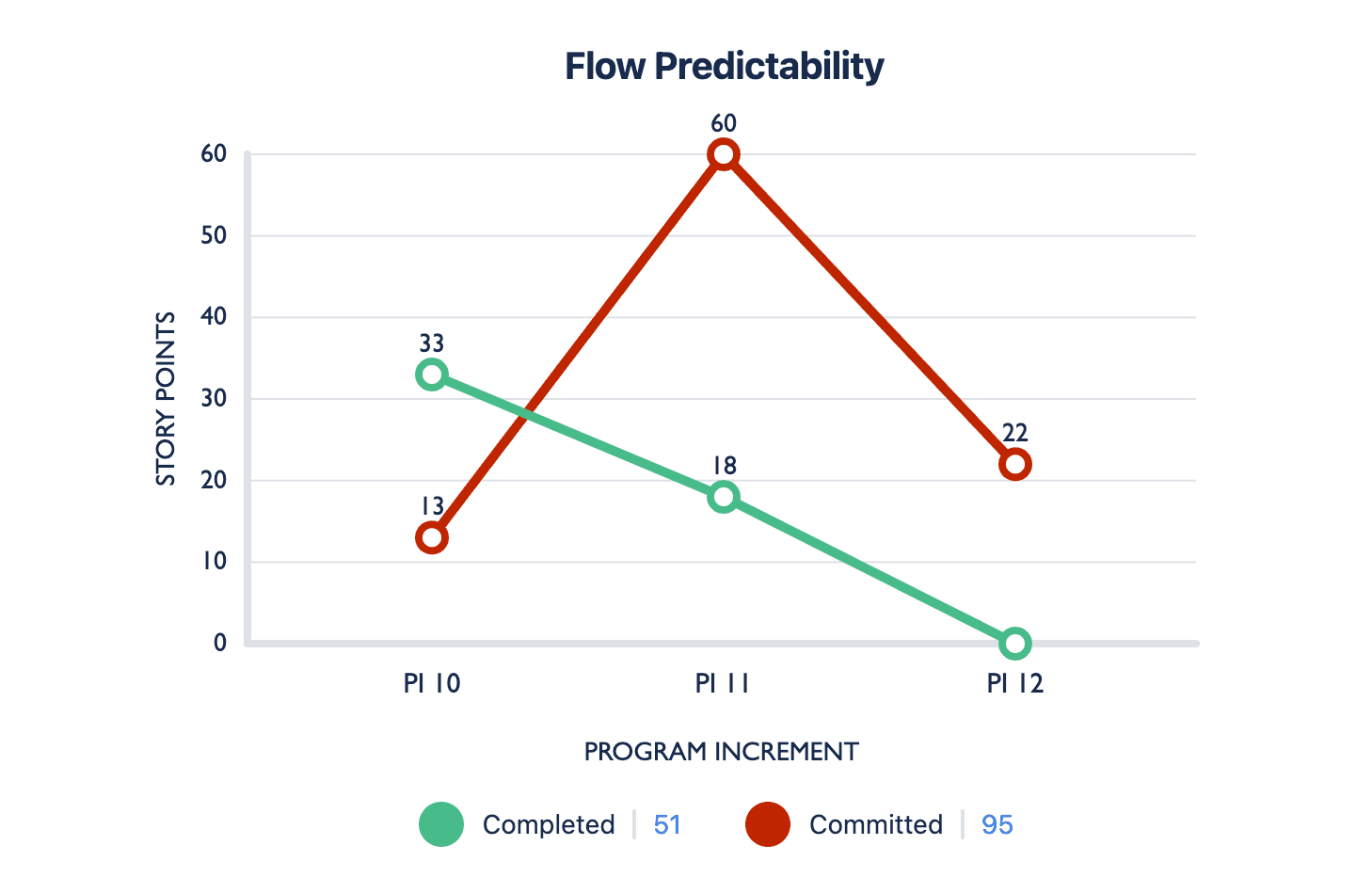
This Custom Charts 2D line chart is displaying our flow predictability, tracking how many story points the ART completed against how many they had planned to complete in each PI. The closer the lines are to each other, the better the teams are at predicting how much they can deliver.
But this chart shows that our predictability in PI 10 and 11 is low. In PI 10, our teams delivered much more value than they planned, and in PI 11, they delivered much less.
Again, PI 12 is a new interval and our teams are yet to complete any work, so there is still a chance to change things. As they complete work, the chart will update in real time and the green line will go up. The more it coincides with the red line, the better our flow predictability will be.
If you’re looking at how to report on SAFe in Jira, you may already be in the throes of a SAFe implementation. If, however, you’re still exploring whether your business is ready for SAFe, then you may want to look at how the wider Tempo toolset can help you get started.
Sign up for a demo
Request Demo
Custom Charts for Jira
Build charts and dashboards to evaluate delivery, capacity, and speed for all teams with Jira's most flexible custom reporting app
Start a Free TrialAll you need to know about SAFe reporting in Jira, the three main areas you need to be tracking, and what an agile release train (ART) is.

Discover why agile release trains (ARTs) are necessary to complete cross-departmental and collaborative work.

Agile PI planning is an integral part of the SAFe project management framework. Learn about contributors, inputs & outcomes of a productive session

Don’t be intimidated by Agile at Scale implementation. The SAFe roadmap will help you successfully transition to the agile methodology in five steps.

Find out if SAFe agile is right for your organization. Discover its principles and benefits and see how it compares to other Agile at Scale frameworks

What's the best way to represent and track PIs? Creating a "PI" Jira issue, fixVersion, custom fields, components, or labels? Decide which fits best.

Group issues by version fields (including custom fields) and keep items with the same version name together, even across different projects.

Would you like an expert to architect your workspace and data structure, train your team, or build out reports? Try our professional services.