Jira and Custom Charts for HR Teams (Part 1)
Tempo Team
If you’ve been in the Atlassian ecosystem for a while, you’ve seen how much Jira and Confluence have evolved. Originally starting out as tools for developers and IT service management, they’ve grown to support project management for other types of teams. In 2021, Atlassian even introduced a new platform for business teams: Jira Work Management (JWM). Selecting a JWM project gives you the option to choose specific templates that cater to the needs of various business teams, including finance, legal, and HR.
From a Jira project standpoint, the Atlassian tools have come a long way in supporting business teams. However, when it comes to reporting, the native tools have major customization and data point limitations. That’s where Custom Charts for Jira steps in. In this series of articles, we’re hoping to show that business teams can get a lot of use out of Jira, especially when used alongside Custom Charts for reporting.
In this first article, we’ll take a closer look at using JWM and Custom Charts to assist HR teams in their hiring process.
Jira HR project and dashboard setup for potential candidates
In Jira Work Management, you’ll want to create a project that tracks the recruiting and hiring process for the HR team. The HR template in JWM includes an issue type called “Candidate” that can be used to track potential new hires. A Jira workflow sits behind the issue type, which includes statuses representing the various stages in the hiring process. Depending on what information you’d like to collect around Candidates, you can also use Jira custom fields to track the following:
Department
Position
Start date
Source (how the candidate found the role)
Candidate name
Location
Are they an internal applicant?
After building out the HR project, you’ll want the HR team to have easy access to the necessary candidate information by creating a Jira dashboard. This dashboard can be used to provide an at-a-glance view of how candidates are progressing through the hiring process and which departments are filling roles. You can utilize specific dashboard gadgets to report on this data, including Custom Charts for Jira.
Now, let’s take a look at some charts and reports you can put on your HR hiring dashboard using Custom Charts.
Candidates and their status in the interview process
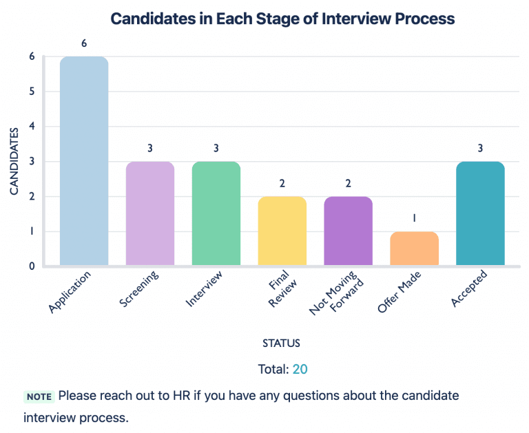
Let’s say you have a strict hiring capacity of 6 open roles. If the role gets a lot of applicants, HR will want to make sure the amount of offers extended doesn’t exceed that number. They can easily see this information using Custom Charts.
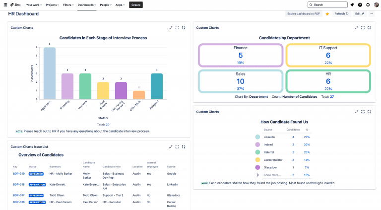
In the example below, we are using the Bar Chart chart type to display the amount of candidates at each stage in the interview process. As mentioned above, we have a workflow that sits behind the Candidate issue type, where each status in the workflow represents a stage in the interview process. Currently, 1 candidate is in the process of deciding whether to accept their offer (“Offer Made” status) and 3 applicants have accepted offers (“Accepted” status), meaning we can continue to interview a few more applicants.
How candidates found the open position
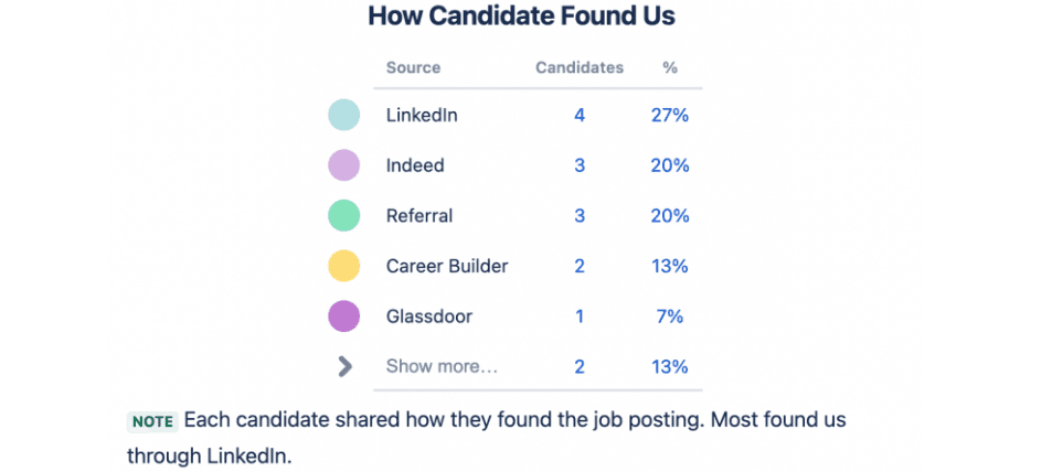
It’s always useful for an HR team to understand how potential candidates came across a position. Collecting this data and visualizing it can provide insight into where the position gets the most traction, and which sources generate the most candidates. It’s also a great way to track referrals.
In the example below, we’re using the 1D Table Chart type in Custom Charts to display this information. We can even calculate the percentage of all candidates that came from each source. We’ve added a description to the chart to provide additional context around the data.
Candidates by department
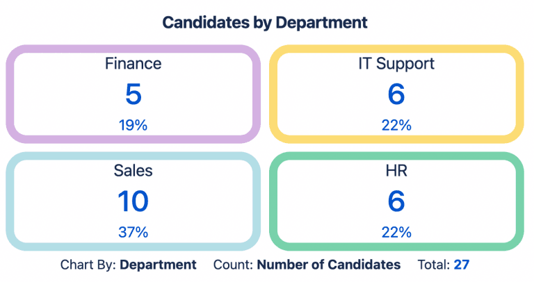
Knowing which departments have applicants and candidates is extremely helpful for the business to understand which positions are being filled. Each department typically has a hiring budget and set of roles that need filling.
You can easily visualize this for your HR team using Custom Charts. Since we are tracking “Department” as a custom field in the HR project, we can break down candidates by their department. In the example below, we are using the Tile Chart chart type to differentiate how many candidates each department has. From this chart, it’s clear that the sales department has the most candidates, while finance has the least.
Candidate details
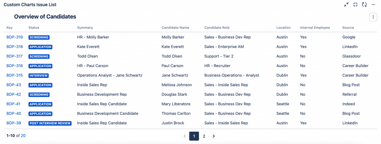
Having a quick insight into each candidate and their details can be extremely helpful for dashboard viewers short on time. In the example below, we are using the Issue List gadget that comes with Custom Charts to display this. Each column contains details such as their location, the role/department they’re applying for, and whether or not they’re an internal recruit. Using Issue List to grab this data ties all of the important information about the candidate together into one spot on the dashboard.
Having created all these reports using Custom Charts for Jira, your HR hiring dashboard should look like this. Pretty, eh?
Conclusion
HR teams already have their hands full screening resumes, interviewing candidates, making offers, and managing the negotiation process. The last thing they want is to be digging through emails, spreadsheets, and documents, across multiple platforms, to find out where everybody is in the hiring process.
By tracking this information in Jira Work Management and utilizing a Jira dashboard like the one above, HR personnel can keep all the relevant details about their recruitment process centralized, at-a-glance, and easy to track.
Of course, you may want to track something different to what we’ve suggested. In which case, have a go at building your own charts in our free app playground. There are loads more chart types to choose from, including pie charts, funnel charts, and 2D stacked bar charts, along with the ability to filter the data based on any custom fields.
Although this article is focused on JWM, Atlassian has great templates for HR teams in Jira Service Management, too.


