Velocity charts in Jira: How to track and improve sprint performance
Tempo Team
Key Takeaways
A Jira velocity chart displays two bars per sprint – story points committed vs. story points completed – so teams can see exactly how their estimates hold up against actual delivery.
Consistent velocity across sprints means estimates are reliable. Wide swings signal scope creep, workflow blockers, or overcommitment worth investigating before the next sprint.
Average velocity is calculated by adding completed story points across multiple sprints and dividing by the number of sprints. Most teams use 6–10 sprints to get a planning baseline they can trust.
Velocity measures how much work a team completes, not whether that work was high quality or delivered real user value. It should be paired with other signals like bug rates and customer feedback.
Tempo Timesheets and Custom Charts extend Jira's native velocity report with time tracking, customizable dashboards, and AI-powered sprint data – giving teams more context for planning decisions.
Most sprint planning sessions run on a mix of instinct and hope. The team looks at the backlog, someone calls out what feels feasible, and everybody commits. Then the sprint closes with tickets still open – and the same pattern shows up next sprint.
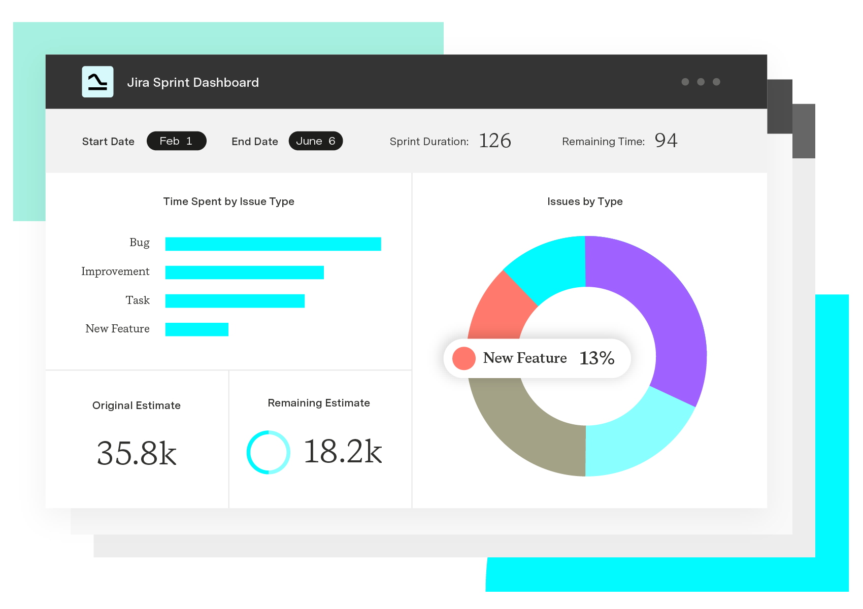
Velocity charts give you something more useful to plan from. A velocity chart in Jira tracks completed work across past sprints as a two-bar comparison: What the team committed to versus what they actually finished.
Parabol's 2024 Agile Statistics Report found that 61% of agile teams already track sprint velocity as a core metric. It tracks story points committed versus completed across past sprints. Over time, that comparison shows you the gap between what you're planning and what you can actually ship. After 6-10 sprints, that data tells you more about your team's actual capacity than any planning conversation will.
What is a velocity chart in Jira?
A velocity chart in Jira is a visual record of a Scrum team's output across sprints. Each sprint shows up as two bars: How much work the team committed to at the start, and how much they actually finished.
Estimated work: The total story points planned at the sprint's start.
Completed work: The actual story points finished by sprint close.
Run that comparison across enough sprints and you've got a reliable picture of what the team can actually deliver.
Benefits of using a Jira velocity chart
Velocity tracking tends to surface workflow problems earlier than most other signals.
Makes sprint planning more predictable
If a team's been finishing 40 story points per sprint, committing to 60 is going to produce a failed sprint. Past Jira velocity reports give teams a concrete baseline to plan from. Scrum masters and project managers can use that data to set realistic goals and keep the backlog from getting overloaded.
Helps teams catch bottlenecks early
A sudden drop in velocity usually means something in the workflow broke. Inconsistent estimates and unplanned work show up in the graph before they turn into missed deadlines. Catching them in a retrospective beats finding out after a sprint review.
Improves accountability
The Jira velocity report shows how much work is getting done each sprint. When those numbers are visible to the whole team, there's a lot less arguing about whether commitments are being met. When velocity dips, teams have something concrete to look at.
Encourages continuous improvement
Velocity data gets more useful the longer you track it. Over time, teams start planning from what the data shows rather than what sounds right in the room. Better estimates mean fewer mid-sprint surprises. The effect compounds.
How to read a velocity chart
A velocity chart shows story points committed versus completed for each sprint. That gap between the two bars tells you how accurate your estimates are.
Consistent velocity means estimates are reliable. Wide gaps between committed and completed points usually point to overcommitment or recurring blockers – scope creep tends to show up here too. Velocity that swings widely sprint to sprint is worth looking at more carefully. Team changes and unclear requirements are common causes, but outside dependencies can drive it as well.
A team averaging 35 points per sprint consistently is easier to plan around than one whose velocity bounces between 20 and 60. The number itself matters less than whether you can predict it.
Velocity chart vs. burndown chart: What's the difference?
These two charts answer different questions and work well together.
Chart | What it shows | Time scope | Best for |
Velocity chart | Story points committed vs. completed, per sprint | Across multiple sprints | Sprint planning, capacity forecasting |
Burndown chart | Work remaining in the current sprint over time | Within a single sprint | Day-to-day progress tracking, mid-sprint adjustments |
Velocity looks backward across sprints to inform future planning. Burndown shows progress inside a single sprint.
How to calculate velocity for a sprint
Add up story points for every completed work item in a sprint. That's your velocity. You'll need to define "done" the same way every sprint, or the numbers won't be comparable over time.
Because velocity fluctuates, teams usually average it over several sprints. Here's the formula:
Average velocity = (Sprint 1 + Sprint 2 + Sprint N) / Total sprints
For example, if your team completes these story points across three sprints:
40 story points in Sprint 1
35 story points in Sprint 2
45 story points in Sprint 3
Average velocity = (40 + 35 + 45) / 3 = 40 story points
That puts your planning baseline at 40 story points per sprint. The number shifts with team availability and unplanned work, so treat it as a starting point, not a hard commitment.
How to compare actual performance with estimates
Track the gap between committed and completed points over time and you've got a useful diagnostic. Here's how to read it:
Consistently completing less than planned? You're probably overestimating capacity, or something's slowing things down mid-sprint – scope creep, recurring blockers, or both. Adjust estimates down and figure out what's getting in the way.
Always finishing exactly what you planned? Your estimates are working. It might also mean there's room to take on more. Try bumping the load slightly to find the real ceiling.
Velocity varying widely sprint to sprint? Don't react to any single sprint. Look for patterns across several – team changes and outside dependencies are common culprits.
Five or six sprints gives you a much clearer picture than any one result will.
Challenges and limitations of velocity charts
Velocity charts have limits. Teams that misread them end up with unrealistic sprint goals and pressure to keep the number climbing.
Velocity doesn't measure quality
A team can close every ticket in a sprint and still ship software that's broken. If the team's rushing to hit a velocity target, quality takes the hit and the chart won't show it. Pairing velocity data with defect rates and customer feedback gives you a more complete picture.
Historical data isn't always reliable
Last quarter's velocity doesn't guarantee the same pace this quarter. Team changes and shifting priorities affect output in ways the chart can't anticipate. Treat past velocity as a reference, not a benchmark. Teams that lock it in as a target tend to game the numbers.
Chasing higher velocity can harm real outcomes
Teams that inflate estimates or rush work to show higher numbers on a Jira velocity report are measuring the wrong thing. The point is working software. Velocity is one input to planning, not the thing you're optimizing for.
Reports and custom charts give you more flexibility in how you filter and present velocity data to stakeholders who need different views.
Improve sprint planning with Tempo
Jira's native velocity report shows what was completed. It won't tell you how long things actually took, and you can't filter or share the data the way most teams need to.
Tempo's tools connect directly to Jira. With Timesheets, you can track how long tasks and story points actually take and share that data across Confluence, Data Center, or Cloud. Tempo's Sprint Performance Assistant is an AI-powered Rovo agent that pulls sprint data together without the manual work.
Try Tempo today and find out what your sprints actually look like.
Sign up for a demo
Request Demo