The ultimate guide to product prioritization: How to use the most popular prioritization frameworks
Learn how to prioritize the user problems worth solving using qualitative and quantitative product prioritization frameworks.


Key Takeaways
Qualitative prioritization – strategic value, competitive position, and customer demand – has to happen before any scoring framework runs, or the framework just optimizes the wrong list of ideas.
A product manager can score a backlog perfectly and still lose stakeholders who were never brought along, since ranking features and managing the people affected by the ranking are two different jobs.
The 10 quantitative frameworks in this guide answer different questions: reach-driven decisions call for RICE, customer satisfaction calls for Kano or opportunity scoring, and a fixed deadline calls for MoSCoW, so the right choice depends on the decision at hand rather than one framework used for everything.
The complete guide to product prioritization
Every feature request arrives wearing the same disguise: “Can we just add one small thing?” It never is. By the time sales has forwarded it, support has seconded it, and a stakeholder has mentioned it twice in a Slack thread, that one small thing is competing for the same two engineers as the initiative your actual product strategy depends on.
Product managers absorb this pressure by default. Support has a ticket queue. Sales has a CRM. A product manager has a backlog, a dozen open Slack threads, and a stakeholder who shows up for the demo, says nothing during discovery, and arrives at launch with strong opinions about a decision that was made three sprints ago.
None of that gets solved by a formula. A working product prioritization process runs in three stages: a qualitative screen for what is even worth scoring, a plan for the people who will disagree with the result, and a quantitative method to rank whatever survives. This guide covers all three, then walks through 10 quantitative frameworks – from RICE to Cost of delay – that turn a backlog argument into a decision you can defend in the next roadmap review.
Start with qualitative prioritization
Qualitative prioritization is the filter that runs before any request earns a place in a scoring framework. It isn't a formula. It is judgment, applied the same way every time, against three questions: does this move the actual product strategy forward, what does the competitive landscape reward or punish right now, and how many people are asking for it. That judgment call is the qualitative half of qualitative versus quantitative prioritization; the quantitative half comes later, once a shortlist exists.
Strategic value
Every framework in this guide should be measured against one dimension first: how directly a feature or initiative pushes the product's stated strategy and vision forward. Rank ideas against that dimension with a simple scorecard, and the ranking itself becomes visible to anyone who asks why something is or is not on the roadmap.
Picture a team building a budgeting app whose stated goal this quarter is improving accessibility, tightening the UX, and reducing churn. Score each backlog idea against those three goals, add the scores, and a ranking falls out on its own – no debate about whose feature is louder, just a number attached to strategic contribution.
Idea | Accessibility | Improve UX | Decrease churn | Score |
|---|---|---|---|---|
Budget warning before reaching limit | 2 | 2 | 4 | 44 |
Log in with Face ID | 4 | 4 | 6 | 76 |
Custom layout for foldable phones | 2 | 2 | 6 | 55 |
Score against strategy first, and a specific risk disappears: prioritizing whoever argued loudest in the planning meeting, or whichever competitor shipped something last month. It also gives a product manager a straight answer the next time someone asks why their favorite idea didn't make the cut this quarter.
Competitive landscape analysis
A feature-level competitive analysis works less like a scoreboard check and more like a glance in the rearview mirror: useful mainly for spotting who is gaining ground, who has fallen behind, and who just made a move worth reacting to. Grid every major competitor against every key capability, and that instinct turns into something a team can act on.
Say a competitor ships an AI summary tool and customers start asking about it within the week. That is a signal to look at the request seriously, not a reason to match it feature-for-feature by the next sprint. The map exists to guide the roadmap, not to set it. If three competitors are racing to build the same analytics dashboard and none of their customers use it, that is information too, and it says skip it, not catch up.
The real value of competitive tracking shows up over months, not in any single comparison. It keeps a team oriented to where the market is heading, so a request gets weighed against real movement instead of a rumor about what a competitor might build next.
Customer demand
Customer demand is the number of times a feature gets requested, whether that request arrives through support tickets, sales calls, social mentions, or a research interview. It is one of the least reliable ways to prioritize on its own, since strategy and vision should outrank it every time, but it is also a signal no product manager can afford to ignore, especially in a market where a newer product is still looking for a reason to stand out.
Idea | Number of requests |
|---|---|
Budget warning before reaching limit | 31 |
Log in with Face ID | 14 |
Custom layout for foldable phones | 11 |
Auto-suggest transaction categories | 6 |
Demand data earns its keep when it changes a decision at the margin: when two ideas score close enough on strategy that the tiebreaker should go to the one more people are already waiting on.
Manage internal and external expectations before you score anything
Strategic value, competitive position, and demand data get a request to the top of a shortlist. None of that, on its own, gets a stakeholder to accept the result. That takes managing stakeholder expectations separately, with the customers, stakeholders, and customer-facing teams who have a stake in what ships next, and it has to happen before the ranked list gets published, not after someone asks why their request lost.
Set expectations early. Tell customers and stakeholders up front how much weight their feedback carries in planning decisions, and say so before they submit a request, not after it gets deprioritized.
Find the problem behind the request. A feature request is usually a proposed solution wearing a problem's clothes, so ask what the underlying problem is before agreeing to build the specific thing that was asked for.
Show your confidence level, not just your estimate. When a delivery timeline is based on limited data, say so, rather than letting a rough guess get treated like a commitment.
Close the loop. Whoever asked for something deserves to hear back, whether the answer is yes, no, or not yet. Silence turns a reasonable stakeholder into a difficult one.
The stakeholder who only shows up at the demo is rarely being difficult on purpose. More often, no one gave them a reason to show up earlier. Regular product strategy sessions with customer-facing teams, including support, sales, and customer success, fix that pattern by giving everyone who fields feedback the same context a product manager already has.
That context comes down to four questions, and every stakeholder meeting should leave people able to answer them:
What counts as value and impact for this product, right now?
What does an ideal customer outcome look like if a given feature ships?
What business outcome, and what metric, would prove this feature worked?
How is the team defining which problems are actually worth solving?
Answer those consistently enough, and customer-facing teams stop forwarding every request with equal urgency. They start filtering before it reaches the backlog at all, which is the entire point of qualitative prioritization in the first place.
Choose a quantitative prioritization framework
A well-run stakeholder conversation filters out plenty of noise before anything reaches the backlog. What survives that filter still needs a way to get ranked against everything else competing for the same sprint. That is the practical question behind how to prioritize product features once the qualitative screen is done: which quantitative method turns a shortlist into an order.
Bruce McCarthy, a product manager and coauthor of the book Product Roadmaps Relaunched, makes a version of this argument: a product's most popular feature request and its second-most-popular request do not automatically belong together on the same roadmap. Popularity isn't a strategy. Quantitative frameworks exist to replace the loudest voice in the room with a shared, numeric answer to what a team should build next, and to make the reasoning visible enough that people can disagree with the math instead of the person.
The 10 covered here range from a five-minute scoring exercise to a facilitated workshop with customers in the room. None of them is universally correct, and each answers a different question well. For a framework-by-framework deep dive once a shortlist is narrowed, Tempo's guide to nine product prioritization frameworks is a useful companion to what follows here.
Weighted and unweighted scoring
The simplest version of quantitative prioritization asks two questions of every idea: how important is it, and how difficult is it to build? Importance usually breaks down into value (potential revenue or customer benefit) and impact (on business or strategic goals). Difficulty breaks down into cost, effort, risk, and complexity.
An unweighted score simply adds these numbers up. A weighted score, covered in more detail below, asks stakeholders to agree on how much each factor should count before any idea gets scored, so a high total reflects the priorities the team agreed on beforehand, not whichever criteria happened to favor a particular idea.
Scoring works well because it is flexible enough to fit almost any team or product, and because it forces disagreements about value and effort into the open where they can get resolved instead of festering in Slack. It works less well at scale: cognitive bias creeps into every self-reported estimate, and a program with multiple product lines and components can spend more time debating what effort means than debating the backlog itself.
RICE
RICE answers the scale problem above with an explicit denominator: effort. It began as Intercom's internal method for prioritizing product ideas, and it scores each one against four factors: reach (how many people it affects in a given period), impact (how much it moves the needle for each person it reaches), confidence (how much data backs the reach and impact estimates), and effort (how many person-months it will take).
Multiply reach, impact, and confidence, then divide by effort, and the result is a single RICE score that ranks every initiative on the same scale, whether it is a two-week fix or a two-quarter rebuild.
Idea | Reach | Impact | Confidence | Effort | Score |
|---|---|---|---|---|---|
Log in with Face ID | 500 | 2 | 80% | 5 | 160 |
Budget warning before reaching limit | 450 | 2 | 100% | 3 | 300 |
Auto-suggest transaction categories | 300 | 3 | 80% | 2 | 360 |
RICE earns its popularity because the effort denominator keeps expensive, low-yield ideas from crowding out cheap wins. It struggles when the inputs get gamed: a team under pressure to ship a favorite feature will quietly inflate reach or impact until the math agrees with the decision that had already been made. See Tempo's glossary entry on the RICE scoring model for a closer look at each variable.
Weighted scorecard
A weighted scorecard takes the value-versus-cost scoring above and adds one more step: before anyone scores a single idea, stakeholders agree on how much each criterion should count toward the total. That weight might put customer value at 40 percent, impact on business goals at another 40 percent, and implementation cost and development risk at 10 percent each.
Idea | Customer value (40%) | Impact on business goals (40%) | Implementation cost (10%) | Dev risk (10%) | Priority score |
|---|---|---|---|---|---|
Budget warning before reaching limit | 3 × 40 = 120 | 1 × 40 = 40 | 1 × 10 = 10 | 2 × 10 = 20 | 190 |
Log in with Face ID | 160 | 80 | 50 | 10 | 300 |
Auto-suggest transactions | 200 | 120 | 40 | 20 | 370 |
The weighting step earns this framework its extra setup time. It forces a room full of stakeholders to say, out loud and before any scores are attached to actual ideas, which factors matter enough to move the ranking. For a deeper walkthrough of the weighted-versus-unweighted math, see Tempo's guide to prioritizing features with scorecards.
The Kano model
Where RICE and weighted scoring turn effort and reach into a number, the Kano model turns customer satisfaction into one instead. It plots features along two axes: how fully a need is implemented, and how satisfied it makes customers. Every feature falls into one of three categories. Basic features are the ones customers expect by default; leave them out, and the product isn't a real option to begin with. Performance features scale with satisfaction, since the more a team invests, the happier customers get. Delighters are the surprises nobody asked for, which is exactly why they land.
A customer questionnaire maps features onto these three categories by asking how someone would feel with and without each one. The output corrects a specific bias: teams that overinvest in delighters while underinvesting in basics, or the reverse, both end up with customers who are dissatisfied for opposite reasons.
Customer expectations aren't fixed. A delighter in one product cycle becomes a basic expectation within a year or two, especially in a competitive category, so a Kano map from eighteen months ago is worth rerunning rather than trusting.
Story mapping
Kano sorts features into categories; story mapping arranges the same kind of list into a sequence, mapped to how a customer moves through the product step by step. Jeff Patton introduced user story mapping in his 2014 book of the same name, and its main advantage is structural: it organizes a backlog around that journey instead of whatever order stories happen to sit in a project tool. Lay out the stages of the journey left to right, such as signing up, setting up a profile, and checking out, then stack the stories for each stage vertically, most important on top.
Draw a line across the map and everything above it becomes the next release; everything below becomes backlog. The result is a visual, collaborative way to spot a minimum viable product, built by a team looking at outcomes rather than internal opinions about which piece matters most.
Story mapping doesn't weigh in on cost, business value, or risk on its own. Most teams pair it with a scoring framework rather than use it alone.
The MoSCoW method
None of the frameworks so far force a hard cutoff under a fixed deadline. MoSCoW does. Dai Clegg developed the method at Oracle in 1994, and the Dynamic Systems Development Method (DSDM) Consortium later adopted it as a core technique for scoping fixed-deadline projects. It sorts every requirement into one of four buckets: must-have (the product does not function without it), should-have (important, but not time-sensitive), could-have (a nice-to-have that won't hurt satisfaction if it slips), and won't-have (out of scope, for now).
The DSDM Consortium's own guidance sets a rough target of 60 percent of a team's effort going to must-haves, with the rest split between should-haves and could-haves as a deliberate buffer. That ratio is measured in effort, not in the raw count of requirements, and counting requirements instead of effort is exactly how teams misapply it.
MoSCoW works because anyone, technical or not, can grasp four labeled buckets in a single meeting. It works less well as a standalone prioritization method, since it says nothing about cost or business value on its own. Teams that treat “must-have” as a synonym for “everyone's favorite feature” end up with a should-have list longer than the must-have list it was supposed to protect.
Opportunity scoring
Opportunity scoring comes out of Anthony Ulwick's outcome-driven innovation work, built on the idea that customers buy products to get specific jobs done, and that those jobs come with outcomes people are trying to achieve. Ulwick's jobs-to-be-done framework is the theory behind the method; opportunity scoring is the practical tool built on top of it.
Survey customers on two dimensions for each desired outcome: how important is it, and how satisfied are they with what already exists. Plot the answers, and the features worth building next are the ones customers rank as highly important and currently underserved, not the ones with the loudest fans, but the ones with the biggest gap between what people want and what they currently have.
The method is precise about where a team is over-serving or under-serving customers on a given outcome, which is more useful than it sounds. Over-served needs are exactly where a team can safely stop investing without anyone noticing.
The product tree
Luke Hohmann designed Prune the Product Tree as one of the collaborative exercises in his 2006 book, Innovation Games. Draw a tree: the trunk represents features the product already has, the inner branches represent what is coming in the next release, and the outer branches represent everything further out. Hand customers or stakeholders a stack of sticky notes, one idea per note, and ask them to place their notes on the branch where they think each idea belongs. See Hohmann's own writeup of the exercise for the full facilitation script.
The resulting tree shape tells its own story. A trunk heavy with fruit and branches that stay bare means a product that is well built but not growing anywhere new. The exercise is a visual, collaborative way to see where a product's attention goes, and that is not always where a team believes it goes.
It doesn't produce a number, which is both the appeal and the limitation. Pair it with a scoring framework for the features that end up crowding the same branch.
Cost of delay
Joshua Arnold, of Black Swan Farming, defines cost of delay as a way to put a number on the impact of time itself on the outcomes a team is trying to achieve. Instead of asking what a feature is worth, cost of delay asks what it is worth per week that it sits unbuilt, and how that number compares to how long the feature will take. See Black Swan Farming's cost of delay explainer for the full framework.
Feature | Cost of delay | Duration | CD per week |
|---|---|---|---|
Feature 1 | $25k | 5 weeks | $5k/week |
Feature 2 | $150k | 2 weeks | $75k/week |
Feature 3 | $5k | 5 weeks | $1k/week |
Feature 4 | $60k | 4 weeks | $15k/week |
Divide cost of delay by duration, and the feature with the highest number per week is the one costing the most to leave in the backlog, regardless of how large or how popular it is. A $150,000-per-week feature that takes two weeks to ship outranks a $60,000-per-week feature that takes a month, even though the second number looks bigger at first glance.
The framework's honesty depends entirely on the inputs, and those inputs start as hypotheses. Treat the dollar figures as informed guesses that get sharper with each cycle, not as numbers a team should defend to the decimal point in a stakeholder meeting.
Buy a feature
Buy a feature is another of Luke Hohmann's innovation games, and it turns a feature-request meeting into something closer to an auction. Assign a price to each candidate feature based on real development cost, and price at least one item high enough that no single participant can afford it alone.
Give a group of customers or team members a fixed budget and ask them to spend it on the features they most want built. Some will pool their money with someone else to afford the expensive item; others will spread a small budget across several cheaper ones. Either way, they have to explain their reasoning out loud, and that explanation reveals more about their priorities than the original request did.
The exercise measures perceived value on its own, without factoring in cost or engineering effort on the team's side, so it works best as one input into a broader decision rather than the final word on what ships.
What good product prioritization looks like
A product prioritization process earns its place on a team's calendar when it consistently does the following:
Brings in the people who need a voice: teammates, stakeholders, and, depending on the framework, customers.
Produces a ranking that moves the product strategy forward, not just a longer backlog.
Gives the team a shared way to explain how each decision serves the company's larger goals.
Filters out the ideas that would bloat the backlog without ever earning their place in it.
Defines worth broadly enough to include effort, risk, and cost, not just revenue.
A well-prioritized backlog looks boring from the outside: no HiPPO opinions carrying the day, no roadmap built by matching whatever a competitor shipped last quarter, no feature surviving purely because it was the loudest request in the room. A decision replaces the noise: something anyone on the team could explain in one sentence, backed by a number they can point to.
Tools like Tempo Structure PPM help by keeping a prioritized backlog connected to what teams are delivering, so a ranking made in a planning meeting does not quietly drift out of sync with reality by the time the next one rolls around. The next “one small thing” is already on its way to your inbox. The only question worth asking before it arrives is whether your process can tell, in under a minute, whether it has earned a place in line.
Strategic Roadmaps
Strategic roadmapping
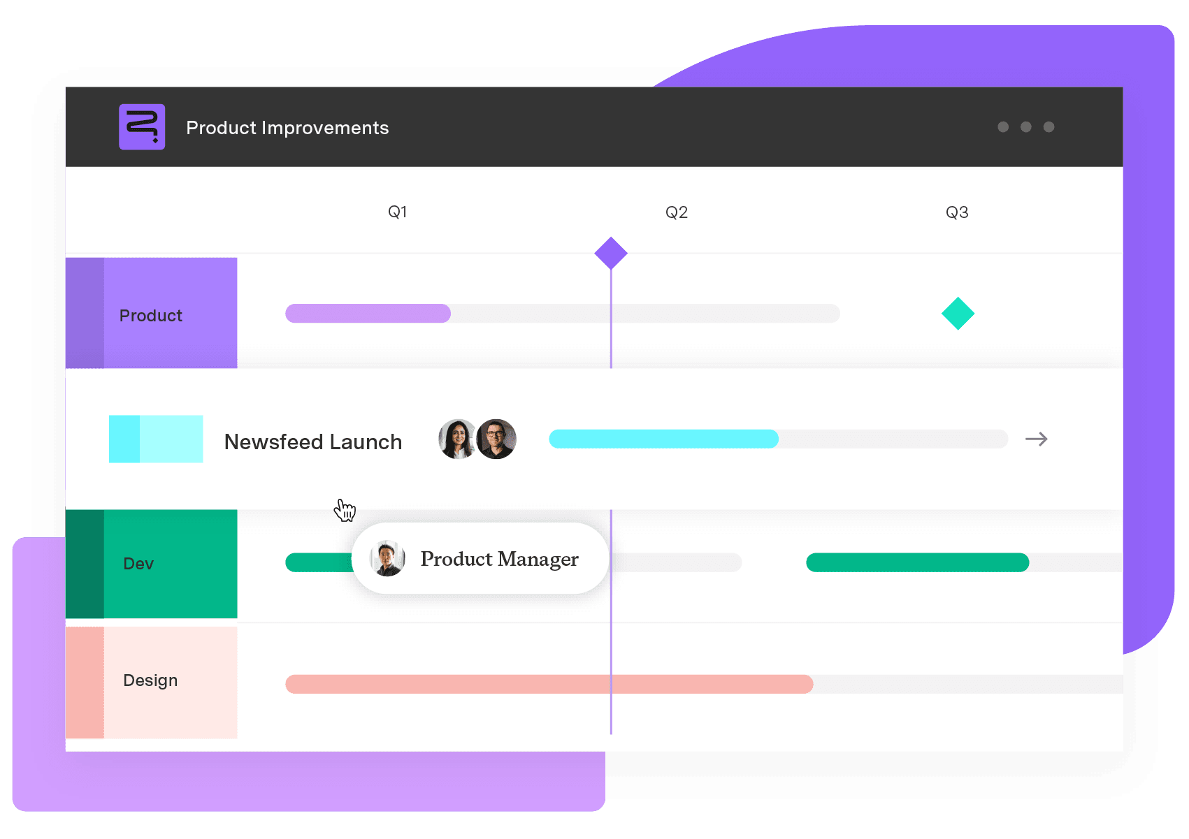
Build your portfolio vision with Strategic Roadmaps. With powerful visualization capabilities, you can communicate strategy to the entire organization and gain alignment around strategic objectives, product goals, and milestones.
Start a Free TrialFrequently Asked Questions
Couldn't find what you need?Go to our documentation
Most fast-moving product teams re-run prioritization every quarter and treat anything longer than two quarters as effectively out of date. Cadence matters less than the trigger: revisit priorities immediately after a major competitive move, a shift in company strategy, or usage data that contradicts an assumption the last ranking was built on, rather than waiting for the calendar to say it is time.
Yes, and most mature product teams do. A common sequence runs Kano first to understand what customers value and expect, RICE or a weighted scorecard next to rank the resulting shortlist numerically, and MoSCoW last to make the final scope call against a fixed deadline. Each framework answers a different question, so layering them tends to produce a sturdier decision than forcing one method to answer all three.
Lean on qualitative signals until the data catches up: strategic fit with the product's stated vision, direct interviews with a small number of representative customers, and competitive gaps that are visible without a survey. Frameworks built for direct customer input, like buy a feature or the product tree, work particularly well here, since they do not require months of usage history to produce a useful signal.
No single framework outperforms the others across every situation, because each one is built to answer a different question. RICE and weighted scoring suit data-backed, reach-driven decisions; Kano and opportunity scoring suit questions about customer satisfaction; MoSCoW suits a fixed deadline that forces hard scope cuts. Choosing well means matching the framework to the decision in front of the team, not defaulting to whichever one is most familiar.