Reporting isn't rocket science with Custom Charts
Tempo Team
Mission-critical means data you can trust
In aerospace, there’s no room for guesswork. One misstep in planning or reporting can cost time, money, and – when lives are at stake – much more. This is high-stakes engineering, where fast, confident decisions rely on accurate, up-to-date data.
But that’s not what this systems engineering team was getting from Jira’s native reporting tools. They were spending valuable time piecing together manual reports, struggling to show real progress, and unable to give leadership a clear view of what mattered most in the moment.
They needed a better way to visualize progress, communicate across teams, and act fast when plans changed. The solution? Custom Charts for Jira.

Dashboards with real power
The company – a major players in aerospace and defence – has chosen to remain anonymous, so we’ll call them Orbital Inc. from here on.
With Custom Charts, the team at Orbital transformed how they track and report on work. They can spin up reports in minutes with no spreadsheets or exports required.
This is thanks to Custom Charts' automation capabilities, which let you create real-time views from any of your Jira data at the project or portfolio level without all the manual effort.
One systems engineer at Orbital told Tempo just how much easier life is when making burnup and burndown reports.
They said that while Jira can create these reports natively, the time required to do so and export query results in CSV files made it far less likely to happen regularly – something that is no longer a problem with Custom Charts.
That means Orbital can create high-end dashboards for every occasion, whether that’s one-off views that consolidate critical datapoints into a single view, or reusable reports for weekly standups or sprints.
Cut the clutter, not the context
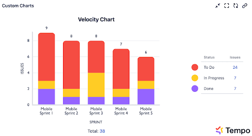
It’s useful to see how many of your tasks are getting blocked – but going beyond that is usually a lot more complex.
With Custom Charts, you get a clear view of the actual work those blocked issues represent. That means decisions can be made on the actual impact on work instead of just issue volume.
These visualizations do more than just give reporting options, as the team at Orbital found. The charts enable real-time drilling down into issues and discussions on the insights revealed by the data.
Now, reports break things down by story points and status, helping the team understand the weight of what’s being worked on – not just the list. Custom visuals and color cues highlight what needs attention, making it easier to respond before small issues become big delays.
“Custom Charts has enabled deceptively simple views that give stakeholders intuitive insights into program status – right in Jira.”
Systems engineer
Plotting a smarter course
When you’re managing a long mission, alignment matters. The team at Orbital Inc. uses Custom Charts to show future capacity across weeks or months – so when priorities shift (as they always do), they can quickly see whether their planning still holds up.
These dashboards act like a pressure gauge. If they’re pushing too hard, it shows. And when things are running smoothly, everyone can see that too.
Their systems engineer highlighted one particular dashboard that summarizes their capacity-based planning allocations for future efforts. It consolidates multiple different views and planning efforts into a single view – and gives the team options to see things from weeks to months in advance.
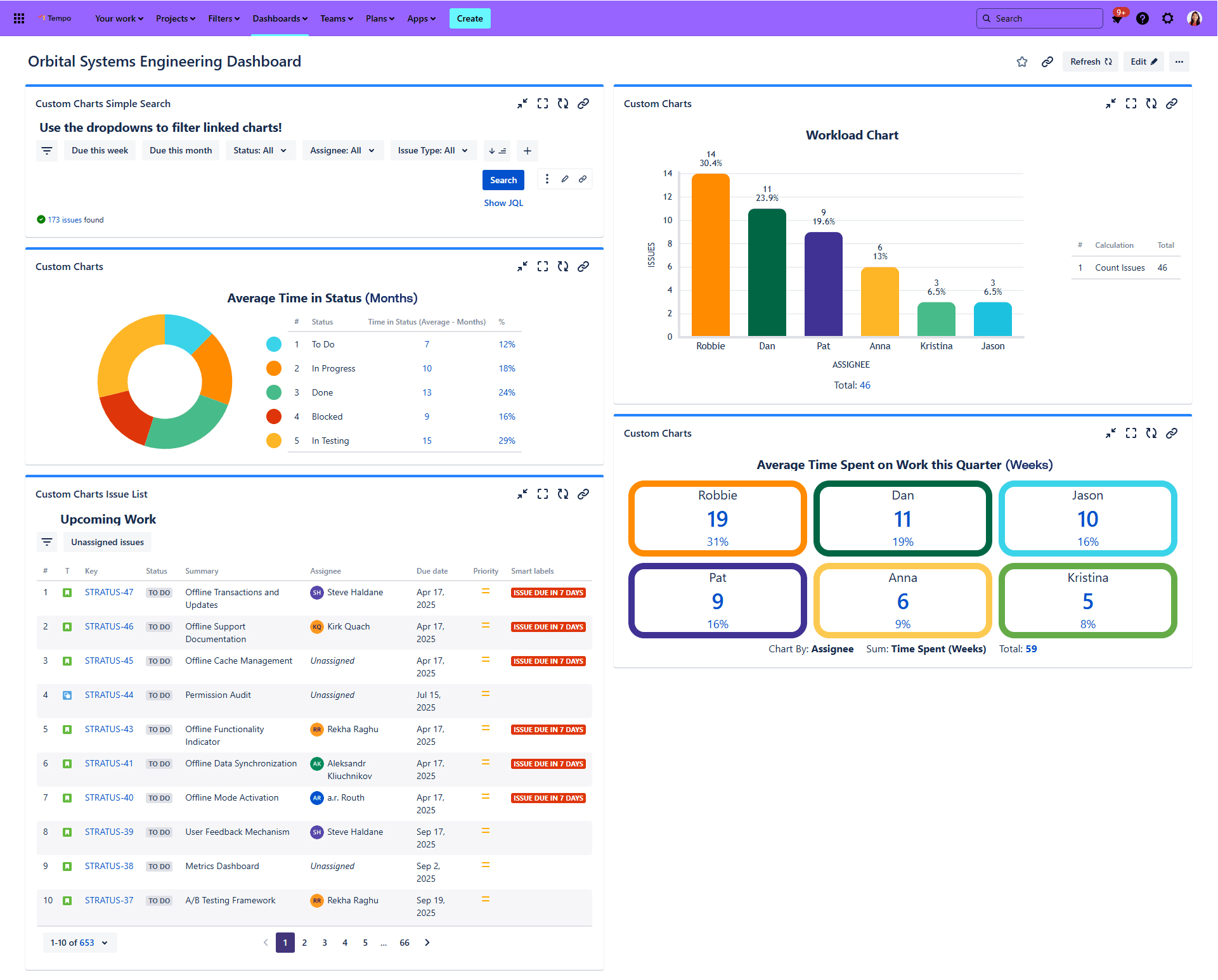
The team at Orbital said these charts have been critical in helping with their capacity planning, and act as a quick checksum.
“These charts have helped us ensure we’re not planning more work than our teams can support.”
Systems engineer
From conversation to confirmation
Clear communication across delivery teams, program managers, and leadership is what keeps everything on track. Custom Charts enables real-time drilling into the data – so when questions come up in meetings, answers are just a click away.
That’s made it easier to get aligned, build trust, and act decisively across the program.
A thousand words, one powerful view
Custom Charts has become a visual language across the division. Whether they’re planning the next sprint or reviewing long-term progress, teams rely on dashboards to tell the full story – instantly.
“A picture is worth a thousand words” absolutely rings true in many of our daily processes.”
Systems engineer
Final approach
You don’t have to overhaul your tools to get better visibility – you just need smarter ways to use the data you already have. With Custom Charts, this team turned Jira into a decision-making engine.
The result? More informed choices, faster delivery, and mission-critical confidence in every report.
Clear your team for takeoff – try Custom Charts for free today.