How Nimbax brings insurance teams together with Jira reporting
Tempo Team
How Nimbax brings insurance teams together with Jira reporting
Nimbax is helping insurance companies, and others, to see that they don’t need to be experts in comprehensive business intelligence platforms like PowerBI to do Jira reporting. It’s because there is a much easier and simpler tool that everyone can use: Custom Charts for Jira.
Founded and based in Quebec, Nimbax offers Atlassian managed services and consultancy to French- and English-speaking firms in Canada. They work predominantly with insurance companies and governmental organizations who are typically already using Atlassian tools, but may not be using them in the right or most optimal way, e.g. they may use Jira for project management but not be aware that you can have templates and automation.
Spotlighting inefficiencies in the way people use Jira and Confluence
Nimbax help insurance companies get more from their Atlassian stack. They also manage and maintain their customers’ Atlassian tools long-term, helping them implement new add-ons and users, and keeping them up to speed on the latest features. Unsurprisingly, a lot of their current work is dedicated to migrating customers from Atlassian Server to Atlassian Cloud.
Nimbax start with an audit of their customers’ processes and a discussion about what they need to work more efficiently. This usually reveals inefficiencies, pain points, and unnecessary costs, and allows Nimbax to see what needs doing before any big system changes and implementations.
Getting teams talking
Nimbax have found that most of the time it’s software and IT support teams who are using Jira and Confluence. However, a few of Nimbax’s major customers have their marketing, legal, and other business teams using it, and at one of their biggest companies, every single employee is a Jira and Confluence user.
Marianne Gosselin, chief information officer at Nimbax, said: “Even if they’re using the same tools, that doesn’t mean they’re talking to each other as much as they should. This is why we recommend Jira reporting. It’s a way of communicating overall progress between teams, of letting other teams know which tickets are in progress, which are high-priority. ”Without reports, it’s like they’re just giving other teams a thumbs up or down as to their progress. It’s not very useful.”
However, the reporting capabilities that come out of the box with Jira are limited, and Nimbax’s customers never fully achieve what they want. They might as well be giving other teams a thumbs up. Often these customers resort to full-scale business intelligence platforms for their reporting instead, like PowerBI.
Gosselin added: “The problem with PowerBI is that you need an expert in PowerBI to use it. If an average user tries to create a report with it, they end up in a mess. PowerBI – and other tools like it – are so complex that they need maintaining by someone who’s really specialized, namely a business intelligence expert.
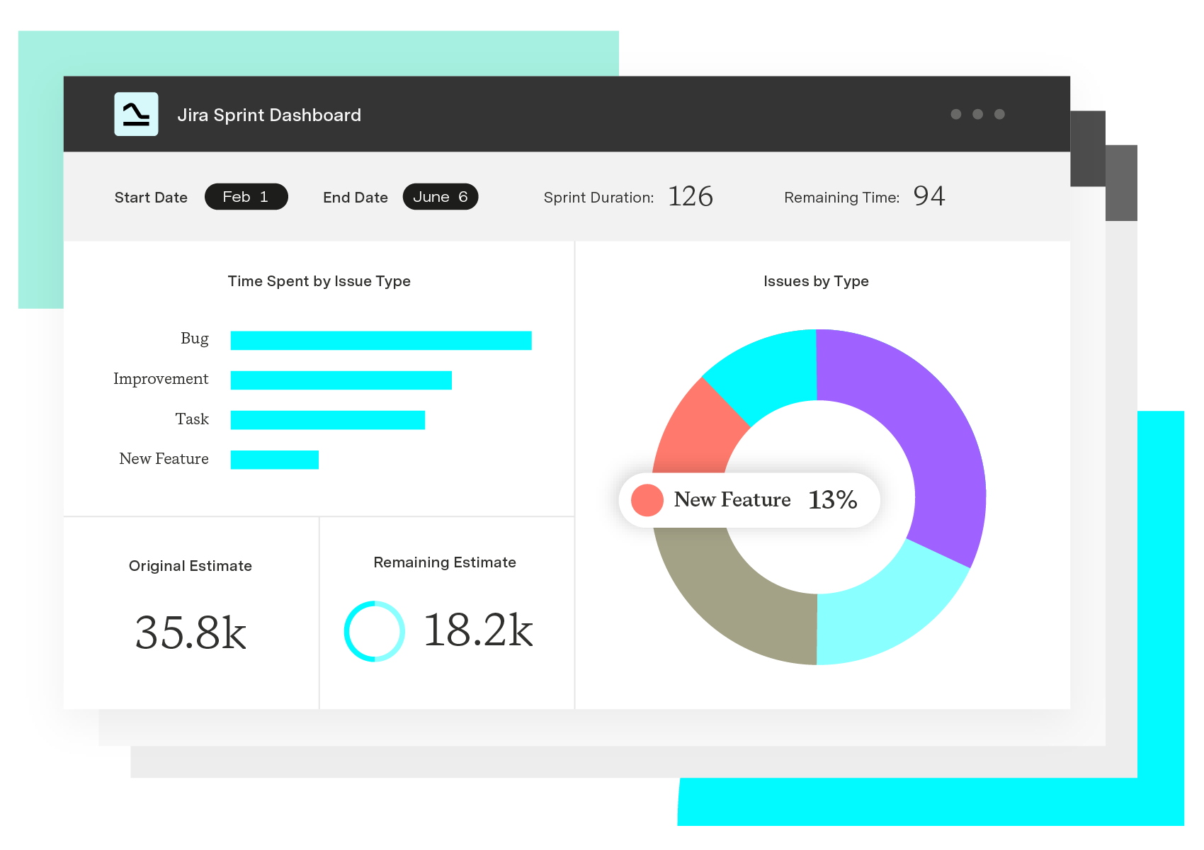
“But people shouldn’t need to be business intelligence experts to create reports. Sometimes all you want to do is create a simple bar chart to report on daily tasks, and customize the colors.”
However, you can’t make your own bar charts (or change the colors) in native Jira. This is why Nimbax recommend Custom Charts for Jira and its sister app, Custom Jira Charts for Confluence.
Making Jira charts in Confluence
One of Nimbax’s customers wanted to create a template master page in Confluence for each new project, and be able to add Jira reports to the page to show the project’s progress. Although the easy integration between Jira and Confluence makes it possible to report on Jira data on Confluence pages, the native capabilities are, again, limited, and the firm just couldn’t display the data they needed to.
So Nimbax recommended Custom Charts for Confluence. This macro, which you add to a Confluence page just like any other macro, allows you to build any kind of chart you want right there on the page, from funnel charts and tile charts to 2D stacked bar charts.
In a few clicks it also lets you change colors, labels, and descriptions, reorder and hide data, and filter the data using an additional macro that comes with Custom Charts – Simple Search.
Gosselin added: “Custom Charts is just so intuitive. It lets you build what you want quickly, with the freedom to tell the data story you want to tell, not the one the tool makes you tell.”
For insurance companies, Jira reporting in Confluence with Custom Charts is bringing knowledge about progress on new insurance products to the sales, service, and admin teams having the day-to-day interactions with the customers.
“Data management doesn’t have to be so nerve-wracking. With PowerBI, it often is, because users end up incorporating too much information into their reports, including sensitive information that renders them subject to a ton of approvals,” says Gosselin. “The thing is, they never needed that information in the first place. Custom Charts gives users more freedom than the native capabilities but keeps things simple at the same time, much simpler than over engineered tools like PowerBI.”