Bar charts
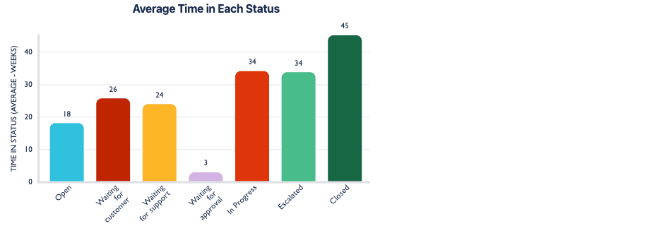
Arrange your data with bars of varying lengths! These 1D charts are useful for comparing the sizes of different categories in your data, providing a clear visual comparison of the data.
Grouped bar charts

These 2D charts let you stack bars within categories. They're useful for comparing values across categories and subcategories simultaneously.
Stacked bar charts
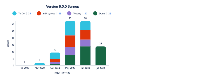
These charts will let you display multiple variables within a category, by stacking bars on top of each other. They’re helpful for comparing categories & understanding the distribution of values.
Pie charts

Pie charts slice your data into sections. Use these charts to make it easy to compare the relative sizes of different categories at a glance.
Line charts
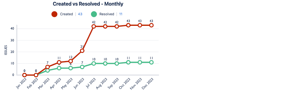
These 1D & 2D charts help you connect data points over time or a sequence. They’re useful for visualizing trends, patterns, and fluctuations in data.
Table charts
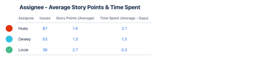
These 1D & 2D charts help you compare items easily without any extra complexity. They’re a straightforward tool for spotting patterns and understanding data at a glance.
Tile charts

With tile charts, you can have multiple squares representing a category or value, helping you compare and understand patterns quickly.
Funnel charts

Funnel charts can help you see how your data decreases or progresses. They’re useful for highlighting bottlenecks and visualizing processes in a concise and engaging manner.